
How to fix background images in mobile for Squarespace 7.0

As a web designer who’s tried a lot of website builders, I keep on going back to Squarespace for many reasons. One of them is how easily flexible and responsive your site can be across devices—the platform even allows you to switch from one screen view to another.
But that’s not to say that Squarespace is perfect. If anything, one of the most common problems in responsiveness is how it deals with most cases of layout issues on its own without giving us other options.
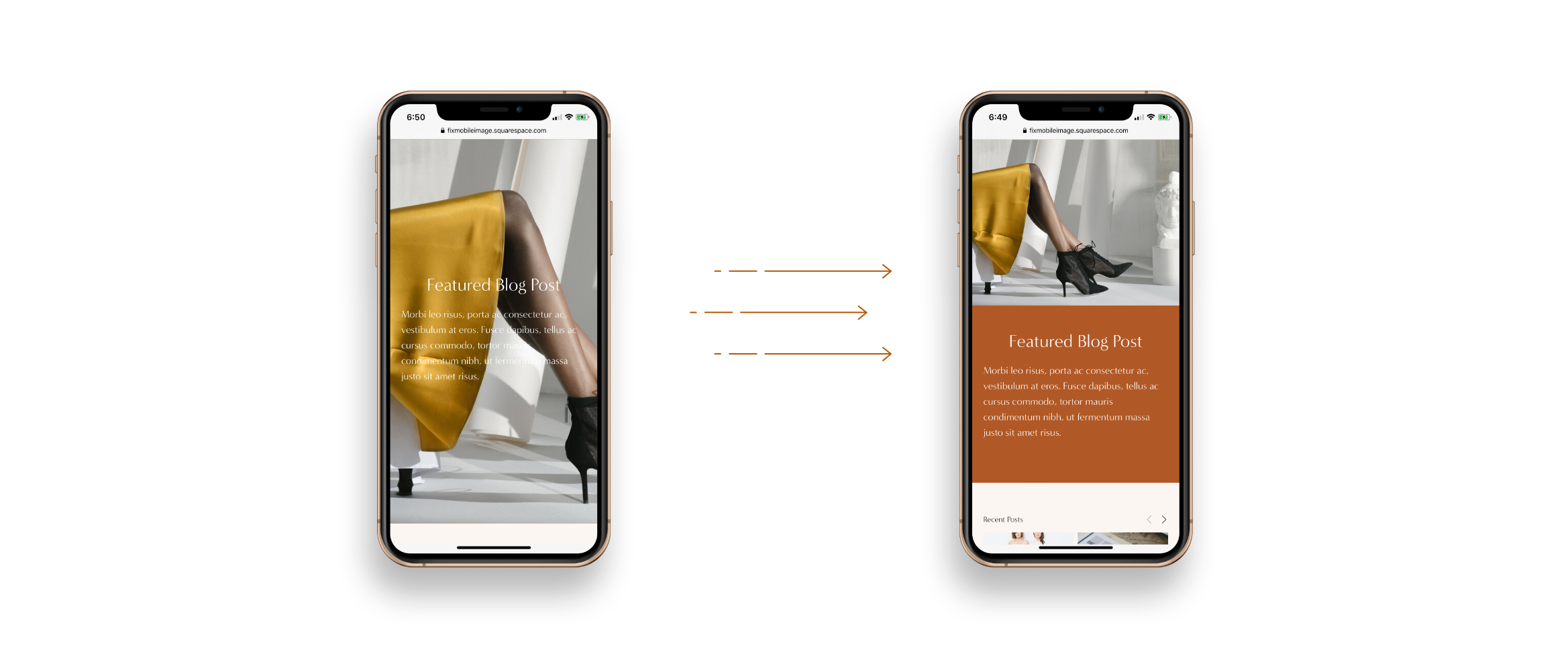
We, for instance, often have little control over how background images display on mobile. The landscape photos are often cropped into portraits by default, taking away from the original design that we've envisioned for a certain page.
Specifying the focal point
There’s an easy, code-free fix for this, one that you might have already heard before. So I’d like to offer you this and get it out of the way, just in case this one will do for your case.
For this option, all you need to do is head to the Page Settings > Media. There you’ll see the background image you’ve set with a small circle hovering above it. Simply reposition this circle to an area that you’d like to designate as the photo’s focal point.
Squarespace will automatically crop your image around that area in mobile. Unfortunately, this isn’t your best bet if you don’t want the photo cropped in the first place, or if you fear that the section text won’t be as readable that way.
Customizing the mobile layout
What if you’d like to keep the entire photo within your user’s line of sight? There’s an alternative solution that works better for both me and my clients, though it does require a little bit of CSS and JavaScript.
The landscape image will be above your section text, which is displayed above a solid background color of your choice. This is easy to implement once you have the code, and I’ll even explain how it works so that you can customize it when necessary.
Watch the Walkthrough Video Below
1. Turn off parallax scrolling site-wide or only for a certain page
I strongly advise you to turn off parallax scrolling before anything else.
There are two ways to go about this. First is by going to Design > Site Styles then typing in “Enable Parallax” (it’s under the “Main: Overlay” section) to turn it off. This will be applied to all the pages in your website.
However, you can also opt to turn it off only for a certain page by using Code Injection. Head to Pages > Index Settings of the page > Advanced, then add the following script I’ve prepared:
<script>
  Static.SQUARESPACE_CONTEXT.tweakJSON[“tweak-overlay-parallax-enabled”] = false;
</script>
2. Specify the media breakpoint
Next, you’d have to head over to Design > Custom CSS and paste the code snippet below. Don’t worry, the remaining steps will explain in simple terms how this works, as well as what you can tweak to your liking.
@media screen and (max-width:767px) { #sectionID { min-height:initial !important; display:box; display:flexbox; display:flex; background-color:#B25A27; //change as needed box-orient:vertical; box-direction:reverse; flex-direction:column-reverse; flex-direction:column-reverse; .Index-page-image { position:relative; height:40vh; } .Index-page-content { min-height:initial !important; padding-top:10px; } h1,h2, h3,p { color:white; } } }
That entire block of code is called a media query, which means that it’ll only apply if a certain condition is true. More specifically, it’s checking if the user’s screen meets a given range of dimensions.
The @media screen and (max-width:767px) part ensures that everything in here will only be applicable to screen widths smaller than 767px, which is called the breakpoint.
Feel free to edit this if you’re going by a different rule, but make sure it’s the same as what’s defined for the entire website. Go to Design > Site Styles and type in “Mobile Breakpoint” to double-check.
3. Get the specific section ID
The #sectionID part indicates where you should plug in your section’s unique location. You can easily find this by going to Page Settings > General > URL Slug. Just make sure it’s preceded by a hash sign (#).
No need for you to think too much into the next few lines, since these are just meant to set the mobile display property to flex. You’ll see that these help make your section more responsive to the screen size as soon as you run the custom code.
4. Change the colors
Some properties are free for you to customize based on your site’s needs, though. For instance, you can change both the background color (find background-color below the display property) and font color (that’s color under h1, h2, h3, p).
All modern browsers support 140 standard color names, including the common ones like white, red, or yellow. You can also use RGB color values, as in rgb(255,0,0), but I often use hexadecimal color values since they’re shorter and more specific.
5. Adjust the height and padding
The .Index-page-image specifies your background image in the new mobile layout, only this time it serves as a photo above your text. You can change its height as needed, but I recommend that you set it at 40vh to maintain the ratio of your landscape image.
On the other hand, the .Index-page-content refers to the section text. It’s now shown in a new container with a background color of your choice, but you can adjust the padding as well. Just change the value of padding-top as you deem fit.

Remember to view the layout in the mobile version to make sure your custom code reflects the changes you want to make in your site.
Hope it helps!
Checkout The Ultimate Carousel Mini Course

Checkout The Ultimate Carousel Mini Course
Learn how to create flexible carousel sliders in your Squarespace website. You may add any block (summary block, image block, social links et al)

