
( RESOURCES ) Browse through our collection of tips & tricks for Squarespace, Shopify, web design, and business. It’s a digital trove of creative ideas right at your fingertips.

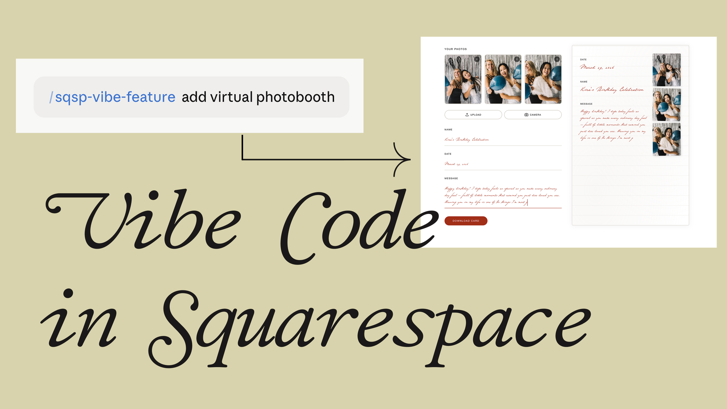
Vibe Code in Squarespace
Imagine if you can add fun and interactive features to your Squarespace website
Vibe code in squarespace
a.
Squarespace
b.
Video
Vibe Code in Squarespace: Add Fun & Interactive Features Using Claude Skills
Imagine What's Possible on Your Squarespace Site [00:00]
Imagine if you can add fun and interactive features to your Squarespace website, for example:
An online virtual photo booth where users can snap pictures of themselves and download that as a keepsake
A 3D global locator like this one
A sketch canvas where users can draw anything and download it
What's great is they are safe and compatible to be added to any Squarespace website — like this quiz — which doesn't require any app or any ongoing costs.
More so, designers and clients can easily edit the properties of these features using this visual editor.
How It Works: Leveraging Claude Skills [00:39]
The way this works is by leveraging a game-changing feature of Claude called skills. Skills are pre-packaged instructions for specialized tasks.
So what I did is to create a specific skill just for creating fun and interactive features that are compatible and safe to add to any Squarespace site.
Uploading the Skill [01:01]
All we need to do is:
Click the Customize tab in the side menu
Under Skills, simply upload the skill file
Once uploaded, we may now use the skill for creating these features
Using the Skill to Create a Feature [01:13]
So we'll start typing forward slash sqsp vibe feature, and from here, we can simply describe what we want to be added to our Squarespace website.
Example: Build Your Own Package Feature [01:27]
For example, if I'd like to add a build your own package feature such that customers can estimate the cost of particular services, the prompt can be as simple as this — because the skill is already pre-packaged with instructions.
Once we initiate this, our skill will come up with some relevant questions. We may answer them in detail. In my case, I created a mock-up in Figma and I can simply take a screenshot of this. So we'll:
Answer these questions concisely
Upload our mock-up from Figma
Then it will start creating the artifact right here — just a preview of what our feature would look like. You may prompt further to make any changes, and we can now add it to our Squarespace website.
Responsive to Global Changes [02:18]
And what's created is also responsive to any global changes. For example, if we wish to change the color of the background, this responds accordingly.
Adding a Visual Editor for Clients [02:30]
Then if you wish to have an option for your clients to be able to edit the details of this feature even after project hand-off, then we can simply prompt this to add a visual editor that allows us to change:
Texts
Hourly rate
Locations
Other properties that you wish
It will then come up with an updated code with the visual editor. Once we add the updated code, we'll now have access to this visual editor settings that gives us access to these properties.
So, for example, I can make changes to the labels, and these changes will be reflected accordingly.
So Many More Features You Can Build [03:05]
There's so many more features that we can achieve using this method, like:
This 3D global store
This interactive drawing canvas
Or even an online photo booth
Learn the Exact Method Inside Standout Squarespace [03:15]
I share the exact method, the skill, and the guidance to create these inside our Standout Squarespace program.

Course Discovery Tool Walkthrough: Find the Right Squarespace Workshop for Your Vision
Are you always wondering whether a layout, feature or functionality can be achieved in Squarespace? In this video, I'm going to share with you a free tool that you can use to easily answer that question.
Course Discovery Tool Walkthrough: Find the Right Squarespace Workshop for Your Vision
a.
Squarespace
b.
Business
Introduction [0:00]
Are you always wondering whether a layout, feature or functionality can be achieved in Squarespace? In this video, I'm going to share with you a free tool that you can use to easily answer that question.
So if you'd like to check whether the vision you have in mind or the layout that you wish to accomplish in Squarespace is something that we can achieve using the current resources within our program, then you can use this tool.
How to Access the Tool [0:30]
This is a public resource, so you simply need to go to our sales page: Standout Squarespace. Then in the navigation that follows you, as you scroll, you'll find that you can see this Discover call to action at the top right.
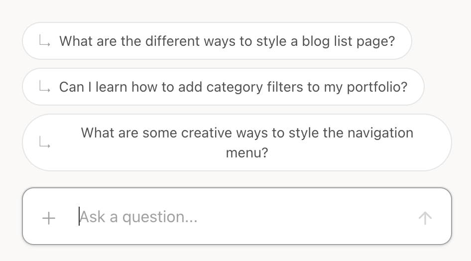
Using Sample Questions [0:45]
There are sample questions that you can reference, or you may simply click them. For example:
"What are the different ways to style a blog list page?"
And then if you'll start to go through our database of workshops, then it will list the relevant workshops based on your question.
So for example, for your blog list page, we have several workshops to help you ideate layouts for that:
The Editorial Blogs layout
The Tag List layout
And there is the See Preview option to give you more context of what this technique is about.
Uploading Images as Reference [1:15]
You may also provide images as reference. For example, if your client needs a particular layout to be present on their website, or you have a mock up in mind, then you can simply take a screenshot and then upload that to the chat.
For example, I can simply upload this image, then I can start asking:
"Can I add a filter to summary blocks like this attached image?"
Then it will start analyzing our image, and again, look through a database if something matches our image and description. And it came up with these options. It says you can absolutely add category filtering to summary blocks using one of our techniques — the most relevant one is Summary Block Category Filter.
A Quick Note on Image Uploads [1:50]
Just to note that if you are uploading images, it's best to keep them below two megabytes. And then if you need help optimizing that image or compressing it, then you can use my tool called pixresize.com.
When You Need Extra Help [2:05]
Also, if you have a specific layout in mind, and our Course Discovery tool can't find it in our workshops, then you can use this chat button and I will personally attend to your question.

Introducing Standout Stories: How Web Designers Shape Meaning Through Style

Introducing Standout Stories, an editorial series that highlights the richly detailed lives of web designers and developers inside our Standout Squarespace and Standout Shopify communities. We’re getting up close and personal on how their experiences and aspirations shape their signature style, if only to inspire you to craft your own.
Introducing Standout Stories: How Web Designers Shape Meaning Through Style
a.
Design
b.
Business
Each website has a story to tell. It’s a virtual space that shapes us as we shape it. When I enter a lovingly crafted site, my eyes linger on the lines, typefaces, colors, textures, and movements. What are they trying to tell me? All these elements draw from their founder’s memories or encounters. Like a home, a website builds a sanctuary for its visitors, and it’s the act of intentionality that will keep them coming back.
This entrusts an important role to the web designer-developer: a facilitator of meaning between brand and website.
As an educator, I tend to step back when it comes to matters of taste. I focus my efforts on teaching you the tools of the trade, because I know that nurturing your signature style is a deeply personal process. It takes careful introspection to know which parts of your experiences and preferences show up consistently in your body of work. I can help you build the skills to scaffold your style, but style you would have to realize within yourself over time. This distinct sense of artistry is what resonates with your ideal client.
Introducing Standout Stories
How, then, do we begin to shape our own style as web designers and developers? We must keep our eyes open, paying close attention to the details that escape the typical bystander. More importantly, we listen to prominent creatives and the effort that goes into their own website pieces. This is what I had in mind for my new multimedia series, Standout Stories, which is an intimate look into the designer-developer’s craft.
Our first feature is none other than Hello-World Studio, a boutique design agency co-founded by Standout students Joy Yiu and Reyna Dashefsky. Their website is a trip down the textboxes and trinkets of Y2K yesteryear, signifying a simple core philosophy—a return to the whimsy and sincerity of the early internet. It has been a delight for me to discover what has brought Reyna and Joy together for this virtual masterpiece.
ASCII art and kaomojis may not be your style, but this story could bring you closer to yours. And who knows? You might find your own words and work featured in this series soon enough.
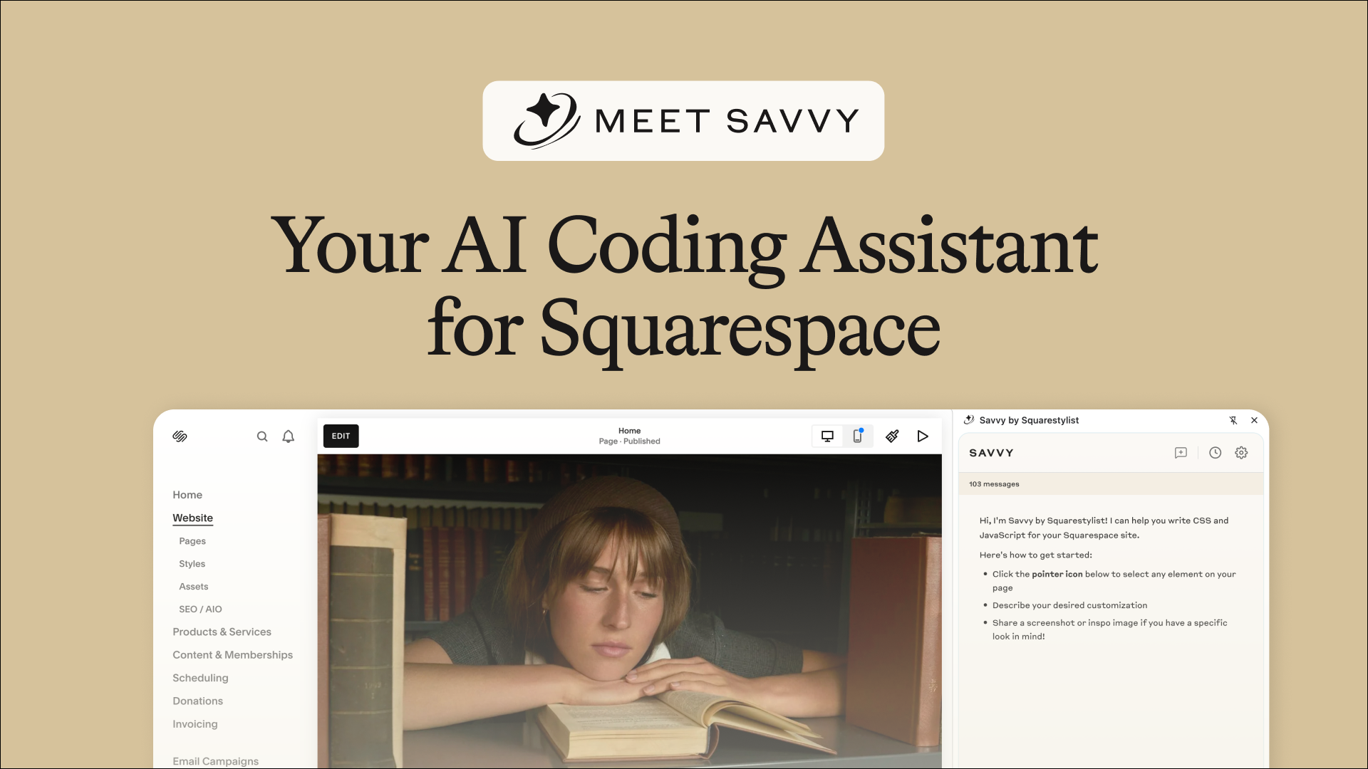
Introducing Savvy: Your Squarespace-Specific AI Coding Assistant
Meet Savvy: an AI code generator built specifically for Squarespace.
Meet Savvy: an AI code generator built specifically for Squarespace.
Introducing Savvy: Your Squarespace-Specific AI Coding Assistant
a.
Squarespace
b.
Video
You've probably heard that building websites is getting easier with AI. You’ve tried using ChatGPT, Claude, or Gemini—maybe you even pasted their code into Squarespace and… it didn’t work.
That’s because most AI tools aren’t built with Squarespace in mind. They don’t understand the platform’s unique element structures, code patterns, or best practices.
That’s exactly why I built Savvy—an AI coding assistant built specifically for Squarespace.
What Is Savvy?
Savvy sits right beside your Squarespace website. It lets you:
Click directly on any element on your site
Upload reference images for customizations
Generate accurate, context-aware code tailored to your Squarespace site
Visit squaresavvy.com to get started.
Getting Started with Savvy
1. Sign Up
Head to the landing page and click “Start for Free.” If you're a standout Squarespace member, make sure to sign up using the same email you use for the Standout Squarespace community.
2. Confirm Your Email
After creating your account, check your inbox (and spam folder!) for a confirmation email. Click Confirm Email to access your Savvy dashboard.
3. Install the Chrome Extension
Click the “Add Chrome Extension” button in the dashboard. Once it's added, pin it in your browser for easy access.
Now, on any Squarespace site, you can activate the extension and use Savvy's powerful features.
Using Savvy to Customize Your Squarespace Site
Savvy needs to understand which element you're working with—so the first step is always to use the pointer tool at the bottom-left of the Savvy panel. Once it's active (turns gold), hover over your site, and click the element you want to modify.
Here’s a walkthrough of what you can do:
Add a Border to an Image
After selecting an image, just type:
“Add a border to this image.”
Savvy considers Squarespace’s quirks (like how images are set to fit) and generates the correct CSS. Copy the code, open the CSS panel (/ > type “CSS”), and paste it in. You might need to preview in a no-redirect browser (?noredirect at the end of the URL) to see the effect.
Want rounded corners? You can ask Savvy—or just use the built-in image block options.
Bonus: Savvy uses Squarespace variables like --paragraphMediumColor so your customizations respond to your theme settings. You can always swap in a hex code if needed.
Custom Bullet Points with SVG Icons
Want more on-brand bullet points? Select your text block and say:
“Change default bullet points to a custom graphic.”
Savvy will guide you through:
Removing default bullets
Adding custom SVGs (just right-click > "Copy as SVG")
Pasting the new code and previewing the result
You’ll get a clean, branded bullet list. You can even tweak the icon size, color, and alignment.
Add Hover Captions to Gallery Sections
Visual customizations are often best explained with images. You can:
Paste in a screenshot or reference image (Figma or Adobe XD works great)
Describe your goal—e.g.
“I’d like the gallery caption to appear on hover like this image.”
Savvy will generate code scoped only for desktop (since hover doesn’t work well on mobile). Paste the code into your custom CSS panel, and you’ll see the caption reveal beautifully on hover.
To reuse this across multiple gallery sections:
Edit the section settings and add an anchor link ID, like
gallery-hoverUse the updated code Savvy provides
Save the section, and reuse it on other pages
Add Estimated Reading Time to Blog Posts
Select your blog post block and ask:
“Add estimated reading time below the blog title.”
Savvy will provide:
JavaScript code (paste in Code Injection > Footer)
CSS code (paste in the CSS panel)
It calculates based on 200 words per minute and displays a message like “1 minute read.”
A Reminder: AI Isn’t Perfect
While Savvy is trained on Squarespace-specific best practices, it’s still AI. It doesn’t have access to all your custom CSS or JS, so sometimes it’ll get you 90% of the way there—and you’ll need to apply your coding knowledge to finish the job.
For example, say you want to change a blog’s “Read More” link to say “View Project”:
Select the block
Ask: “Change Read More to View Project”
Savvy will give you CSS to paste
If there’s an issue (e.g. strikethrough text), you may need to inspect elements manually to troubleshoot
This is where your coding foundations come in.
Help Improve Savvy
Within the chat history, you can:
Rename conversations for future reference
Click the three dots (
⋯) to share feedback
When you do this, the entire conversation is shared with me. This helps me train Savvy even better.
Feel free to share your wins, too! What you’re building, what you love—it fuels continued improvement of the tool. You can also visit the Support menu on the dashboard for more resources.
Savvy is here to empower you to take control of your Squarespace customizations—without the guesswork. It’s visual, context-aware, and continuously improving.
But remember: AI is only as good as the questions we ask. Your creativity and coding foundation are the keys to unlocking its full power.
Can’t wait to see what you build with Savvy.

How to Upload and Use Custom Fonts in Squarespace (Finally!)
Squarespace has finally rolled out a long-awaited feature: you can now upload your own custom fonts directly, without touching a line of code.
How to Upload and Use Custom Fonts in Squarespace (Finally!)
a.
Squarespace
b.
Video
If you've ever struggled with using custom fonts in Squarespace, we’ve got good news—it’s now easier than ever. Squarespace has finally rolled out a long-awaited feature: you can now upload your own custom fonts directly, without touching a line of code. Let’s walk through how this works and some tips to keep in mind as you start customizing your site’s typography.
Custom Fonts Without Code? Yes, Please.
Previously, if your preferred font wasn’t available in the built-in font picker, you had no choice but to inject code or CSS workarounds. But now, Squarespace has introduced a simple drag-and-drop upload feature for custom fonts.
To upload a font:
Head to the Font Manager.
Drag your font file (like
.otf,.woff, or.woff2) into the upload window.Squarespace will auto-detect the font name and weight—super handy!
💡 Note: Always ensure you have the proper web license for the font you upload. Many foundries sell separate licenses for desktop and web use.
Assigning Fonts to Your Site
Once uploaded, your custom fonts will show up in your Squarespace font drop-down menu, making it super easy to assign them to various text elements like headings, paragraphs, or even buttons.
For example:
Replace Helvetica with your custom font like “Glossy Display” for headings.
Adjust weight, text transform, and other styling directly in the design panel.
Want to italicize? No problem. If you’ve uploaded the italic version of your font, Squarespace will handle the switch automatically when you apply italics.
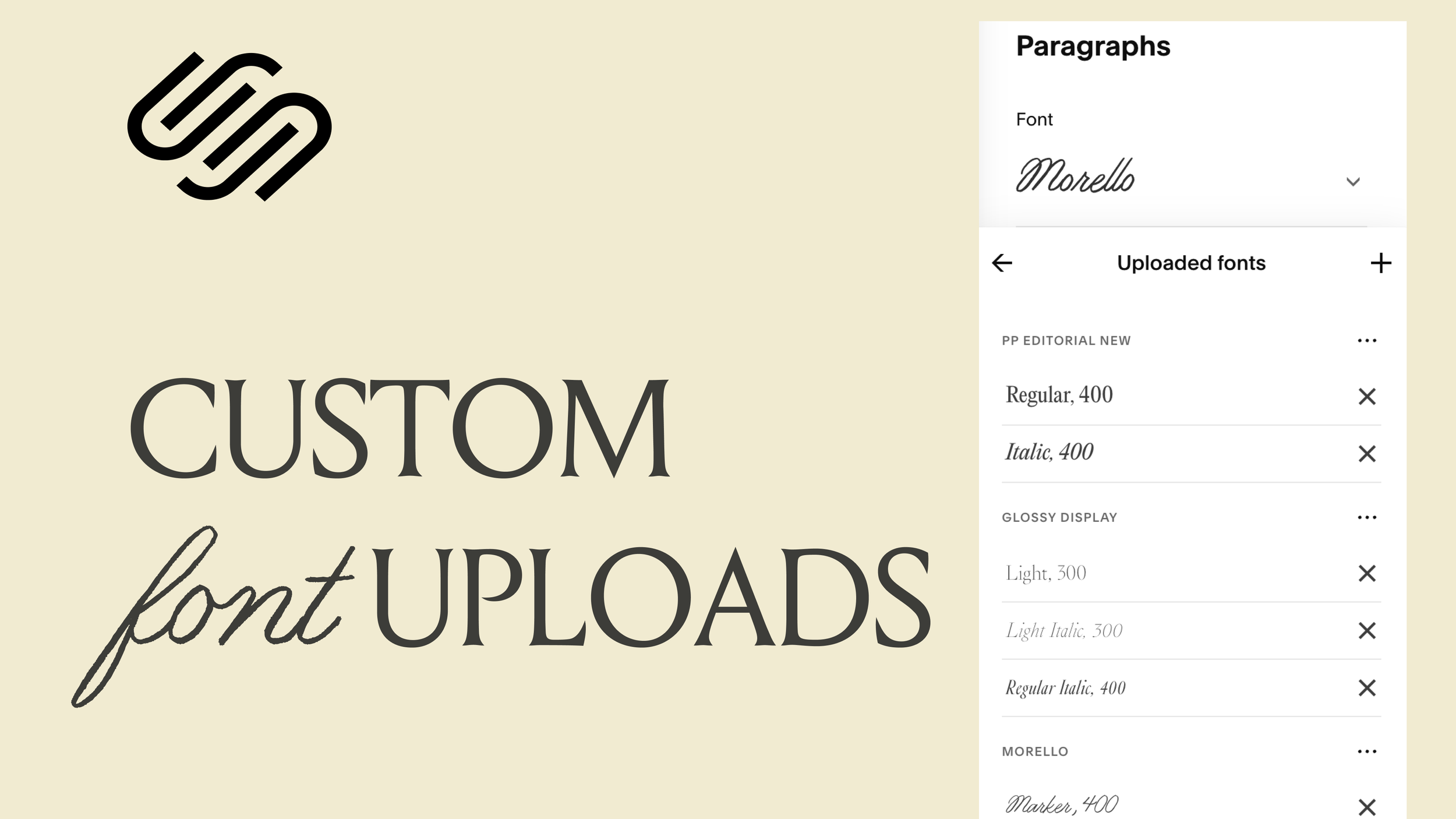
Uploading Font Variations (Light, Regular, Italic, etc.)
You can upload different variations of your font—light, regular, italic—and Squarespace automatically organizes them under the same font family. That means:
Upload a light italic? It’ll be categorized as such.
Switch weights easily using the font settings panel.
Italicize elements and see the correct version display beautifully—no fake italics here.
🛑 Pro Tip: Only upload the variations you actually need. Uploading too many can slow down your site. Squarespace even reminds you: fewer fonts = faster site.
Deleting Fonts You No Longer Use
If you decide to remove a font:
Make sure it’s no longer assigned to any element.
Click the “X” icon in the Font Manager.
If the font is still in use, Squarespace will prompt you to remove it from your site first.
Beyond Headings – Get Creative
Custom fonts aren’t just for headings. You can:
Assign them to miscellaneous fonts like buttons or captions.
Use them on specific blocks, like setting a monospace block to a custom sonar-style font.
Apply them via granular font assignments in the style editor.
But here's a final piece of advice: if you're only using a custom font in one small spot, it might be better to upload it as an SVG. That way, you’ll avoid the performance hit that comes with loading extra fonts.
Squarespace’s new font upload feature opens up tons of creative possibilities—no more coding hacks or messy workarounds. Just drag, drop, assign, and go.
But remember:
Always check licensing.
Upload only what you need.
Consider performance alongside aesthetics.
Now go ahead, give your Squarespace site that custom type vibe it deserves.

Introducing Adagio: Scroll-Driven Animations for Memorable Squarespace Websites
Adagio is an advanced scroll animation system designed specifically to bring immersive, scroll-driven features to your Squarespace website.
Introducing Adagio: Scroll-Driven Animations for Memorable Squarespace Websites
a.
Squarespace
b.
Animations
There are millions of websites out there, so how do you make yours unforgettable? That’s the question that led me to create Adagio — an advanced scroll animation system designed specifically to bring immersive, scroll-driven features to your Squarespace website.
And with Squarespace soon launching a native way to animate block elements, I figured now's the perfect time to introduce even more advanced, section-based scroll animations that work beautifully in tandem with the upcoming native features.
What Are Scroll-Driven Animations?
Scroll-driven animations are a type of website animation where the movement of elements is directly based on the user’s scroll position.
Take the beautiful Cosmos website as an example — elements start to move as soon as you hit certain sections, and their speed or transformation depends on how fast you scroll. Apple has also mastered this technique in their product pages, making users feel like they're unwrapping a product as they scroll.
When crafted well, these animations can transform your website into a story — an unfolding experience rather than a static presentation.
Meet Adagio — Graceful, Scroll-Based Animations
I wanted to make scroll animations easy and intuitive to implement in Squarespace. That’s how Adagio was born — named after the slow and sweeping expression of grace in music and dance.
Head over to CasaAdagio.com to explore a showcase of what's possible.
A Tour Through Casa Adagio
As you land on the page, you're greeted by a clock-inspired graphic that slowly rotates to reveal the brand’s colors. A message reads: "Take time as you scroll." This isn't just poetic — it’s instructional. Slow scrolling reveals the magic.
Highlights from the Demo:
Split Characters: As you scroll, text is slowly revealed letter by letter.
Stroke Animation: Custom graphics created in Figma are revealed in sync with your scroll.
Audio Integration: Click ‘Play Audio’ to enhance your experience with ambient music — toggled on or off, stuck at the bottom right of your screen.
Scroll-Synced Video Shifts: Full-width videos subtly transition between blocks as you scroll, creating a seamless storytelling effect.
Installing Adagio: Quick & Flexible
Installing Adagio is effortless. Here’s how it works:
Step 1: Install the Catalog
You can set it up in seconds — a simple code adds the entire animation system to your Squarespace site.
Step 2: Activate Specific Effects
You don’t have to activate everything. Use the visual guide to pick and activate only the effects you want — with just one line of code.
For example, to activate horizontal scrolling sections, all you need to do is add keywords to your section anchors:
Add
HL startto the first sectionAdd
HL endto the last section
Adagio automatically calculates the scroll length based on how many sections are included. No code editing required.
Scroll Animation Techniques in Adagio
Here’s a rundown of the scroll-driven animation types available:
1. Horizontal Image Scroll
Using Fluid Engine + Gallery Blocks, the images scroll horizontally. The scroll length adjusts based on how many images are in the gallery.
2. Draw on Scroll (SVG Reveal)
Create custom SVGs in Figma, Illustrator, or Adobe XD. These graphics reveal themselves as users scroll. Combine them with split-character text effects for layered impact.
3. Horizontal Scroll by Section
Assign full Fluid Engine sections to horizontally scroll. Add any type of content: images, videos, galleries, or lists.
4. Moments of Delight
Interactive hover animations — items bounce and respond dynamically as you hover over them.
5. Mouseover Reveal
Using just a gallery block, images swap based on mouse movement. It's great for showcasing portfolios in a clean, engaging way.
6. Circular 3D Scroll
Use list sections to create a 3D scroll wheel effect — perfect for displaying list items in a unique format.
7. Curved Horizontal Scroll
Another list-section-based animation, this one adds a soft curve to the scroll for a more dynamic look.
Block-Level Animations
Although Squarespace will soon have native block animations, I’ve added custom effects in Adagio that go beyond what the native tools can offer.
For example:
Split Text Animation: Add keywords like character split directly in your text block link (in edit mode), and the animation is applied automatically.
Customize stagger timing by adding a value (e.g., stagger:03) to control how fast each letter appears.
Scrollytelling System Built for Squarespace
What makes Adagio truly special is how it brings advanced animation techniques to your Squarespace site without requiring code editing. You simply:
Add specific keywords to sections or blocks
Use the visual guide to activate effects
Customize effortlessly through section or block IDs
If you're curious to dive deeper, check out my free workshop on Scrollytelling — where I walk through how to design memorable Squarespace websites using scroll animations.

My one secret to keeping website visitors engaged
Make your audience linger a while longer with scrollytelling, subtle motions that bring a sense of novelty.
MY ONE SECRET TO KEEPING WEBSITE VISITORS ENGAGED
a.
Squarespace
b.
Animations
We tend to think of scrolling as a bad habit we fall into. Unlike deliberate action, scrolling comes across as lazy, thoughtless, repetitive. Our thumb goes through the motions searching for something new, yet we wind up in endless corridors of images and clips that blur into one another. Time, before we know it, has slipped through our fingers.
Can we change the way we scroll? Rather than treating it as a coping mechanism for boredom or dissatisfaction, we could turn scrolling into a medium for delight. Web designers and developers have the ability to reshape digital experiences by building websites for clients.
Holding people's attention begins with the intention of adding visual momentum to an otherwise flat website—an often overlooked technique called scrollytelling.
What does scrollytelling look like?
On the surface, it might seem that website design consists of mulling over brand imagery, font pairings, or color palettes. But this assumption can hold us back. We're working with a medium that allows for complex movements and transitions. Why not let our webpages unfold with animations?
The art of scrollytelling began as a journalistic ambition to reimagine center spreads beyond your typical morning paper. "Snow Fall: The Avalanche at Tunnel Creek" written by John Branch for The New York Times was the first feature of its kind in 2012, blending pop-up galleries, full-bleed interviews, and parallax scrolling into an immersive documentation of a tragedy in six parts. This award-winning multimedia piece later inspired other publications to take full advantage of coding techniques to contextualize their data-rich narratives.
These developments, as you can imagine, were not limited to newspapers or magazines. A number of businesses have adapted scrollytelling to infuse their sites with character. The elements don't just look the brand; they live and breathe and move it. Slow motion transforms into an invitation for each visitor to drink in the details at their own pace.
When performed well, animation breaks the monotony of the usual scroll. Both play and pause commit the movements to memory, and your attention to detail makes all the difference.
Stylistic scrollytelling effects to consider
It takes skill and intuition to find rhythm in scrollytelling. There are basic animation options available to website builders, but experts would find the selection limiting. Custom choreographies might be necessary for premium sites to carry out a client's specific requests. With the help of code, you can tailor transitions to fit the narrative—not the other way around.
Here's a look at advanced scrollytelling applications that can get you ahead of the curve:
Canals Amsterdam Website
Horizontal Scrolling
Some design rules are made to be broken. Horizontal scrolling shows you how fun it can be to turn the website on its head every now and then. This one's suited for sprawling timelines, media galleries, kind words, and other collections. A single code snippet slides your homepage from left to right, and it works even when your visitors scroll downward out of habit.
Going in circles
Another way to bend digital reality is to orchestrate the trajectory of objects on scroll. Consider adding a touch of whimsy to your project with a carousel going round and round the more you move down the page. You can have it in three ways: a gradual circular reveal, a curved horizontal path, or a single focal point spinning like a top.
Loti.ai website
Drawing SVGs
Treat every website like a creative canvas where even your visitors can draw along with you. Scalable vector graphics (SVG) allow you to work with single-stroke illustrations so anyone can scribble down the page as they scroll. The overall effect leaves a stunning, sketch-like impression. Pretty neat, don't you think?
Bouncing and Dragging Elements
What if users can play around with elements they see on screen? With a bit of JavaScript, you can add a delightful bounce or drag to any block around your cursor. This effect makes sections a whole lot more dynamic, setting your site apart from the get go.
Synced on Scroll
Turn scrolling into a conversation between your content and your visitor's curiosity. As elements drift into view, they wake up—images materialize from transparency, backgrounds blush with new colors, and text slides in from the wings.
Would you believe that you can do all these and more in Squarespace? People may know it as the all-in-one platform that's simple enough for beginners, but don't underestimate its capabilities. You'll realize it's possible to craft world-class websites right here, refining each project with polish while keeping maintenance easy for clients after launch.
Stunning visuals do catch people's attention. But in the end, it's your ability to deliver a seamless story that makes them stay. I hope this inspires you to build interactive websites that can slow down our scrolling—and make each second count.
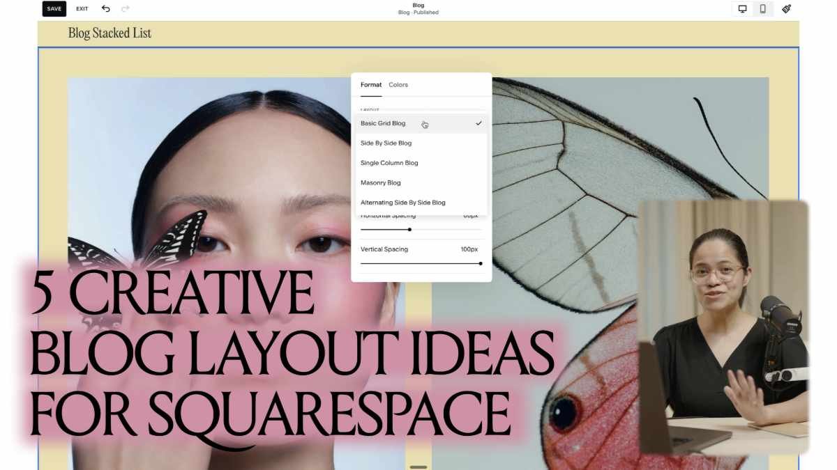
5 Creative Blog Layout Ideas for Squarespace
Transform your Squarespace blog from template-standard to editorial-style with these 5 new handcrafted Code Components
Transform your blog from template-standard to editorial-style with these unique code components designed to showcase your content beautifully.
5 Creative Blog Layout Ideas for Squarespace
a.
Squarespace
b.
Video
Most blog pages you see online follow the same predictable pattern: blog cards arranged in simple grids or columns. While Squarespace's built-in options work perfectly fine, they don't have to be your only choice. With a few thoughtful code additions, you can create something that feels more editorial and uniquely yours.
In this post, we'll explore what's possible with Squarespace's visual editor first, then dive into five signature Squarestylist code components that completely transform how your blog looks and feels, just like magic.
Working with Squarespace's Built-in Options
Before we get into custom code, let's appreciate what Squarespace gives us right out of the box. The visual style editor makes it easy to customize your blog without any coding:
Adjust fonts, colors, and spacing across your entire site
Choose from different blog layouts like grid, side-by-side, or single column
Control the number of columns and overall structure
Toggle elements like author bylines, dates, categories, and tags
Modify placement of blog titles and metadata
Add thumbnail images, excerpts, or full post previews
These built-in options can take you pretty far, especially when you're strategic about combining them.
Simple Workarounds Using Existing Features
Sometimes the most elegant solutions come from creatively combining Squarespace's existing blocks:
Summary blocks on custom landing pages let you create entirely different layouts for showcasing your posts
Different styling between your main blog page and individual posts creates varied reading experiences
These approaches work well when you want something different but aren't ready to dive into custom CSS yet.
When You're Ready for Custom Code
If you want your blog to look truly distinct from templates, custom CSS opens up much more creative control:
Custom styling and filtering for tags and categories
Unique hover effects on blog images
Don't let the word "code" intimidate you—you can get started by simply copying and pasting code snippets. I keep all my favorite techniques organized in what I call my Code Toolkit, making it easy to search and apply them to new projects.
5 Plug-and-Play Blog Layout Components
Here are my favorite code components for creating blogs that feel editorial and unexpected:
1. Blog Stacked List
This typography-focused layout stacks your blog titles in elegant layers, perfect for showcasing a beautiful type system. It's ideal when your content is text-heavy and you want the titles to be the main attraction.
2. Blog Feature Grid
Creates an editorial magazine feel with your most recent post displayed prominently on the left while visitors scroll through the rest on the right, creating a nice focal hierarchy.
3. Blog List Follow Cursor
Adds subtle interactivity as thumbnail images appear and follow the cursor when hovering over post titles. It's playful without being overwhelming—a small detail that makes browsing feel more engaging.
4. Blog List Carousel
Transforms your standard grid into a smooth horizontal carousel that visitors can drag through or navigate with arrows and pagination. The layout automatically adapts to mobile, showing one post per slide for easy browsing.
5. Blog List Expand
Creates a dynamic expand-on-hover effect where images reveal themselves as visitors explore your post titles. It's unexpected and memorable without being distracting.
Why Code Your Blog Layouts?
The advantage of using custom CSS over workarounds like summary blocks is that you keep all of Squarespace's built-in functionality. Your visitors can still navigate to older posts, use pagination, and access all the features they expect from a blog while experiencing your unique design vision.
All of these techniques are available in our Standout Squarespace Code Toolkit, where they come with step-by-step video walkthroughs to help you implement them confidently. If you're just looking to try one or two specific layouts, they're also available individually in our Code Components Shop.
The goal isn't to make your blog complicated—it's to make it feel intentionally crafted. When visitors land on a blog that clearly reflects the creator's aesthetic vision, they're more likely to stay, explore, and remember what they found.
Which of these layouts speaks to your creative vision? I'd love to hear about your favorite approach in the comments below.

Setting up your studio’s tech stack
How to build the toolkit that will serve you in your day-to-day operations

How to build the tech stack that will serve you in your day-to-day operations.
Setting up your studio’s tech stack
a.
Business
b.
Tech Stack

When it comes to being a web designer, we often think about creative skills that develop your eye for good design. There's also the business aspect to it—the clarity and confidence that demonstrates what you can do for clients.
Yet we tend to overlook a key component to any design studio: the digital system that facilitates your best work and keeps the lights on even when you're away.
I call this collection of business apps and resources the tech stack, a term that I borrowed from web development circles. Think about the tools that blend seamlessly in the background as you focus on client projects. It's easy to take them for granted when they get the job done. However, when your workflow becomes too overwhelming and tasks begin to slip between the cracks, a few tweaks to your tech stack might be in order.
How do you know if you've chosen the right tool? When is it time to upgrade the size of your toolkit? Here are some useful tips to set up your studio for success:
Establish your studio essentials
Start with the tools of the trade—the items most closely involved in your creative projects. What's your bare minimum? These will shape the digital environment where you'll be spending the most time in, so choose what will grant you the most ease and flexibility.
For me, I can't imagine doing web design without Figma to craft my website prototypes and Squarespace to build and launch them for clients. I even created Pixresize so I can quickly optimize website images in bulk.
Mind the learning curve
How long would it take you to get used to navigating an app's features? This depends on your level of expertise, as well as past experience with similar tools. Extensive documentation, community support, and available courses could also go a long way in addressing any gaps in your knowledge.
For client-facing platforms, you need to keep in mind usability and accessibility even for less tech-savvy users. The tool has to be intuitive enough to require minimal handholding, and this is especially true for your website platform of choice.
Consider app compatibility
Does this app function well with other existing tools in your stack? Check the settings for third-party integrations with your favorite platforms. You might want to do a test run before you commit, or else you might find yourself addressing glitches or manually double-checking for errors all day.
There's one AI automation tool I run to when there are no built-in integrations: Zapier. Its visual interface lets me map out workflows that use my everyday apps to accomplish tasks on my behalf, such as collecting form responses.
Secure your digital storage
I believe this is one of the most crucial decisions you'll make for your studio: where to entrust your documents for safekeeping. Of course it's ideal to have a local backup of all your brand assets and projects. But online copies have an advantage in terms of collaboration—you could easily generate a link to share with clients for review.
Personally I use Dropbox to safeguard my brand assets and project files; it helps that it has a nifty feature called Sign that I can use for my contracts. As for gathering my bookmarks, notes, and images for inspiration, I stick to mymind as my virtual, self-organizing corkboard.
Streamline the smaller tasks
When you're used to handling every single task, it's too easy to get caught up in busywork that don't contribute meaningfully to your business. Which recurring items on your to-do list take too much of your time away from design? See if you can find tools that can get the tedious, repetitive work off your hands.
In my case, Peachs became my go-to for hassle-free affiliate marketing to save me the effort of onboarding and sending payouts. I also use Superhuman to get on top of my emails and Voicenotes to record my thoughts and meetings.
Future-proof your toolkit
It can be tempting to reach out for that new shiny toy you spotted in the market. Before you ditch the one you're currently using, ask yourself: Will this tool be able to support my needs in the long run?
Nothing lasts forever—even that lifetime access guarantee—but you can still do your background check on an app for signs of longevity. Research their business model and roadmap, as well as testimonials from avid users. Plus, it's worth looking into options for importing and exporting your data when you need it.
Contact your trusted experts
You've come this far doing everything on your own by being scrappy with tools. However, there comes a time when you'll have to take a step back and allow your studio to scale with the advice of mentors. It's perfectly alright to ask for assistance. Just because you could make it alone doesn't mean you have to.
Get exclusive access to the Squarestylist Stack
Curious about my studio setup yet? I'm sharing my very own tech stack with those who fill out my 2025 midyear survey for web designers. You can submit your response here to browse a list of my go-to apps and experts.

Shaping your tech stack is a constant work in progress; what may have suited you in the past may no longer fit your studio's growing needs today. It helps to revisit the systems you've set in place every now and then to evaluate what works. But there's no need to reinvent the wheel, either. Sometimes you can just keep an eye on what designers like you are already raving about.
You might also like:

The Ultimate Squarespace Tutorial for Beginners
Learning the building blocks and pro hacks that let you create distinctive Squarespace websites.
Learning the building blocks of Squarespace that let you create distinctive websites.
The Ultimate Squarespace TUTORIAL for Beginners
a.
Squarespace
b.
Video
What I love most about Squarespace is how it scales with your ambitions. When you're starting out, this seemingly simple platform enables you to create something beautiful without the typical overwhelm that comes with using and learning a new website builder for the first time. As you grow more confident, you discover layers of sophistication, advanced design options, powerful section and block features, collection pages that transform into directories, courses, and full-fledged web shops.
I've seen students go from complete beginners to professional web designers, all while staying on Squarespace. These are the foundational techniques that unlock that potential, the pro tips that will grow with you from your very first website to professional client projects.
Start Smart
Skip the Template Overwhelm
Here's what most beginners don't know: every single Squarespace template is built from the same framework. Those beautiful galleries you see? They're just showing you what's possible when you understand the building blocks.
Instead of endlessly scrolling through templates, start with a blank canvas. Use those templates as inspiration, not limitations. This simple shift will open up unlimited creative possibilities.
Prepare Before You Build
Before adding any content, take these two steps that most people skip:
Optimize your images using a tool like PixResize. Images are the main thing that slows down websites, and you want yours to load seamlessly on every device.
Plan your content structure thoughtfully with Copyspark. It’s not hard to notice that planning the website content is the typical bottleneck of website builds. Creating a simple outline, more so a well-branded one that incorporates your tone of voice and business offerings, will save you hours of rearranging later.
Essential Shortcuts
Once you start building, these keyboard shortcuts will make you feel like a Squarespace wizard:
Press G to reveal or hide the invisible grid that helps you position elements precisely
Cmd+D to duplicate blocks
Cmd+A to select everything in a section for easy alignment
Forward slash (/) to search settings instantly
These might seem insignificant, but they'll save you countless clicks and make the whole experience feel more intuitive.
Design Secrets
The Scale Text Hack
This is one of my favorite discoveries: Squarespace has a "Scale Text" feature that automatically adjusts your text size to fit its container. Instead of manually tweaking font sizes, let Squarespace do the math. This allows your text to look perfectly proportioned on every screen size.
Hidden Font Category
There's an often-overlooked "Miscellaneous" font category that I find to be the easiest way to incorporate accent fonts to your website with zero lines of code. Assign it as the Monospace option, and suddenly you have beautiful accent fonts that make your site feel custom.
The Color Theme System
Set up your five main colors once, and Squarespace automatically creates color themes you can apply to any section. It's like having a professional design system built in—no more guessing if colors work together.
Mobile Mastery
In Squarespace, we may position and resize elements differently on mobile without affecting your desktop layout.
Squarespace makes responsive design approachable. You don't need to learn complex code. Just switch to mobile view and adjust as needed. Working on the desktop and mobile layouts simultaneously allows you to address design issues early on which saves you a lot of time and headache in the long run.
Advanced Techniques
Overflow Elements
Want your site to look custom-coded? Remove section padding and use shape blocks to create elements that appear to overlap between sections. It's a simple technique that adds visual sophistication.
Saved Sections Workflow
Once you've created a section you love, save it with the heart icon. You can reuse it across pages, creating consistency while saving hours of rebuilding. This is how Squarespace experts work efficiently.
Strategic Section Types
Squarespace offers different section types for different needs:
Fluid sections for complete creative freedom
Gallery sections for beautiful image showcases
List sections for testimonials and informative carousels
Classic editor when you need columned layouts
Learning when to use each type will bring ease to your build process.
SEO & Accessibility
Not so much a hack but a crucial pro tip: Assigning heading levels based on your page structure, not just how big you want the text to look. Think of it like a book outline: H1 is your title, H2s are chapters, H3s are sections.
This simple practice will help search engines understand your content and make your site accessible to everyone. Professional web design isn't just about looking good—it's about making sure it works well for all users.
Ready to Keep Learning?
These tips are just the beginning of what's possible when you understand Squarespace's true capabilities. If you're feeling inspired to dive deeper, I'd love to share more in my free workshop “Secrets to High-End Squarespace Projects.”
And when you're ready for complete mastery, Standout Squarespace teaches everything from these fundamentals to advanced techniques that create truly standout websites.
But for now, take these pro tips and start experimenting. Open Squarespace with fresh eyes, skip those templates, and start building something that feels uniquely yours. You've got this.
Want to see these tips in action? Watch my complete beginner tutorial where I walk through building a beautiful Squarespace website from scratch, using every technique mentioned in this guide.

Design Process: How to Design Unique Squarespace Websites
My design process for creating distinctive websites on Squarespace.
In this guide, I'll walk you through my design process for creating distinctive websites on Squarespace.
Design Process: How to design unique websites
a.
Design
b.
Video
I often hear from other designers that they can spot a Squarespace website from a mile away. So how do we design websites that don't look like Squarespace? Let me be clear, though—our goal is not to disguise the platform we're using. But in this day and age where it's so easy to publish websites and everything just starts to look and feel the same, how do we create websites that truly create lasting impact?
Because Squarespace is so easy to use, it comes with pre-built components and templates. I know that many users worry that their website will look just like everyone else's, but I'm a firm believer that Squarespace, like any website builder, is simply a tool. The results we achieve will ultimately depend on the creativity and expertise of the person using the tool.
I use other website platforms because Squarespace is not for all use cases, but I'd say that Squarespace is my most favorite platform because it's the easiest for my clients to use. And my goal as a designer is not to make websites difficult, but to delight my clients by working magic with the simplest of tools.
In this guide, I'll walk you through my design process for creating distinctive websites on Squarespace.
Step 1: Start with Purpose
Let me start with the first step, which is to start with purpose. This part is not necessarily the most fun part of the process, but I believe it informs the rest of the steps. I ask myself these questions in every project, whether it's a client project or a personal project:
What are the goals and how can we achieve them through design?
What are the problems that we're solving?
How should the website make visitors feel?
At the start of every website project, my very first milestone is to accomplish a website strategy document. I essentially summarize insights from the data and information that I've gathered from the client and their brand. Most of these insights come from:
Customer testimonials and feedback
Google Analytics data
My own simulation while keeping in mind the target audience
The website strategy is all about coming up with website features, functionalities and flow that will meet these business and user goals. In the same strategy document, I highlight key features of the website and tie these features to the goals. The insights, goals and brand tone that we establish here will be the lens through which we identify which inspirations are relevant in the second step.
Step 2: Immerse Yourself in Diverse Sources of Inspiration (3:44)
The second step is all about immersing ourselves in diverse sources of inspirations for context. When I work with a client project, I require them to have at least the logo, typography and brand colors finalized before I start with the website design phase. However, these aren't enough for me to really establish the mood, vibe and the overall experience, so I still take time to go through inspirations.
When I was starting out, I would simply go through website directories like:
Site Inspire
Awwwards
Standout Showcase (where I curate beautiful websites by our students)
These are beautiful references, but what really helped me come up with unique designs is when I look at inspirations beyond the website design space. I now look at inspirations such as:
Packaging design
Textures
Interiors that align with the project I'm working on
For reference, here's how I establish different moods and vibes by curating inspirations for different projects:
Sophisticated editorial look - Clean lines, minimal color palette, strong typography
Nostalgic and eccentric - Vintage elements, playful layouts, unexpected combinations
These inspirations and the insights from our strategy document will all come together when we proceed to our next step.
Step 3: Craft Layouts with Character
To make this step more manageable, I broke it down into three sub-steps:
Defining the content
Visualizing the placement of elements through wireframes
Adding character
It would be overwhelming to go through the steps for the entire website at once, so my approach is always to work on one section at a time.
3.1 Understanding What Content to Present
In layout design, our goal is to present information in the most effective way possible. There's this age-old debate on whether we start with the design or the copy first. Personally, as a designer, I prefer having the copy to inform my design.
I really encourage clients to provide copy or to hire a copywriter. I guide them through the process by sharing a content guide where I give them examples of how to write hero statements. Some clients, even with this much guidance, still find it hard to provide copy.
When the client can't provide copy, I generate placeholder content using an AI tool I developed called Copy Spark. This tool is based on established copywriting frameworks, so it helps identify the sections that would go into every page. I find that some clients find it easier to edit the copy once they see it with the design.
3.2 Creating the Canvas
After defining the content, I proceed with a canvas where I assess how to effectively present the content visually. In this phase, I focus more on the placement of elements, without the typography, colors and imagery yet, so I can ensure that the right information is prioritized.
Here's my practical workflow:
Set up your design file - I use Figma, but you can use Canva or Adobe XD
Create two pages in your file:
Page 1: Insights and inspiration (from steps 1 and 2)
Page 2: Wireframes
Start with one focal section - For example, a brand manifesto
Create multiple layout options - Don't stop at just one; explore variations
When creating wireframes, I refer back to my inspirations to see if there are elements that can inspire the layout. It's totally fine to be inspired by website layouts—observe how other designers present content. But personally, I love looking at other design pieces and seeing how I can bring that to the web interface.
For example, if I'm drawn to overlapping elements and big typography in my inspiration collection, I'll explore how to incorporate these into my wireframes. I come up with several layout explorations because it's easy to move things around in visual builders.
3.3: Adding Character to the Layout
This is when I incorporate the visuals like typography, imagery and branding. The key question I ask myself is: What is the key defining feature that I can express throughout the website?
Examples of key defining features:
Geometric shapes - Used consistently across headers, buttons, and decorative elements
Bordered frames and outlines - Applied to testimonial blocks, images, and even the footer
Layered notes and memos aesthetic - Creating depth through overlapping elements
Table of contents style - Using archive list aesthetics throughout the site
Cards with overlapping elements - Combined with sideways text for visual interest
I visualize each wireframe into layouts with character by adding imagery, colors and the brand type system. Among these explorations, I pick the one that speaks most to me, then keep referring back to my inspirations page until I identify what will be the key defining feature of the website.
Step 4: Ground Yourself with Constraints
Before getting carried away designing the rest of the website with the key defining feature, I ground myself with constraints. Remember that these designs need to be translated to Squarespace.
Key questions to ask yourself:
What design solution is practical to build?
Can this design be easily updated?
Will it meet website quality standards in practice?
When designing the rest of the sections, you want the character to be carried throughout, but make sure you design with development in mind. Before proposing any design, ensure you can implement it on Squarespace and that it will be easy for the client to update.
Defining What's Practical
Knowing what's practical to design and how much time and effort it will require depends on your mastery of Squarespace. I highly recommend having a deep understanding of the native features of Squarespace so you know exactly what is easy to build.
I use a complexity factor when pricing projects:
Level One - No additional code aside from installing custom fonts
Level Two - Using existing techniques from my coded library
Level Three - Developing new custom features
The pages might look similar, but the amount of effort will be vastly different. I assess the level of complexity during the discovery call when the client shares their inspirations and references.
Step 5: Harness the True Power of Code
For level two projects, I reference a library of tried and tested features. This makes the design and development process much easier, especially when building the rest of the sections.
You might ask: If we keep referring back to the same library of tested features, won't our websites start to look the same? My answer is no—not if we learn the true power of code.
For me, code is another powerful design tool. Once we learn how to properly use it, so many possibilities open up. We can creatively combine or stack the current techniques we already know.
Real-world example: In my Standout Squarespace course, I share a code toolkit that includes a technique for horizontal fluid tabs. My students have taken this base technique and created completely reimagined layouts:
One student used it to create an innovative portfolio section
Another transformed it into a unique navigation system
A third combined it with other techniques for a completely custom look
They're able to realize possibilities beyond the examples I've shown because they understand how code works, not just how to copy and paste it.
Final Thoughts
Creating unique Squarespace websites isn't about fighting against the platform—it's about understanding its capabilities deeply and then pushing beyond them strategically. By following this process:
Starting with clear purpose and strategy
Drawing inspiration from diverse sources beyond web design
Crafting layouts with distinctive character
Working within practical constraints
Leveraging code as a design tool
You can create websites that don't just avoid looking like typical Squarespace sites—they stand out as memorable, impactful digital experiences that serve both your clients and their audiences effectively.
If you wish to learn more about harnessing the power of code to create standout Squarespace websites, I invite you to my free workshop called "The Secrets to High-End Squarespace Projects."
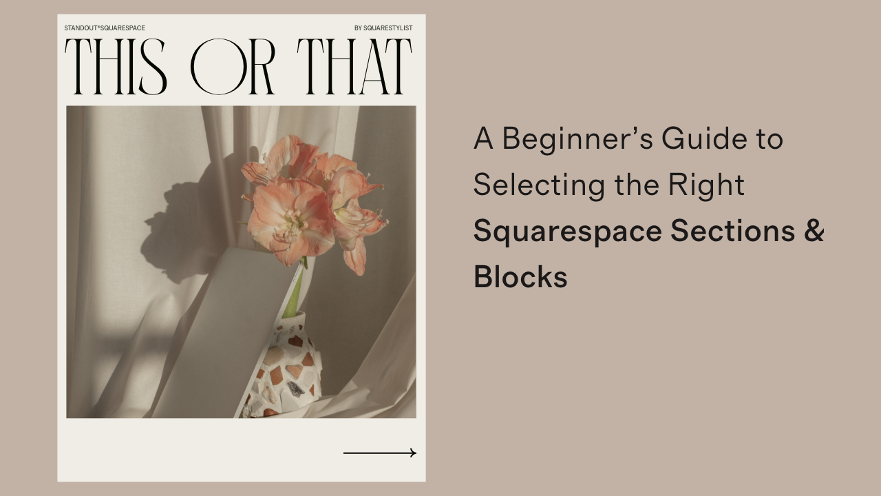
Squarestylist’s Guide to Selecting the Right Squarespace Sections & Blocks
A Squarestylist guide to selecting the right Squarespace sections and blocks.
A Squarestylist guide to selecting the right Squarespace sections and blocks to achieve your dream layouts, functional needs and long-term management requirements.
Selecting the Right Squarespace Sections & Blocks
a.
Squarespace
b.
Article
Squarespace website pages are built on the most clever engineering of sections and blocks—powerful and flexible components that we can tweak and customize to our liking, depending of course on each one's built-in functionalities and limitations.
Sections and blocks can have similar features, which is why those who are new to Squarespace, and sometimes even Squarespace experts, often find themselves asking: Which block or section should I use?
The truth is: There are many ways to approach builds.
Consider a team members page. You could:
① Add individual Images and Text blocks on a Fluid section to build your own layout
② Add a Gallery block (though this feature has spacing considerations and some aspects are limited to Squarespace Circle members) or
③ Use an Autolayout List section which lets you bulk upload images, add captions, and includes a Lightbox feature for enlarging images.
So which is the right choice for your project? It comes down to:
Functionality. What features do you need to prioritize for this layout?
Practicality. Is it simple to update and maintain?
In this post, we will explore the built-in features of Fluid sections, Autolayout List sections, Autolayout Gallery sections, Gallery blocks and Summary blocks, how they compare to each other, and my suggestions on which section or block to use depending on the layout and functionality you want to achieve.
List sections VS Gallery sections
Both the List section and Gallery section are types of Autolayout sections, just in different formats.
Autolayout sections are some of the most powerful tools in Squarespace, allowing us to quickly add content and switch layouts (between Carousels, Slideshows et al) without manually rearranging them. The content also reflows depending on the browser or device size, helping with long-term functionality and making updates much simpler.
List sections are ideal for making granular style tweaks to colors, sizing, spacing and alignments—all without using code.
Gallery sections are simple to edit and maintain for showcasing images, and can be further styled with code. If autoplay animations on certain imagery is a priority, I would use the Gallery section over the List section that has no animation nor Lightbox capabilities.
Autolayout sections are available in the Sections Catalogue with the Information ℹ️ icon.
Let’s first make a detailed comparison of the two different types of Autolayout Sections.
Autolayout List sections
Supports formatted titles and descriptions
Offers arrow navigation
Lack Lightbox and animations
Require code for clickable images
Don't support masonry layouts
Autolayout Gallery sections
Support simple captioning
Provide bullet or arrow navigation
Include built-in Lightbox and animations
Feature clickable images
Offer masonry layout options
Squarestylist’s recommendation: List sections are ideal for featuring branded content—from your services to testimonials—and similar informative content that requires images, titles, descriptions and buttons. Gallery sections are the better option for showcasing imagery with minimal captioning, with the option to activate Lightbox and animations. ✺
Autolayout List sections VS Summary blocks
Though they appear similar, List Sections and Summary Blocks have distinct features that make either one a much more ideal choice compared to the other, depending on your needs for functionality and practicality.
I recommend testing both on a sample website to better understand what makes each one unique and help you assess which one is best for your projects.
Autolayout List sections
Intuitive to edit and update
Easy to rearrange
Independent from collections
Cannot be added to product and blog items
Functions as an independent section—doesn't support Fluid Editor blocks
Summary blocks
Automatically pulls items from the blog, shop and events page
To add content, new items must be published on either your blog, shop or events
More challenging to rearrange—requires changing the publish dates of the blog posts or events
Can be added to individual product pages or blog posts
Can be placed anywhere within a Fluid section
Squarestylist’s recommendation: List sections are ideal for content that does not require syncing, such as your services list, team profiles or pricing options. For cases where we need to sync product items or blog posts on pages such as the homepage (as previews or related content), Summary blocks are the better option. ✺
Autolayout List sections VS Fluid sections
Fluid sections may seem like the more flexible option, especially for stylized layouts scattered around the page. For content that does not need to be updated regularly, like the team members in our example, working with a Fluid Section by adding individual image and text blocks could be a good approach. Style-wise, Fluid sections are easier to tweak without using code. However, Autolayout List sections are the better option for sections where content needs to be updated and perhaps even rearranged from time to time. Consider using List sections for showcasing your process, services or similar branded content.
Autolayout List sections
Easy to add new entries
Simple to rearrange
Automatically reflows based on device size
Can easily switch between layouts (Carousels, Slideshows, et al)
Requires additional code for styling
Fluid sections
Adding new entries is tedious
Time-consuming to rearrange
May appear too narrow on some devices
Cannot switch between layouts
Easier to layout and style
Squarestylist’s recommendation: Before building with a Fluid section, consider if a List section could work for your needs. While Fluid sections offer more styling flexibility without code, the ease of switching layouts and content that automatically reflows based on device size makes List sections the more sustainable option. ✺
Gallery blocks VS Gallery sections
These similarly named options can be confusing, but they serve different purposes. Gallery blocks offer the flexibility to incorporate videos with the option to add other blocks within Fluid sections. Autolayout Gallery sections function independently and are ideal for showcasing images, particularly with a masonry layouts.
Gallery blocks
May have spacing issues when added to Fluid sections
Can be styled alongside other Fluid blocks
Offer arrow navigation
Support videos
No masonry layout option
Gallery sections
Function as independent sections—not compatible with Fluid sections
Cannot combine with other Fluid blocks
Provide both arrow and bullet navigation
Don't support videos
Include masonry layout option
Squarestylist’s recommendation: Use Gallery blocks to showcase a combination of images and videos with the option to add other decorative elements using Fluid blocks. For classic gallery layouts with the option to activate Lightbox and animations, the Gallery section is a better option. ✺
Choosing the Right Building Blocks
When designing in Squarespace, the difference between a good website and a great one often comes down to selecting the right components for each job. Each section and block we've explored has distinct strengths:
List sections shine with highly-customizable, structured and adaptable content
Gallery sections create visual impact with clean image displays and interactive features
Summary blocks seamlessly connect your blog or shop content across your site
Fluid sections offer creative freedom for custom layouts that don’t require frequent updates
The key is understanding not just what each can do, but which will serve your specific needs for both functionality and long-term management. The best choice balances what looks good today with what will work smoothly tomorrow.
Armed with this knowledge of Squarespace's powerful building blocks, you're now better equipped to make intentional design decisions that enhance both aesthetics and functionality.
In our next post and video, we'll explore Collection pages—specifically Blog and Portfolio collections—comparing their features and identifying the best use cases for each.

10 Project Expectations I Set for My Own Clients
Communicate these 10 project requirements & limitations to your clients during the onboarding phase to manage their expectations.
Communicate these 10 project requirements & limitations to your clients during the onboarding phase to manage their expectations.
10 project expectations I set for my own clients
The first consultation call with a prospect can feel like a whirlwind of ideas and possibilities. They talk about their business needs and goals; you can't wait to offer your creative vision. They tend to want a lot of things on their website, and that might rush you into saying yes to everything—to go above and beyond as a web designer.
Anything to get them to say yes to working with you, right? Unfortunately, being overly accommodating could lead to scope creep and milestone delays down the line.
This might seem counterintuitive, but in my many years of handling client work, I realized that the most successful projects do not rely on my unlimited availability or countless revisions. Instead, they're founded on mutual respect, clear communication, and well-defined boundaries. Being transparent with the level of service you can realistically provide will get you far in earning the trust of great clients.
As part of my regular practice, here are 10 project expectations I often discuss with web design clients before they sign a contract with me:
1. Defining project assets and file management
What will you be needing from your client? When do you expect to receive it? It's difficult to draw up a custom-fitted strategy for their website without its content, so ideally you'd want access to their brand elements, official photos, and website copy at least one week before kickoff.
Not every client has these assets ready, but at least you'd be able to assist them if they find this initial step overwhelming. For businesses without a strong brand identity, I typically offer my brand strategy and design services before building the website. But if it's writing their own website copy they're stumped on, I point them towards a brainstorming tool I built myself, Copyspark.
2. Establishing communication methods and channels
How will you be keeping in touch for the duration of the project? I personally don't like digging through my emails for comments or requests, so I set up a bespoke client portal that's easy to use and maintain on Notion. This way, we're always on the same page when it comes to tracking project updates, deliverables, and messages. Truly an understated way of providing a white-glove experience.
3. Setting web design studio hours and availability
When will you be working on the project and responding to inquiries? Let them know your timezone and work days while you're at it. This will help you pencil in milestone meetings without having to disrupt your sleep or postpone your weekend plans. Plus, it's reassuring for your client to know they can expect a reply from you, even when they don't get immediate answers.
4. Requiring timely client feedback
How much time does your client have to review what you've given them so far? Personally I'd like to give them a few days to go through the deliverables and provide their input. Clients can get too busy running their business, but their steady guidance remains necessary for the website project to proceed as planned.
It's essential to emphasize late fees and rescheduling fees, both of which apply to the final bill in case you don't hear from them within a certain period. You could, however, choose to make exceptions for emergencies on a case-by-case basis.
5. Limiting web design revision rounds
How many times can your client ask for a revision? A maximum of three rounds of refinement per phase is the sweet spot in my experience—allowing for adjustments based on client input without extending the timeline too much. This is all up to you, but do note that it's unreasonable to guarantee unlimited revisions for offers with much quicker turnarounds, like template reskins or design intensives.
6. Clarifying website performance standards
What factors do you consider in measuring performance? Which of these are within your control? A quick Google Lighthouse check illuminates insights on website strengths and areas for improvement. Use your own discernment to interpret these figures by benchmarking against the client's existing site, industry standards, or other relevant considerations.
It's possible to uncover opportunities to speed up page load before the launch. But if your client is unwilling to make concessions in the final build, feel free to explore alternatives to improve user experience such as crafting a custom loading GIF.
7. Specifying website responsiveness for devices and screens
How much can the website for accommodate for a variety of screen sizes? Unlike print and packaging design, web design is meant to be more fluid. In theory, it takes the shape of whatever screen size or orientation is available to it. Yet in practice, you can only ever check the build for specific resolutions and widths called breakpoints.
Not all clients are aware that the final design can deviate from your prototype for this very reason. I find that the best way to address their apprehension is by involving them in the testing process. A quick call or video walkthrough can do the trick.
8. Outlining browser compatibility testing and support
Which browsers did you use to test the website for potential glitches? Browser options abound, but as a good rule of thumb it's enough to optimize your design elements and custom code for the top three: Google Chrome, Mozilla Firefox, and Apple's Safari. After all, most niche browsers are built on the open-source, Google-maintained Chromium code (e.g. Brave, Opera, Arc).
If the business owner insists on testing cross-browser compatibility on major alternatives such as Internet Explorer or Microsoft Edge, you can consider this as a service add-on to be discussed and priced accordingly.
9. Addressing web accessibility standards and compliance
How do you ensure that their site is accessible to users of all abilities? At the very least, I'm sure we all want every visitor to have a pleasant experience scrolling through your client's website. But intention may not always lend itself to implementation. I do believe this aspect requires your careful consideration—so much that I examined how a select few website platforms perform in this regard.
We can do our best to educate ourselves as web designers and developers. Still, there is no better substitute to the cooperation of accessibility specialists for industries that require stricter compliance (e.g. e-commerce, healthcare, education, automobile, finance).
10. Integrating artificial intelligence tools in the design process
How much involvement does generative AI have in your design process? It's important to disclose whether you've intentionally employed machine learning tools (e.g. ChatGPT, Midjourney, Copilot) at any stage of the project. I'm certain your client will appreciate you taking great lengths to consider intellectual property (IP), data privacy, and other ethical matters that could directly impact their business.
If this is something you'd like to look into, you can read more about my collaboration with IP lawyer Ivy of Canary and Hedge as we discuss relevant contract language and use cases.
And there you have it—the many administrative and technical ways to manage client expectations before they even sign the dotted line. Trust me, it's best to bring these up within your consultation call and project proposal, rather than reserving them for your web design service agreement where they can be overlooked.
Broaching these key topics will not come across as unreasonable to the right clients. In fact, your honesty will demonstrate a deep familiarity with the design process—and by extension, a vote of confidence that their dream website is in the right hands.

The Magic of Shopify AI Blocks
Everything you need to know about Shopify AI
In this tutorial, I’ll walk you through how theme blocks work, the current limitations, and a clever workaround to use them with any Online Store 2.0 theme, not just the new Horizon them
The magic of shopify AI Blocks
a.
Shopify
b.
Tutorial
Building websites on Shopify just got a whole lot easier. If you’ve ever felt overwhelmed by Shopify or struggled with theme limitations, now might be the perfect time to take another look. With the introduction of AI-powered theme blocks, Shopify has made store customization not only more flexible—but also incredibly intuitive.
In this tutorial, I’ll walk you through how theme blocks work, the current limitations, and a clever workaround to use them with any Online Store 2.0 theme, not just the new Horizon theme. We'll also dive into how AI-generated blocks work and how you can get even more accurate results with a simple tool I built.
What Are Theme Blocks?
Before theme blocks, customizing layouts on Shopify meant relying heavily on pre-built sections that came with your theme. You were boxed in by whatever layout templates were available.
With theme blocks, that changes.
You now have the freedom to start with a blank custom section and add site-wide modular blocks (text, images, product cards, etc.)
The Power of AI Block Generation
Here’s where things get really exciting.
Shopify now lets you generate custom blocks using AI. You simply describe what you want in plain English, and Shopify’s AI builds it for you.
For example, if you want a product carousel slider with arrows and pagination dots, just type that in. Shopify will do the heavy lifting—generating the layout, code, and even customization settings like autoplay, spacing, and background.
You can further tweak the output with follow-up prompts or even edit the code directly if you’re comfortable with Liquid or CSS.
A Real-World Use Case
Let’s say we want to build a layout with a headline and two images side-by-side.
Here’s how it works:
Start a custom section using the Horizon theme.
Add a text block (set it as a heading).
Add two image blocks from your media library.
Switch to horizontal layout and align blocks to the top.
Want to spice it up with a product carousel in the third column? Just type in your prompt, like:
“A product carousel slider with arrows and pagination dots.”
The AI will generate a functional block — sometimes even smarter than expected. You can refine it with instructions like:
“Show one slide at a time.”
And instantly—you’ve got a responsive product slider, complete with product descriptions and buy buttons.
Better Results with Better Prompts
I found that the AI feature best works if we describe the layout that we envision in detail. Hence I built a simple tool to make your prompts more specific and effective.
Here’s how it works:
Upload a screenshot of your design.
The tool analyzes the layout and asks questions about functionality.
It then generates a tailored prompt you can paste directly into Shopify’s AI block generator.
The results? Much closer to your design vision, often with no need for follow-up tweaks.
How to Add AI Blocks to Any Theme (Yes, Even Dawn)
Right now, AI blocks are only available with the Horizon theme. But what if you want to use your favorite theme like Dawn?

Here’s a quick workaround:
Go to your theme, click the ellipsis icon, and choose Edit Code.
Open the sections folder, click Add new section, and name it
theme-blocks.Delete placeholder code and paste in the snippet. Get the snippet here ->
Save and refresh.
Now, when you add a section, you can search for “theme blocks” and use the AI generator exactly like you would in Horizon—across any page or template.
Advanced Resources
This just scratches the surface of what’s possible with Shopify’s new AI-powered theme blocks. From dynamic layouts to AI-generated carousels, the potential for custom design is huge.
If you're serious about mastering this, I invite you to join my Master Shopify AI Workshop. You’ll get access to:
My theme prompt builder
Guidance on polishing AI-generated blocks
Making the most of other Shopify AI features
For those wanting a more comprehensive program, from Shopify basics to building a service-based offering—check out the Standout Shopify Program. The AI workshop is included in the pro version.

Transitioning to Independent Work: Is Standout Squarespace Foundations Right for You?
Looking for the best course to support your transition from in-house to independent work?
What does it take to transition from an in-house role to independent work?
We give you a glimpse into Standout Squarespace Foundations curriculum and course inclusions–along with a video tour of our classroom and Knowledge base–and how this could be the perfect course to support your transition.
WALKTHROUGH OF STANDOUT SQUARESPACE FOUNDATIONS CURRICULUM & COURSE INCLUSIONS
a.
Squarespace
b.
Video
What does it take to transition from an in-house role to independent work? This question came into sharp focus some months ago when Shannon, a seasoned marketing specialist with over 20 years of experience, reached out to me. After decades of working in different companies, she was yearning for a change—specifically, a 15-hour work week that would allow her to truly enjoy her work while carving out more time for real life.
She then wanted to know if our Standout Squarespace Foundations program could help her make this transition.
Like many experienced professionals considering this shift, Shannon's main concerns centered around sustainability.
How do you create a practice that doesn't require constant hustle?
How do you package your expertise into valuable services?
What systems and processes do you need to work efficiently with clients?
What She Was Looking For
As Shannon evaluated different Squarespace design courses, her requirements were clear. She wanted access to:
Complete business templates and processes—from welcome packets to handoff documents
Sustainable approaches to client work that wouldn't require constant hustle
Examples of different business models so she could create a business that suits her individual strengths and lifestyle goals
Community support and guidance
Professional design skills to create distinctive websites
How Foundations Supports Your Transition
Build Your Sustainable Practice
Perhaps most importantly, Foundations helps you create a business that fits your life. Whether you're aiming for part-time work like Shannon or building a full-service studio, we show you how to:
Structure services that support your ideal schedule
Price your work to reflect its true value
Set boundaries that protect your time and energy
Create systems that scale with your growth
Our comprehensive toolkit eliminates the overwhelm of starting from scratch:
Discovery questionnaires that effectively uncover client needs
Project proposal templates that set clear expectations
Carefully crafted email scripts for smooth client communication
Website strategy frameworks that streamline your process
The Standout Checklist—your reliable guide for every website project from asset preparation to launch
Master Distinctive Design
"I don't want my sites to look Squarespace-y" is something we hear often. That's why our approach focuses on helping you:
Master Squarespace’s Fluid Editor
Transform built-in features into unique design elements
Create sophisticated, professional designs beyond templates and trends
Build responsive, accessible websites
Develop your signature style
Understand technical foundations for future growth
Thrive in Community
Learning new skills in this digital age can feel isolating, but it truly doesn't have to be. In our private Circle community, you’ll have:
Direct access to mentorship and feedback
Connections with creatives on similar journeys
A space for inspiration and collaboration
See Inside Foundations
Watch the 12-minute Standout Squarespace Foundation walkthrough video above, a video I originally recorded for Shannon, for a private tour of our classroom and course inclusions for the Foundation tier of our signature Standout Squarespace program. You’ll get a peek into:
Our comprehensive curriculum
The active community space
The well-loved Knowledge base
And previews of our business templates
Is Foundations Your Next Step?
Foundations is designed for you if:
You're ready to transform your organizational experience into independent work
You want to build a sustainable design practice without the hustle
You're seeking proven processes rather than creating everything from scratch
You want to create distinctive websites while growing at your own pace
When you're ready to explore more advanced coding customizations, you can seamlessly upgrade to our full program, building on the foundation you've established. To compare the Foundations and Full tiers of Standout Squarespace, visit this link.
Remember, every Standout designer started exactly where you are. The difference between staying stuck and moving forward often comes down to having the right support and systems in place—our team would love to hold your hand through this milestone.
Ready to create the design practice of your dreams? Visit Standoutsquare.space/Foundations to enroll.
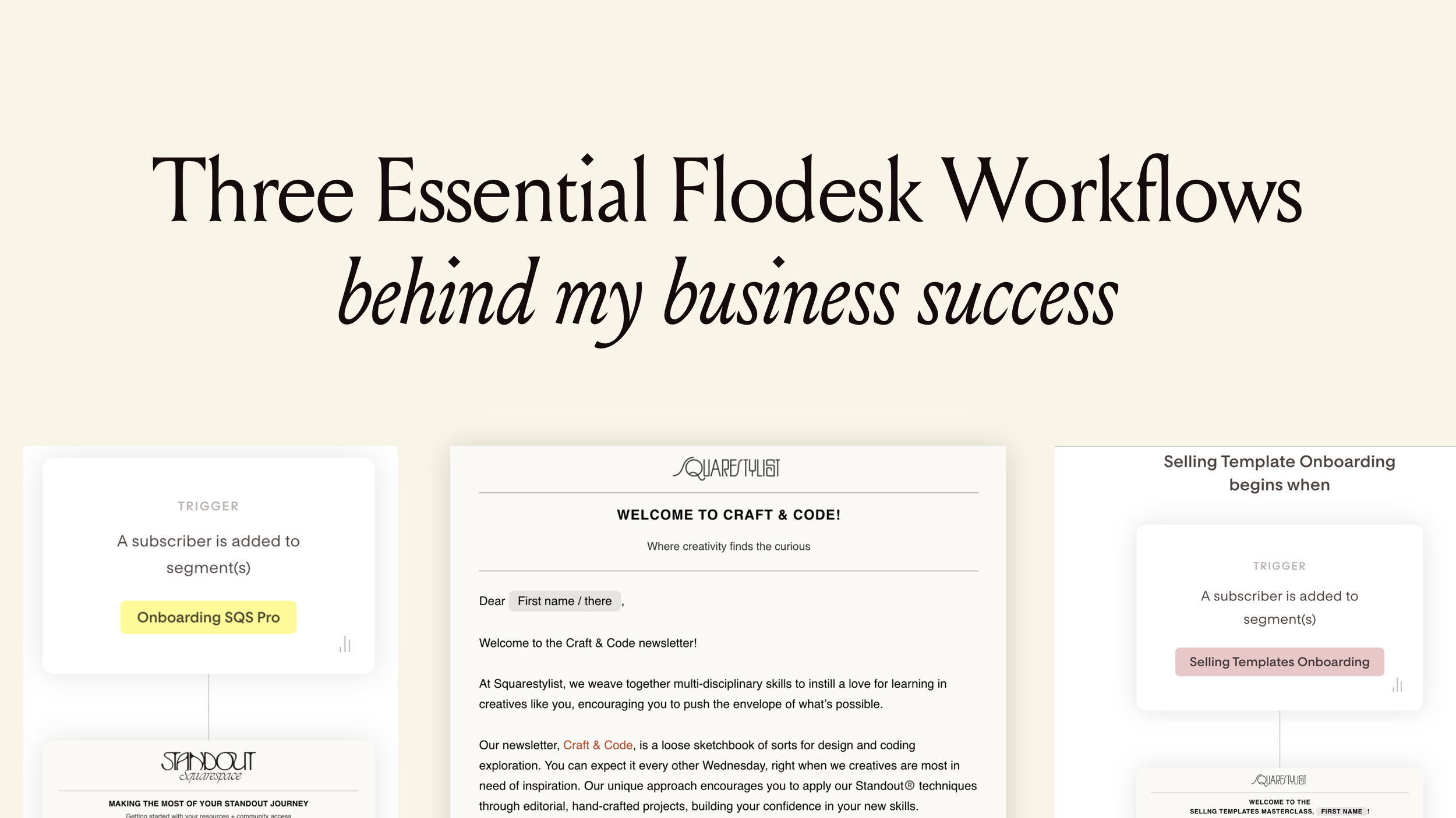
Three Essential Flodesk Workflows behind my Business Success
From newsletter nurturing to evergreen course funnels, these three Flodesk workflows have been the secret engine powering my design and education business.
Three Essential Flodesk Workflows behind my Business Success
a.
Flodesk
b.
Email Marketing
Disclosure: This post contains affiliate links for Flodesk. If you purchase through these links, I may earn a commission at no additional cost to you. I only recommend products I use and genuinely love.
Email marketing remains one of the most powerful ways to connect with your audience. Yet finding a platform that balances beautiful design with powerful automation isn't always straightforward.
As someone who runs a design business and mentors web designers on a daily basis, I've found my answer in Flodesk. This platform has constantly supported how I attract, nurture, and serve my community of curious and tasteful designers.
Today, I'm pulling back the curtain to show you the three essential workflows that have been keeping Squarestylist's design and education business running smoothly since we launched in 2020. These automated sequences have helped me nurture relationships with students, onboard thousands of designers into my programs, and consistently invite new creatives into my ecosystem — all while maintaining my distinct brand voice and the artful aesthetic.
1. The Craft + Code Newsletter Nurture Sequence
When someone first enters your world, you have a golden opportunity to make a meaningful connection. My newsletter nurture sequence is designed to welcome new subscribers with open arms and establish the foundation for our relationship.
When new subscribers sign up for my "Craft + Code Newsletter," they're immediately welcomed with a warm, personalized email that sets the tone for what they can expect from me. This isn't just a transactional "thanks for subscribing" message — it's thoughtfully written to reflect my brand's voice and aesthetic sensibilities.
What makes this workflow special is how it introduces newcomers to our archives. With a single click, subscribers can browse through previous issues, allowing them to discover valuable content that resonates with their current interests or challenges. This immediate value delivery builds trust from day one.
The beauty of this workflow lies in its simplicity. Through Flodesk's intuitive builder, I've designed emails that maintain perfect brand consistency — from custom fonts to my signature layouts — without requiring hours of design work for each send (thanks to Flodesk Templates feature). The clean interface eliminates distractions, allowing me to focus on crafting messages that truly connect.
Best of all, this entire sequence runs on autopilot. Whether I get one new subscriber or one hundred in a day, each person receives the same thoughtful, brand-aligned welcome experience without any manual intervention from me.
2. The Course Onboarding Flow
When new students join one of my courses, I want them to feel immediately welcomed and fully supported. My onboarding workflow is designed to do exactly that — providing the right resources at the right time to help them succeed.
What makes this workflow essential is its ability to adapt based on which course or product someone has purchased. My high-ticket programs like Standout Squarespace and Standout Shopify have different onboarding needs than my masterclasses or workshops.
For premium courses, the workflow strategically times emails to:
Provide immediate access to key resources
Remind students of the support included in their purchase
Encourage them to submit their websites for feedback or showcase
Check in at critical milestones to ensure they're progressing

For my mini-courses and components, the sequence is more simplified but equally effective. While Flodesk doesn't have direct integration with Squarespace Commerce out of the box, I've created a custom solution using Squarespace's Commerce API and Airtable to trigger the right workflow based on purchase data. (I teach this exact integration process in my SquareCourses Masterclass for those interested in the technical details.)
What I love most about this system is how it creates natural funnels between my offerings. For instance, when someone purchases my Selling Squarespace Templates Masterclass, the workflow eventually includes a thoughtful invitation to consider my Standout Squarespace program — but only after they've received substantial value from their initial purchase.
This tiered approach ensures students receive personalized attention regardless of their investment level while opening doors to deeper learning opportunities when they're ready.

3. The Evergreen Flagship Course Funnel
Perhaps the most business-critical workflow in my arsenal is my evergreen funnel for flagship courses. This automated sequence has allowed me to consistently enroll new students into my premium programs without being locked into exhausting launch cycles.
The workflow begins by inviting my audience to a free workshop — "Secrets to High-End Squarespace Projects." Once someone registers, they enter a carefully orchestrated sequence that:
Encourages them to watch the workshop on demand
Addresses common questions and objections about my flagship courses
Extends an invitation to enroll in our Standout Squarespace course

What makes this workflow particularly powerful is its ability to qualify prospects and deliver targeted messaging. Those who engage with specific content receive follow-up emails tailored to their apparent interests. Meanwhile, those who don't open certain emails might receive alternate messaging or even a different offer better suited to their needs.
Through Flodesk's visual workflow builder, I can easily map out this complex journey and make adjustments based on performance data. I can see exactly which emails are driving conversions and continuously optimize the sequence for better results.
Most importantly, this workflow gives me the freedom to focus on serving my existing students rather than constantly chasing new ones. Since implementing this system, I've been able to maintain consistent enrollment numbers while actually reducing my marketing workload.
Why Flodesk Has Been My Platform of Choice
These workflows have been the backbone of Squarestylist since I founded it in August 2020. While I'm well-versed in other email service providers and recommend different platforms based on my clients' specific needs, Flodesk has remained my personal choice for several compelling reasons.
First, its delightful interface genuinely encourages me to write emails. The clean, minimalist design removes the technological friction that often accompanies email marketing, allowing me to focus on crafting artful, story-rich messages that resonate with my audience.
Second, the visual workflow builder makes complex automation accessible. I can create sophisticated, branching sequences without needing to dive into complicated conditional logic or coding. This visual approach keeps me focused on the subscriber experience rather than getting lost in technical details.
Finally, the design flexibility aligns perfectly with my brand's aesthetic values. From custom fonts to beautiful layouts, Flodesk gives me the creative freedom to ensure every touchpoint with my audience feels consistently and unmistakably Squarestylist — something that proved challenging with other platforms.
Throughout the years, I've sold more than 1,000 templates, 5,000+ plugins, and mentored nearly a thousand Squarespace and Shopify experts through my education programs. Through all of this growth, Flodesk has been my reliable partner in nurturing relationships with students and delivering educational value at scale — and it's the email marketing platform I consistently recommend to the designers I mentor.
Want to See These Workflows in Action?
If you are a creative who values both aesthetic and function in your marketing, I've created a set of aesthetic, artful Flodesk templates that you can download for free to jumpstart your own email workflows. These templates reflect the same design principles I teach in my courses and are specifically optimized for creative professionals. Simply sign up for our newsletter (powered by Flodesk, of course) to get instant access:
I hope these workflows can serve as inspiration for creating more automated, effective client journeys.
Have you implemented any automatic workflows in your design education business? I'd love to hear which ones have made the biggest impact for your business.
How I Built a Profitable Business Selling Website Templates—And How You Can Too
Have you ever wondered if selling website templates could be a legit source of income—even without coding skills or a design degree?
How I Built a Profitable Business Selling Website Templates—And How You Can Too
a.
Squarespace
b.
Selling Squarespace Templates
Have you ever wondered if selling website templates could be a legit source of income—even without coding skills or a design degree? Trust me, you're more than ready to get started. I know because I began with zero experience, no formal background, and just a vision.
I'm Rache, the self-taught designer and developer behind Squarestylist, and through my programs Standout Squarespace and Standout Shopify, I’ve mentored hundreds of creative entrepreneurs looking to build profitable design businesses.
Let me take you through how I went from launching a single Squarespace template to creating a full-fledged business—and how you can do the same.
Why Website Templates Are the Perfect Starting Point
Selling templates isn’t just about passive income—it’s about freedom, creativity, and building your personal brand. Here’s why templates might just be your new favorite creative outlet:
A Creative Playground
Back when I worked with corporate clients, I felt creatively boxed in. Templates became my escape—a space where I could refine my style without client restrictions.
Portfolio Gold
Those template demos? They became my most powerful portfolio pieces. I no longer had to showcase work that didn’t reflect my true style. Instead, I attracted clients who loved my aesthetic.
Confidence to Charge More
In 2019, I was charging $800 per project. After launching my first template shop and building a solid passive income stream, I grew my packages to $5,000 and later to $12,000. Templates gave me the confidence and leverage to raise my rates.
Ready to Dive In? Here’s the Process:
I’ve broken down the journey into four main steps:
1. Ideation: Pick Your Platform & Specialty
Start with a platform you're comfortable with. If you’re unsure, I highly recommend Squarespace for its intuitive design and ease of use—for both creators and clients. If you’re leaning toward e-commerce, Shopify is the gold standard, though it requires more technical knowledge.
Then, define your specialty. Don’t be discouraged by a “saturated” market—there’s room for you. Consider:
What are you naturally good at?
What do you want to be known for?
What communities or industries do you understand deeply?
Real-world examples:
Melissa, a therapist, created Squarespace templates for therapists.
Kia built an editorial, edgy collection that reflects her unique aesthetic.
2. Build: Keep It Specific, Simple & Scalable
Focus on 3–6 key features per template. These should be reusable, adaptable, and easy for clients to update. Examples might include:
Testimonial sliders
Galleries that serve multiple functions
Blog and services menus
Tip: Use a fictional brand (e.g. "Thrive Wellness") and tools like Copy Spark to generate placeholder content before designing. This makes layout creation a breeze.
For design elements like fonts and images, use royalty-free assets (e.g. Unsplash or Pexels) and built-in fonts for base templates. You can still showcase the template with mockup brands and creative styling—just clearly note that these are not included in the final purchase.
For more advanced design, yes—code is optional, but can set your shop apart and allow for higher pricing. Just ensure that any custom features carry over when duplicating the site for customers.
3. Sell: Set Up Shop & Deliver Smoothly
Your sales page should:
Highlight your template’s key features
Demonstrate adaptability to various branding styles
For Squarespace, templates are usually delivered 24–72 hours post-purchase. Automating this process with tools like Airtable can make delivery seamless—even while you’re asleep or on vacation.
On Shopify, deliver your theme as a downloadable zip file. Simple and straightforward.
Don’t forget post-purchase touchpoints: Set up an automated email sequence with support info and next steps.
4. Support: Set Boundaries & Provide Resources
This part can be the trickiest. A few key pointers:
Define support duration (e.g. 90 days)
Clarify what’s included—and what’s not
Offer general tutorials that apply to all templates
I also built an AI-powered support tool so customers can get answers instantly without needing to email. Smart, right?
Beyond DIY: Other Ways to Sell Templates
Not every customer wants to DIY. Here are some service options:
Template Installation – Just install the demo on their existing site.
Template Restyle/Remix – Help them apply their branding; charge $1,500+.
Design Intensives/One Week Website – Fast-track services using a template as a base.
One of my students, Julie from Studio Volha, runs a one-week website experience based entirely on her own template collection.
Want to Launch Fast? I’ve Got a Class for That
If you’re ready to launch your Squarespace template shop, check out my class: Selling Squarespace Templates
It’s a done-for-you system that includes:
A real-world template
The AI-powered Template Wizard
Automated delivery setup
One-click sales page template
Licensing and shop policy templates
Or if Shopify is more your vibe, check out my Standout Shopify program instead.
Final Thoughts
If this breakdown made you realize that selling website templates is doable, then my job is done. I truly believe there’s something in your vision the world needs to see.

Everything You Need to Build a Successful Squarespace Web Design Business
While many know Standout Squarespace for teaching custom coding techniques, in this post I want to highlight the comprehensive business resources that make our program the complete package for web designers.
Everything You Need to Build a Successful Squarespace Web Design Business
a.
Squarespace
b.
Standout Squarespace
Are you looking to kickstart or level up your Squarespace web design business? Whether you're just starting out or refining your client process, our Standout Squarespace program is designed to support you every step of the way—not just in design and development, but in building a thriving business.
Let me take you through what makes this program special.
Two Levels to Fit Your Journey: Foundations and Advanced
The program is split into two levels: Foundations and Advanced. You can begin with the Foundations tier, which teaches you how to professionally build Squarespace websites—no code required (yet!). Once you're ready to push your skills further, you can upgrade to the Advanced lessons.
What’s Inside the Foundations Tier?
The Foundations tier is your go-to if you're looking for business tools and resources. It’s packed with templates, checklists, guides, and scripts that support the entire project journey—from inquiry to launch.
We even have a dedicated page just for Foundations because there’s so much packed in that we couldn’t fit everything on the main sales page.
Templates, Scripts, and Client Tools That Actually Work
We’ve got everything you need to streamline your client process:
Process Templates & Checklists
Discovery Questionnaire – Interactive and dynamic
Welcome Guide Kits – Available in XD, Figma, or adaptable to your preferred tool
Copy Prompts & Website Copy Guide – Available as form templates or Google Docs
Discovery Call Scripts
Email Scripts for Pitching, Onboarding, and Client Management
Our goal is to make every step smooth—not just for you but for your clients too.
A Step-by-Step Curriculum You Can Follow
Inside the module lessons, you'll learn to deliver full Squarespace projects end-to-end:
Start with Design Strategy
Follow the Standout Checklist to ensure nothing gets missed
Learn about Development using Squarespace’s built-in tools
Master SEO, accessibility, and performance through dedicated checklists
Build real projects: homepage, about, portfolio, shop, even courses and digital products
We walk you through the basics and beyond, making sure each lesson is interactive and actionable.
Real Practice, Real Projects
Throughout the program, you’ll work on hands-on projects and get to follow along with video lessons. You can watch how we build each section—or try it yourself first and then compare.
This isn't surface-level knowledge. These are best practices built from years of client work and real-life Squarespace projects.
Business Tools That Help You Thrive
In the business-focused section, you'll learn:
Strategic Pricing – How to price with purpose
Marketing Your Services – Build authority with digital products and free content
Client Experience – From onboarding to offboarding, we’ve got guides for it all
Plus, we guide you in using your product suite as part of your portfolio. It’s a smart way to show your expertise while growing your reach.
An Engaged, Supportive Community
You won’t be doing this alone. Our Standout Squarespace community is where you can:
Ask questions
Connect with other designers
Join live practice threads
Get support from mentors and me personally
Whether it's troubleshooting, pricing advice, or client communication tips—we’re here to help.
Ready to Learn Code?
Once you're confident with the no-code tools, you can level up by upgrading to the full version of the program. Everything you paid for the Foundations tier will be credited toward the upgrade—so there’s no risk in starting small.
The Advanced tier introduces coding in Squarespace, taught in a smart, accessible way. You’ll unlock endless possibilities to create custom, in-demand website features.
Check out our Showcase page to see what’s possible. Every site featured there was built by our students using the techniques and support we provide.
An Invitation
Whether you’re just starting your web design journey or looking to streamline and scale your process, Standout Squarespace offers the structure, tools, and support to help you succeed.
Still got questions? I’m here to help—just reach out!

Introducing Montage: Where Creative Code Meets Seamless Design
The unveiling of Montage, our new Squarespace Master Template combining our community’s most loved creative code solutions into one cohesive foundation.
The unveiling of Montage, our new Squarespace Master Template combining our community’s most loved creative code solutions into one cohesive foundation.
LAUNCHING THE MONTAGE MASTER TEMPLATE
a.
Squarespace
b.
Master Template
There's something poetic about the word "Montage" — a technique of combining various elements to create something entirely new. It perfectly captures what we've been quietly crafting behind the scenes: a Squarespace Master Template that brings together our most beloved creative code solutions into one cohesive foundation.
As I reflect on the years of teaching web design and watching our community grow, I've noticed how certain creative components have become essential tools in our students' workflows—features they reach for in their client projects time and time again. These are the components that make websites feel both familiar and surprising, the ones that turn a simple scroll into an engaging journey.
This observation led to some questions: What if we could weave all these favorite elements into one thoughtfully crafted template?
That's how Montage was born—not just as a plain-and-straight Squarespace template, but as a canvas for possibility.
A Foundation for Creative Freedom
Every exceptional experience starts with a blueprint. What makes Montage special isn't just its collection of hand-coded section templates or its sophisticated modular design—it's how these elements come together to give you creative freedom while maintaining the structure, as well as the flexibility, needed for professional results.
Beyond the Expected
What brings me joy about Montage is seeing how it reduces friction in the design process. Our community members often share how having these sought-after features readily available—from dynamic navigation options to engaging content displays—allows them to focus more on crafting unique experiences for their clients rather than rebuilding common elements from scratch.
The template brings together accessibility, performance, and creative possibility in a way that feels natural. It truly feels like having a well-organized creative toolkit where everything works together seamlessly.
The Standout community well knows how I deeply value performance, especially for a Master Template such as Montage so I made sure it is value-packed yet immensely lightweight. To illustrate: Montage features 27 creative components as of writing, including Tabs, Lists, Sliders, Carousels, Blog Layouts and Styled Texts. With so many moving parts, some may wonder how these many coded features affect your site’s loading time. You’ll be happy to note that any and all creative components that have not been activated, especially those written with Javascript, will be offloaded from your website and won’t affect site loading.
A Familiar Echo
Montage's approach mirrors what we've seen work beautifully with Esencia, our well-celebrated Shopify theme. I smile when I think of the feedback from our community. As Rebekah from Studio Kanuka shared, "I have loved using Esencia theme in a variety of projects. When I have a tight timeline or budget, I feel confident using Esencia since I am now very familiar with it and can offer unique layouts and features easily and the websites are all so unique!"
Kotryna from Studio Heavenly echoed this sentiment perfectly: "The Esencia Theme alone is pure gold! Not to mention Rache's ongoing support and tutorials. I understand Shopify much better, making something way more custom for clients."
Can you imagine feeling this same way about your Squarespace builds?
Join our Standout Squarespace
As we officially launch Montage on March 24, 2025, it represents more than just a template — it's a reflection of our community's journey and creative needs. Available exclusively to our Standout Squarespace members, Montage gives you the tools to build stunning, bespoke websites in half the time without compromising on quality or creativity.
In web design, as in life, sometimes the most beautiful creations come from thoughtfully combining existing elements in new ways. That's the essence of Montage, and that's what we hope this template helps you achieve in your own creative journey.
Whether you're building your first professional website or your hundredth, Montage is designed to be that reliable foundation that lets your creativity shine through while positioning you as a bona-fide Squarespace design expert. After all, isn't that what great web design is all about?

Creative Layout Ideas for your About Page (For Solo Creatives)
This marks the first edition of our Creative Layout Ideas series, where we'll explore unique ways to combine techniques from our code toolkit into stunning, functional designs.
Creative Layout Ideas for your About Page (For Solo Creatives)
a.
Squarespace
b.
Article
When our Standout Squarespace community asked for fresh inspiration on creative layouts, I knew exactly where to start — the About page, where personality meets purpose in web design. This marks the first edition of our Creative Layout Ideas series, where we'll explore unique ways to combine techniques from our Standout Squarespace code toolkit (also available in our shop) into stunning, functional designs.
What you'll find here are four distinctive layouts specifically crafted for solo creatives, each inspired by the techniques we've developed in our toolkit. While most of these require custom code to implement, they showcase what's possible within Squarespace when you think beyond the conventional headshot-and-bio format.
Let's explore these layouts that can help you tell your story in more engaging ways:
Fixed Split Screen
Imagine your About page as a curated gallery where your introduction remains fixed on one side while your personality unfolds through visual stories on the other. This layout anchors your core message on the left while allowing visitors to scroll through a collection of personal touches on the right— perhaps your favorite books, travel snapshots, or behind-the-scenes glimpses of your creative process.
What makes this layout special is how it maintains context while revealing more about who you are. Your introduction stays put, grounding the visitor's experience, while the scrolling section creates a natural rhythm of discovery.
Learn how to implement this technique via this free tutorial: Fixed Split Section →
List Autoscroll
Sometimes, the best stories unfold naturally, like a conversation over coffee. The List Autoscroll layout embraces this idea by creating a gentle, automatic flow of content that reveals different facets of your personality. From behind-the-scenes moments to portfolio highlights, each element smoothly transitions into view, creating an effortless browsing experience.
This approach is particularly effective for creatives who want to showcase multiple aspects of their work and personality without overwhelming visitors. This feature uses the built-in carousel list section and is a delight to update and rearrange.
Get this component as part of our Standout Squarespace program or purchase it as a standalone component: List Autoscroll component →
Moveable Blocks
Here's where we add a playful twist to the traditional About page. The Moveable Blocks layout turns your page into an interactive canvas where visitors can drag and rearrange content blocks that represent different aspects of your personality. Think of it as a digital mood board that visitors can explore and interact with.
This layout creates a memorable experience by inviting visitors to engage with your story actively. Each moveable element — whether it's a photo, a quote, a video, or a snippet about your creative process—becomes part of a larger conversation.
Get this component as part of our Standout Squarespace program or purchase it as a standalone component: List Autoscroll component →
Multi-image Reveal
The Multi-Image Reveal layout adds an element of discovery to your About page. As visitors hover over images, they uncover snippets of your personality — from your coffee preferences to creative inspirations. It's like having a series of gentle "aha" moments that gradually paint a fuller picture of who you are.
What’s great is you have the freedom to place the image blocks anywhere on the fluid engine grid! So much room for exploration and creative freedom.
While most of these layouts require code implementation (available in our Standout Squarespace code toolkit), they are also available as standalone components in our shop. They showcase the possibilities within Squarespace.
Remember, your About page is more than just a space for introducing yourself—it's an opportunity to create a meaningful connection with your visitors. You may choose to keep things simple or opt to experiment with more interactive elements, the key is to create an authentic representation of you and your creative journey.