
Custom Mobile Menu
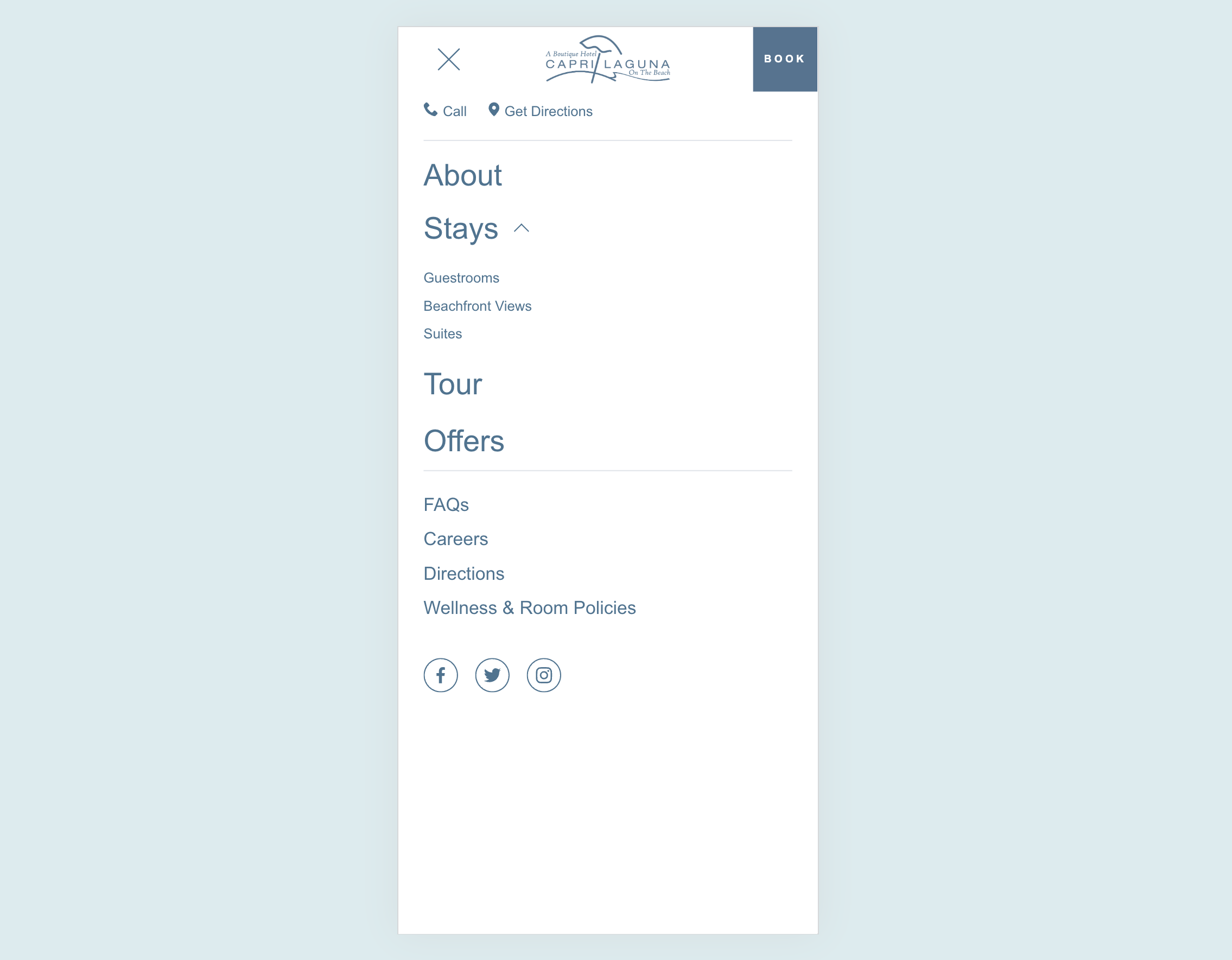
What You'll Create
A completely custom mobile menu that you design in Squarespace's visual editor, then magically appears when visitors tap the hamburger icon. Design your mobile navigation exactly how you want it - with images, buttons, social links, or any layout you can imagine.
The Problem It Solves
Squarespace's default mobile menu is limited to simple text links with minimal styling options. If you want a mobile menu with images, custom layouts, multiple columns, or branded design elements, you're stuck with what Squarespace provides. This technique lets you build any layout you want.
Perfect For
Branded mobile experiences, menus with featured images, mobile navigation with promotional content, sites needing unique mobile layouts, restaurants or shops with visual menus.
What Makes This Different
You design your custom menu as a regular section in the footer area using Squarespace's visual editor - no code needed for the design itself. The code then moves that section into the mobile menu position when the page loads. This means you get full visual editing control while still having it appear in the right place on mobile.
Details
Section Type: Fluid & Classic
Code Type: CSS + JavaScript
Prerequisites: Footer section with #mobilemenu anchor containing your custom menu design
Toolkit Title: Custom Mobile Menu
Learn This Technique
This is one of 150+ code techniques taught inside Standout Squarespace, where you get:
The complete, copy-paste code
Video walkthrough explaining how it works
The principles behind the technique so you can customize it
Access to our private community for support