
Embed Website in Device Mockup Frame
What You'll Create
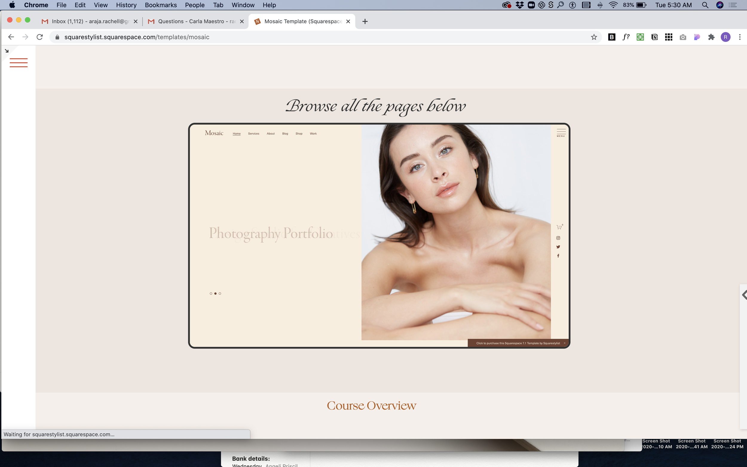
A live website preview displayed inside a device-style frame with rounded borders—like showing a website inside a browser or device mockup. The embedded site is fully interactive, scaled down to fit attractively within your section.
The Problem It Solves
Showing website previews in your portfolio typically means taking screenshots, which quickly become outdated and aren't interactive. Embedding a live site via iframe usually looks awkward—no frame, wrong size, and doesn't feel polished. There's no native Squarespace way to create that "website in a device" look.
Perfect For
Web design portfolio showcases, Client project demonstrations, Template previews, Before/after website comparisons, Interactive case studies
What Makes This Different
This technique embeds a fully live, interactive website scaled down to about half size with a device-style border and rounded corners. Visitors can actually scroll and click within the preview. The frame automatically adjusts for mobile screens, showing a taller, narrower view. Just swap in any URL you want to showcase—the embedded site updates in real-time whenever that site changes, so your portfolio stays current without maintenance.
Details
Section Type: Fluid & Classic
Code Type: CSS
Prerequisites: Code block spanning full section width, target website must have clickjack protection disabled
Toolkit Title: iframe Mockup
Learn This Technique
This is one of 150+ code techniques taught inside Standout Squarespace, where you get:
The complete, copy-paste code
Video walkthrough explaining how it works
The principles behind the technique so you can customize it
Access to our private community for support