
Split and Sticky Section Layout
What You'll Create
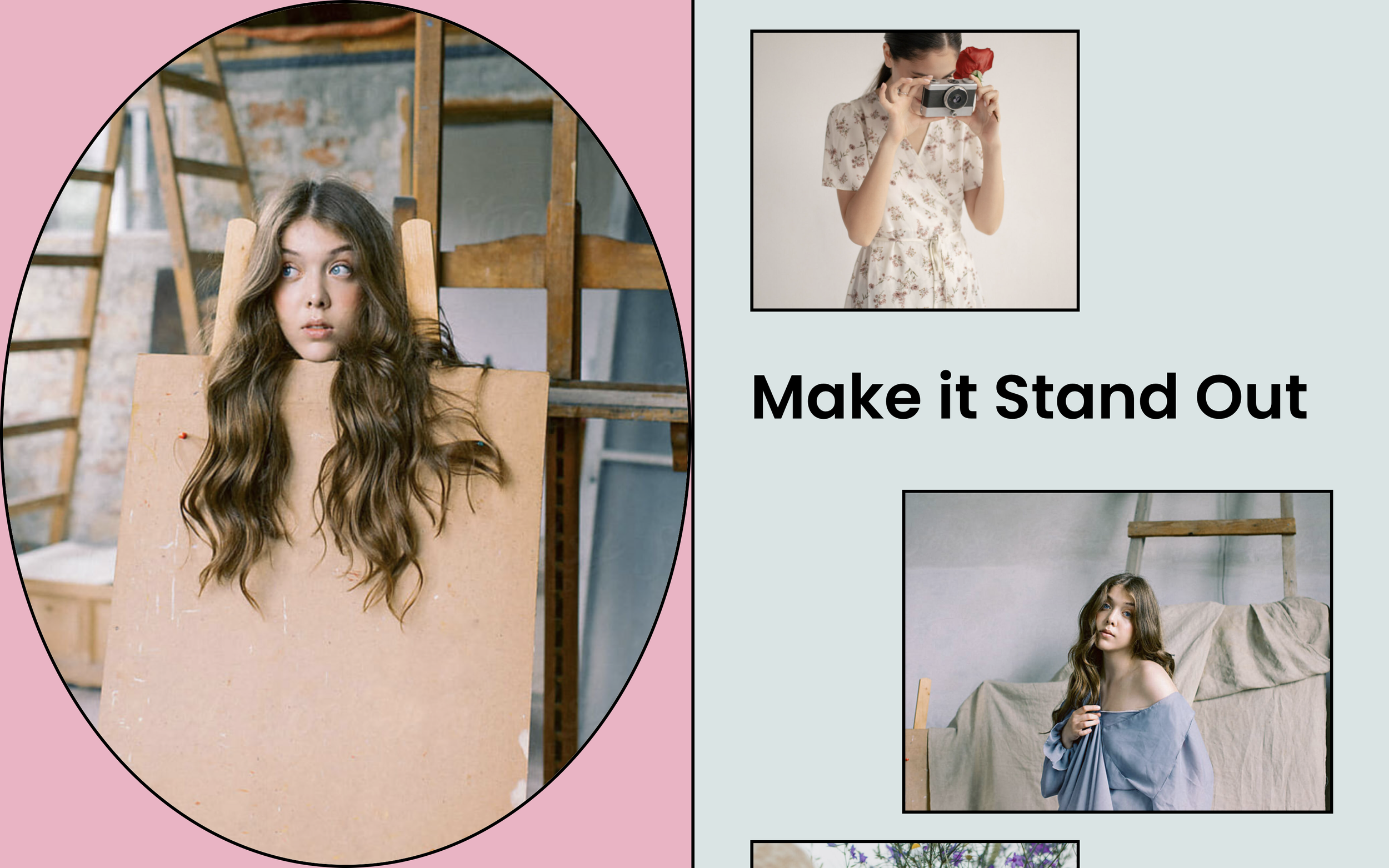
A powerful layout where two sections sit side-by-side, with one section staying sticky (fixed in view) while the other scrolls. This creates dynamic, modern page layouts where content relationships are emphasized through scroll behavior.
The Problem It Solves
Squarespace sections stack vertically by default. There's no native way to have two sections appear side-by-side with one pinned in place while the other scrolls. This technique uses Flexbox to create that side-by-side sticky layout.
Perfect For
Long-form content pages, Product showcases, Case study presentations, About page layouts, Service feature pages
What Makes This Different
This approach transforms how your sections behave at the page level. Instead of stacking vertically, sections can sit side-by-side with controlled widths. One section stays locked in view while visitors scroll through the adjacent content. The technique also includes an edit mode fix so you can still work in Squarespace's visual editor.
Details
Section Type: Classic
Code Type: CSS
Prerequisites: Multiple sections on page, Custom Content Width and Section Height settings applied
Toolkit Title: Split and Sticky Flexbox
Learn This Technique
This is one of 150+ code techniques taught inside Standout Squarespace, where you get:
The complete, copy-paste code
Video walkthrough explaining how it works
The principles behind the technique so you can customize it
Access to our private community for support