
( RESOURCES ) Browse through our collection of tips & tricks for Squarespace, Shopify, web design, and business. It’s a digital trove of creative ideas right at your fingertips.


Setting up your studio’s tech stack
How to build the toolkit that will serve you in your day-to-day operations

How to build the tech stack that will serve you in your day-to-day operations.
Setting up your studio’s tech stack
a.
Business
b.
Tech Stack

When it comes to being a web designer, we often think about creative skills that develop your eye for good design. There's also the business aspect to it—the clarity and confidence that demonstrates what you can do for clients.
Yet we tend to overlook a key component to any design studio: the digital system that facilitates your best work and keeps the lights on even when you're away.
I call this collection of business apps and resources the tech stack, a term that I borrowed from web development circles. Think about the tools that blend seamlessly in the background as you focus on client projects. It's easy to take them for granted when they get the job done. However, when your workflow becomes too overwhelming and tasks begin to slip between the cracks, a few tweaks to your tech stack might be in order.
How do you know if you've chosen the right tool? When is it time to upgrade the size of your toolkit? Here are some useful tips to set up your studio for success:
Establish your studio essentials
Start with the tools of the trade—the items most closely involved in your creative projects. What's your bare minimum? These will shape the digital environment where you'll be spending the most time in, so choose what will grant you the most ease and flexibility.
For me, I can't imagine doing web design without Figma to craft my website prototypes and Squarespace to build and launch them for clients. I even created Pixresize so I can quickly optimize website images in bulk.
Mind the learning curve
How long would it take you to get used to navigating an app's features? This depends on your level of expertise, as well as past experience with similar tools. Extensive documentation, community support, and available courses could also go a long way in addressing any gaps in your knowledge.
For client-facing platforms, you need to keep in mind usability and accessibility even for less tech-savvy users. The tool has to be intuitive enough to require minimal handholding, and this is especially true for your website platform of choice.
Consider app compatibility
Does this app function well with other existing tools in your stack? Check the settings for third-party integrations with your favorite platforms. You might want to do a test run before you commit, or else you might find yourself addressing glitches or manually double-checking for errors all day.
There's one AI automation tool I run to when there are no built-in integrations: Zapier. Its visual interface lets me map out workflows that use my everyday apps to accomplish tasks on my behalf, such as collecting form responses.
Secure your digital storage
I believe this is one of the most crucial decisions you'll make for your studio: where to entrust your documents for safekeeping. Of course it's ideal to have a local backup of all your brand assets and projects. But online copies have an advantage in terms of collaboration—you could easily generate a link to share with clients for review.
Personally I use Dropbox to safeguard my brand assets and project files; it helps that it has a nifty feature called Sign that I can use for my contracts. As for gathering my bookmarks, notes, and images for inspiration, I stick to mymind as my virtual, self-organizing corkboard.
Streamline the smaller tasks
When you're used to handling every single task, it's too easy to get caught up in busywork that don't contribute meaningfully to your business. Which recurring items on your to-do list take too much of your time away from design? See if you can find tools that can get the tedious, repetitive work off your hands.
In my case, Peachs became my go-to for hassle-free affiliate marketing to save me the effort of onboarding and sending payouts. I also use Superhuman to get on top of my emails and Voicenotes to record my thoughts and meetings.
Future-proof your toolkit
It can be tempting to reach out for that new shiny toy you spotted in the market. Before you ditch the one you're currently using, ask yourself: Will this tool be able to support my needs in the long run?
Nothing lasts forever—even that lifetime access guarantee—but you can still do your background check on an app for signs of longevity. Research their business model and roadmap, as well as testimonials from avid users. Plus, it's worth looking into options for importing and exporting your data when you need it.
Contact your trusted experts
You've come this far doing everything on your own by being scrappy with tools. However, there comes a time when you'll have to take a step back and allow your studio to scale with the advice of mentors. It's perfectly alright to ask for assistance. Just because you could make it alone doesn't mean you have to.
Get exclusive access to the Squarestylist Stack
Curious about my studio setup yet? I'm sharing my very own tech stack with those who fill out my 2025 midyear survey for web designers. You can submit your response here to browse a list of my go-to apps and experts.

Shaping your tech stack is a constant work in progress; what may have suited you in the past may no longer fit your studio's growing needs today. It helps to revisit the systems you've set in place every now and then to evaluate what works. But there's no need to reinvent the wheel, either. Sometimes you can just keep an eye on what designers like you are already raving about.
You might also like:

Design Process: How to Design Unique Squarespace Websites
My design process for creating distinctive websites on Squarespace.
In this guide, I'll walk you through my design process for creating distinctive websites on Squarespace.
Design Process: How to design unique websites
a.
Design
b.
Video
I often hear from other designers that they can spot a Squarespace website from a mile away. So how do we design websites that don't look like Squarespace? Let me be clear, though—our goal is not to disguise the platform we're using. But in this day and age where it's so easy to publish websites and everything just starts to look and feel the same, how do we create websites that truly create lasting impact?
Because Squarespace is so easy to use, it comes with pre-built components and templates. I know that many users worry that their website will look just like everyone else's, but I'm a firm believer that Squarespace, like any website builder, is simply a tool. The results we achieve will ultimately depend on the creativity and expertise of the person using the tool.
I use other website platforms because Squarespace is not for all use cases, but I'd say that Squarespace is my most favorite platform because it's the easiest for my clients to use. And my goal as a designer is not to make websites difficult, but to delight my clients by working magic with the simplest of tools.
In this guide, I'll walk you through my design process for creating distinctive websites on Squarespace.
Step 1: Start with Purpose
Let me start with the first step, which is to start with purpose. This part is not necessarily the most fun part of the process, but I believe it informs the rest of the steps. I ask myself these questions in every project, whether it's a client project or a personal project:
What are the goals and how can we achieve them through design?
What are the problems that we're solving?
How should the website make visitors feel?
At the start of every website project, my very first milestone is to accomplish a website strategy document. I essentially summarize insights from the data and information that I've gathered from the client and their brand. Most of these insights come from:
Customer testimonials and feedback
Google Analytics data
My own simulation while keeping in mind the target audience
The website strategy is all about coming up with website features, functionalities and flow that will meet these business and user goals. In the same strategy document, I highlight key features of the website and tie these features to the goals. The insights, goals and brand tone that we establish here will be the lens through which we identify which inspirations are relevant in the second step.
Step 2: Immerse Yourself in Diverse Sources of Inspiration (3:44)
The second step is all about immersing ourselves in diverse sources of inspirations for context. When I work with a client project, I require them to have at least the logo, typography and brand colors finalized before I start with the website design phase. However, these aren't enough for me to really establish the mood, vibe and the overall experience, so I still take time to go through inspirations.
When I was starting out, I would simply go through website directories like:
Site Inspire
Awwwards
Standout Showcase (where I curate beautiful websites by our students)
These are beautiful references, but what really helped me come up with unique designs is when I look at inspirations beyond the website design space. I now look at inspirations such as:
Packaging design
Textures
Interiors that align with the project I'm working on
For reference, here's how I establish different moods and vibes by curating inspirations for different projects:
Sophisticated editorial look - Clean lines, minimal color palette, strong typography
Nostalgic and eccentric - Vintage elements, playful layouts, unexpected combinations
These inspirations and the insights from our strategy document will all come together when we proceed to our next step.
Step 3: Craft Layouts with Character
To make this step more manageable, I broke it down into three sub-steps:
Defining the content
Visualizing the placement of elements through wireframes
Adding character
It would be overwhelming to go through the steps for the entire website at once, so my approach is always to work on one section at a time.
3.1 Understanding What Content to Present
In layout design, our goal is to present information in the most effective way possible. There's this age-old debate on whether we start with the design or the copy first. Personally, as a designer, I prefer having the copy to inform my design.
I really encourage clients to provide copy or to hire a copywriter. I guide them through the process by sharing a content guide where I give them examples of how to write hero statements. Some clients, even with this much guidance, still find it hard to provide copy.
When the client can't provide copy, I generate placeholder content using an AI tool I developed called Copy Spark. This tool is based on established copywriting frameworks, so it helps identify the sections that would go into every page. I find that some clients find it easier to edit the copy once they see it with the design.
3.2 Creating the Canvas
After defining the content, I proceed with a canvas where I assess how to effectively present the content visually. In this phase, I focus more on the placement of elements, without the typography, colors and imagery yet, so I can ensure that the right information is prioritized.
Here's my practical workflow:
Set up your design file - I use Figma, but you can use Canva or Adobe XD
Create two pages in your file:
Page 1: Insights and inspiration (from steps 1 and 2)
Page 2: Wireframes
Start with one focal section - For example, a brand manifesto
Create multiple layout options - Don't stop at just one; explore variations
When creating wireframes, I refer back to my inspirations to see if there are elements that can inspire the layout. It's totally fine to be inspired by website layouts—observe how other designers present content. But personally, I love looking at other design pieces and seeing how I can bring that to the web interface.
For example, if I'm drawn to overlapping elements and big typography in my inspiration collection, I'll explore how to incorporate these into my wireframes. I come up with several layout explorations because it's easy to move things around in visual builders.
3.3: Adding Character to the Layout
This is when I incorporate the visuals like typography, imagery and branding. The key question I ask myself is: What is the key defining feature that I can express throughout the website?
Examples of key defining features:
Geometric shapes - Used consistently across headers, buttons, and decorative elements
Bordered frames and outlines - Applied to testimonial blocks, images, and even the footer
Layered notes and memos aesthetic - Creating depth through overlapping elements
Table of contents style - Using archive list aesthetics throughout the site
Cards with overlapping elements - Combined with sideways text for visual interest
I visualize each wireframe into layouts with character by adding imagery, colors and the brand type system. Among these explorations, I pick the one that speaks most to me, then keep referring back to my inspirations page until I identify what will be the key defining feature of the website.
Step 4: Ground Yourself with Constraints
Before getting carried away designing the rest of the website with the key defining feature, I ground myself with constraints. Remember that these designs need to be translated to Squarespace.
Key questions to ask yourself:
What design solution is practical to build?
Can this design be easily updated?
Will it meet website quality standards in practice?
When designing the rest of the sections, you want the character to be carried throughout, but make sure you design with development in mind. Before proposing any design, ensure you can implement it on Squarespace and that it will be easy for the client to update.
Defining What's Practical
Knowing what's practical to design and how much time and effort it will require depends on your mastery of Squarespace. I highly recommend having a deep understanding of the native features of Squarespace so you know exactly what is easy to build.
I use a complexity factor when pricing projects:
Level One - No additional code aside from installing custom fonts
Level Two - Using existing techniques from my coded library
Level Three - Developing new custom features
The pages might look similar, but the amount of effort will be vastly different. I assess the level of complexity during the discovery call when the client shares their inspirations and references.
Step 5: Harness the True Power of Code
For level two projects, I reference a library of tried and tested features. This makes the design and development process much easier, especially when building the rest of the sections.
You might ask: If we keep referring back to the same library of tested features, won't our websites start to look the same? My answer is no—not if we learn the true power of code.
For me, code is another powerful design tool. Once we learn how to properly use it, so many possibilities open up. We can creatively combine or stack the current techniques we already know.
Real-world example: In my Standout Squarespace course, I share a code toolkit that includes a technique for horizontal fluid tabs. My students have taken this base technique and created completely reimagined layouts:
One student used it to create an innovative portfolio section
Another transformed it into a unique navigation system
A third combined it with other techniques for a completely custom look
They're able to realize possibilities beyond the examples I've shown because they understand how code works, not just how to copy and paste it.
Final Thoughts
Creating unique Squarespace websites isn't about fighting against the platform—it's about understanding its capabilities deeply and then pushing beyond them strategically. By following this process:
Starting with clear purpose and strategy
Drawing inspiration from diverse sources beyond web design
Crafting layouts with distinctive character
Working within practical constraints
Leveraging code as a design tool
You can create websites that don't just avoid looking like typical Squarespace sites—they stand out as memorable, impactful digital experiences that serve both your clients and their audiences effectively.
If you wish to learn more about harnessing the power of code to create standout Squarespace websites, I invite you to my free workshop called "The Secrets to High-End Squarespace Projects."

Are Wireframes still necessary if I can design directly on website builders?
Does wireframing still play an important role in modern web design?

What I believe the role of wireframing is in modern web design and a walkthrough of our well-loved Wireframe Kit.
Are Wireframes still necessary if I can design directly on drag-and-drop website builders?
a.
Design
b.
Video
As web designers in the era of user-friendly website builders like Squarespace, we face a dilemma: Should we skip wireframing altogether and design directly on the editor? Or is it worthwhile to spend a few hours exploring layouts in visual editors like Adobe XD, Figma, or Canva before moving on to the actual website build?
The Appeal of Direct Building
Let's address the elephant in the room - yes, you can design directly on Squarespace or similar platforms. The ability to drag and drop elements, adjust colors and fonts, and add media on the fly is undeniably appealing. It's immediate, it's tangible, and it feels productive. So why bother with wireframes?
The Value of Wireframing
While wireframing in tools like Adobe XD, Figma, or Canva isn't a strict requirement, it offers several advantages that can significantly improve your design process and outcomes:
Faster Layout Exploration. Wireframing tools allow you to explore multiple layout ideas without the constraints of a website builder. This gives you space for more creative freedom.
Unique Designs. Templates on website builders are an excellent starting point, but they can sometimes lead to websites that look too similar or, as I like to call it, "too Squarespace-y." Wireframing offers you the chance to create unique, tailored designs without being overly influenced by pre-made templates.
Time and Cost Efficiency. While it might seem counterintuitive, spending time on wireframes can actually save time and money in the long run by identifying and solving potential issues early in the design process.
Better Client Communication. Wireframes serve as a great tool for early-stage client presentations. They allow clients to focus on layout and functionality without getting hung up on specific design elements.
Finding the Balance
The good news is that there's no single correct approach to this dilemma. I advocate for wireframing because I've experienced and witnessed firsthand how it can elevate a designer's work. That said, some designers have found success working directly on builders—which is truly admirable—and we encourage them to continue with what works best for them.
An invitation to use our well-loved Wireframe Kit
As always, I find myself creating tools to simplify our web design and development process, including of course, wireframing.
I've built this Wireframe Kit to simulate the drag-and-drop experience of the Squarespace editor, complete with all base elements and sections native to platform. The idea is for you to feel you’re dragging and dropping elements as you would on the editor so you get to familiarize yourself with built-in features and possibilities within the editor itself, and yet still be able to to ideate and design beyond it.
I swear by this Wireframe Kit, and so does hundreds of my students who have built their proudest websites using this as their starting point.

Free for Standout Squarespace members, whether enrolled in the Foundations or Full program. Download this Wireframe Kit in the Knowledge Base.
Final Thoughts on Wireframing
While not strictly necessary, especially given the capabilities of modern website builders, wireframing remains a valuable tool in a web designer's arsenal. I recommend dedicating 2–3 hours wireframing to explore more original layouts and secure client approval before moving on to development.
This process is tried and true—and I say this not just as a personal claim. It's been an honor to witness how this wireframe-to-platform workflow has worked wonders for the many talented web designers and developers in our Standout community.
How to build a Standout Squarespace site?
Creating expert-level Squarespace websites

The making of the our new Brand Visual Identity.
How to build a standout squarespace website
a.
Design
b.
Article
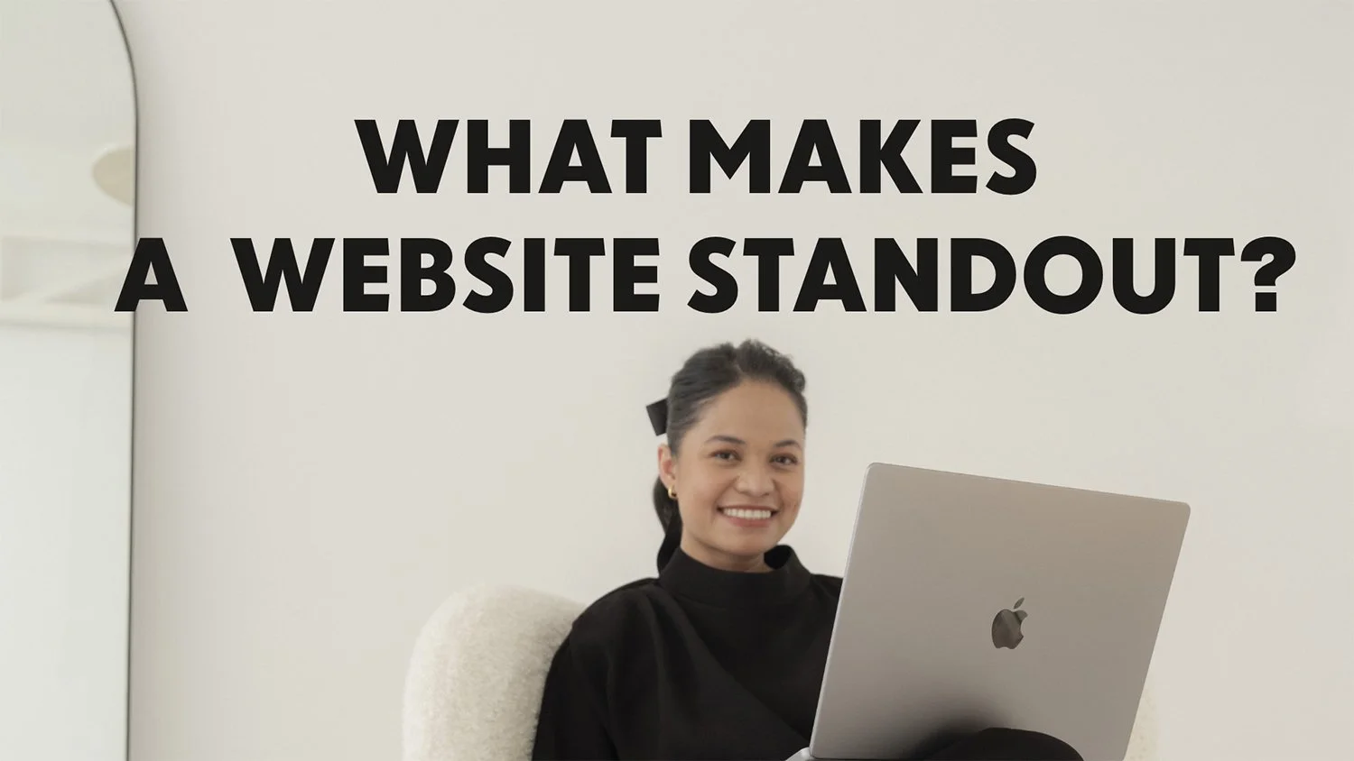
What Makes a Website Stand Out?
Since launching the Standout Workspace program in October 2020, I’ve noticed the term “standout website” being thrown around loosely. In this article, I want to clarify exactly what makes a website truly stand out. After building hundreds of websites and mentoring designers to do the same, I’ve identified two key hallmarks of a standout website: first, it is visually distinct, and second, it is expertly crafted.
Timestamped Overview
0:00 Introduction to standout websites and the creator’s experience.
0:19 Defining the two hallmarks of a standout website: visually distinct and expertly crafted.
01:10 The importance of visual distinction for brand identity and standing out among competition.
01:56 Common pitfalls of over-relying on Squarespace’s default features.
03:02 Emphasis on accessibility, responsiveness, and performance in web design.
04:01 Case studies of websites built using the standout method (Hotel Weekend, Hello World Studio).
06:16 Understanding expert craftsmanship in website building: intentional, thoughtful design.
09:03 Smart coding techniques to streamline website functionality.
12:46 Ensuring smart codes are reusable and adaptable for future site updates.
17:30 Details of the Standout Squarespace program and its two levels (Foundations and Advanced).
The Two Hallmarks of a Standout Website
1. Visually Distinct
A standout website must be visually distinct because a brand’s website is not just a platform to display information—it’s a creative tool for connection. In today’s digital world, where users encounter countless websites, how will yours resonate and stand out from the sea of forgotten browser tabs?
The distinction is in the details. Platforms like Squarespace make it simple to publish a website, but relying solely on default styles can result in websites that look and feel generic. For instance, Squarespace allows us to easily add headers, text blocks, and newsletter forms. But when we only use built-in styles, our sites can start looking a bit too familiar, even a bit “Squarespace-y.” I’m sure you’ve noticed this comment as well.
The Role of Familiarity
It's important to emphasize that creating familiar interfaces is actually a law of user experience design. As Raymond Loewy, the father of industrial design, said: “To sell something surprising, make it familiar, and to sell something familiar, make it surprising.” Our challenge as web designers is to create an experience that’s simultaneously surprising and familiar.
Balancing Surprise and Familiarity
In Squarespace, I achieve this by adding custom code to modify built-in features. For example, I can create a menu that’s both familiar and surprising by customizing the header’s layout or adding unexpected animation.
Examples of Visually Distinct Websites
I’ve mentored numerous designers and business owners to create websites that are truly distinct. A great example is Hotel Weekend, built by Natalia Swars, a member of our standout program. Her site was so impressive that Squarespace invited her to become an ambassador. Natalia attributes part of her success to the Standout Workspace program.
Another standout example is Hello World Studio, a fun and cosmic website created by two standout members who met through the program. This collaboration shows how Squarespace can support any brand aesthetic with a bit of creativity and code.
Lastly, the Hatties and Paw Art website, built by our standout member Ellie, is another shining example. This visually distinct site was built entirely on Squarespace but doesn’t scream "Squarespace," showcasing how creative customization can make any website stand out.
2. Expertly Crafted
Crafting with Ease and Delight
A website can be visually identical to another, but its craftsmanship determines if it stands out. An expertly crafted website is not only easy to build but also delightful to update.
Here’s a breakdown of the differences:
Patchwork websites rely on guesswork and piecemeal solutions.
Expertly crafted websites are intentional at every step, meeting professional standards in accessibility, performance, and responsiveness.
Even though all of us have access to platforms like Squarespace, it’s how we use these tools that matters. For example, I built an entire project using Squarespace’s built-in features with minimal code. Still, I followed my Standout Squarespace Checklist, ensuring compliance with key web standards.
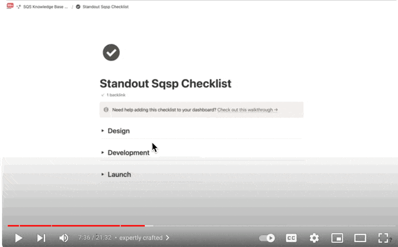
Even though all of us have access to platforms like Squarespace, it’s how we use these tools that matters. For example, I built an entire project using Squarespace’s built-in features with minimal code. Still, I followed my Standout Squarespace Checklist, ensuring compliance with key web standards.
Smart Coding Techniques
Smart coding is essential for building a standout website. Before adding any additional code, I ask myself key questions:
Will this code slow down the site or impact accessibility?
Will it be easy to update?
Will it unintentionally affect other elements?
By being mindful of the answers to these questions, I avoid the common pitfalls of mindlessly copying and pasting code from online sources.
Streamlined and Efficient Websites
An expertly crafted website is also streamlined and efficient. For example, many designers overcomplicate things by adding unnecessary lines of code. However, with smart coding techniques, we can often achieve the same outcome with just one line of code.
This smart approach not only makes the site easier to manage but also allows for efficient future updates. For instance, if I want to style a blog collection, I’ll do so by adding minimal CSS, ensuring the collection looks unique while leveraging built-in features like pagination.
Innovating with Code
Lastly, a standout website isn’t just cookie-cutter; it’s innovative. When we understand the underlying principles and code, we can combine them in creative ways to create something new. One of our standout members, Zo, used a pre-existing workshop technique as a starting point to create a unique folder tabs feature on her website.
Another member, Lauren, transformed her portfolio collection into a stylish showcase by combining foundational techniques and adding custom features like filter options.
The Standout Workspace Program
If building a standout website seems intimidating, know that there’s a smart way to do it—by learning smart coding techniques. In the Standout Workspace program, you’ll not only learn how to build visually distinct and expertly crafted websites, but you’ll also learn to do so efficiently and creatively.
Program Levels
We offer two levels in our program:

Foundations Level:
In this level, you’ll learn how to build a complete website from start to finish, using the Standout Checklist to ensure compliance with accessibility, performance, and responsiveness standards.
Advanced Level:
Here, we push the boundaries of Squarespace by teaching smart coding techniques.
You’ll build a project together with me, like the Hologram Concept Project, to solidify your understanding of advanced coding and web design.

Workshops and Resources
Our program includes numerous workshops, covering highly sought-after techniques, such as smart coding for galleries or customizing blog lists. These workshops are available in our ever-growing library, and we offer continuous support within our community.
Additionally, we provide complete business resources to streamline client communication—from discovery call scripts to email templates—all accessible in our knowledge base.
If you’re ready to start building standout websites, you can join the Standout Workspace program. Check out our website at StandoutSquare.Space to get started.

Behind the scenes of our New Brand
The making our new brand identity


The making of the our new Brand Visual Identity.
Behind the scenes of our New Brand
a.
Design
b.
Article
A New chapter of squarestylist
Things are changing here at Squarestylist, and we're excited to share our journey with you.
What began as a personal project has blossomed into something much larger. Today, Squarestylist serves hundreds of students enrolled in our signature programs and thousands more who follow us intently. As we've grown, so too has our vision.
Our Core Tenets
At the heart of Squarestylist's elevated look and feel are two core tenets:
Handcrafted
Hand-coded
These principles guide us as we move our business closer to where we want it to be—closer to the creatives we aim to serve.
A Creative Resource Library
We're redefining Squarestylist as a creative resource library: a place that draws meaning from the warmth of the physical and the breadth of the digital. It's an ode to continuous learning, designed to inspire and empower web designers through code and curated resources.
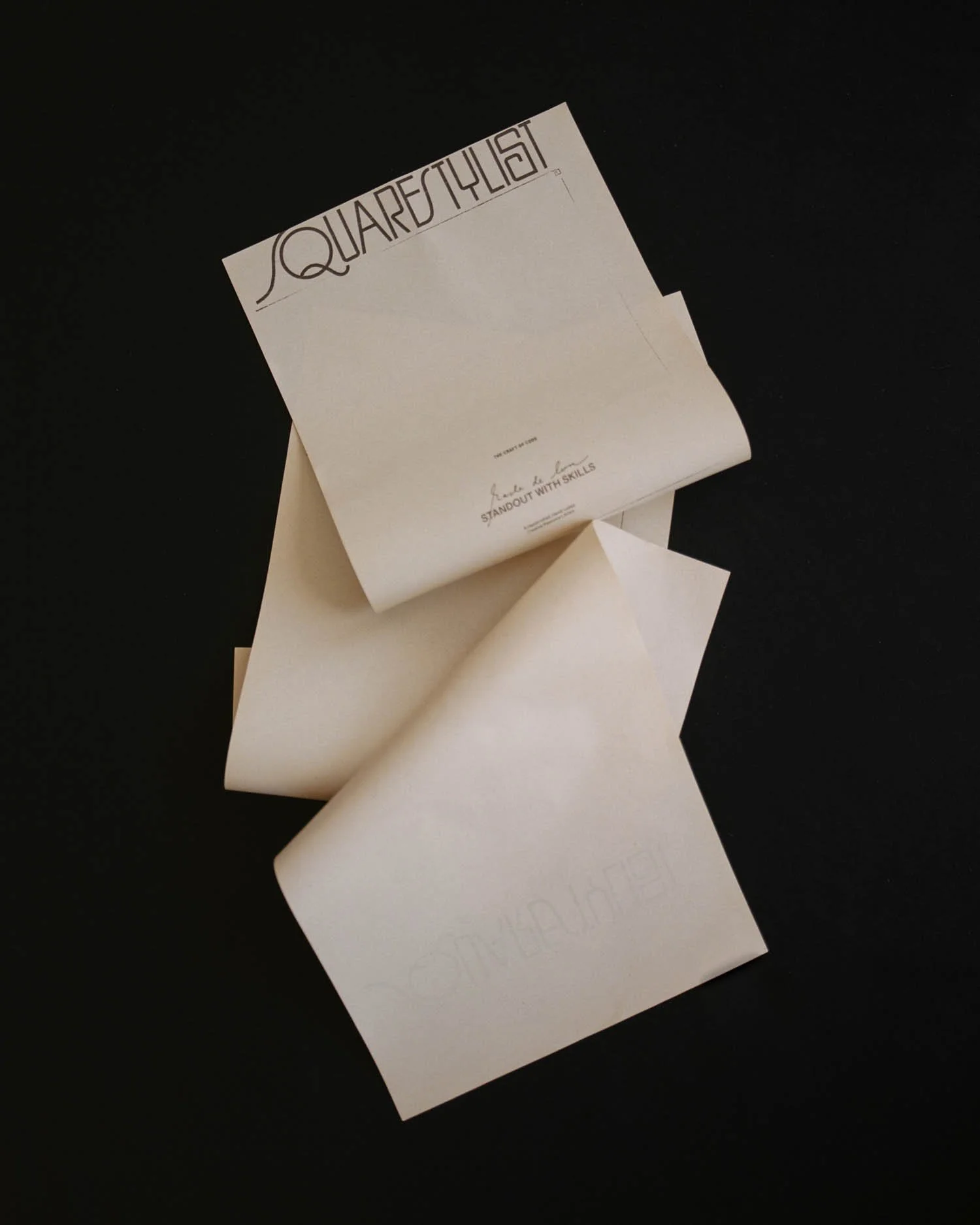
Our new brand identity, crafted in collaboration with Char Gladden Studio, reflects this evolution. The new logo represents the weaving of skills, with each letterform honoring a thread of discipline entwined in our work.
Our Journey
Founded out of a desire to empower web designers through code, Squarestylist has taken us on an incredible journey:
Launching signature courses, Standout Squarespace and Standout Shopify
Speaking at various podcasts & webinars
Witnessing countless students start their own design studios, sign ideal clients, and launch their own templates
These experiences have shaped us and reinforced our commitment to serving web designers better.
Our New Visual Identity
Our custom logo, created by Char Gladden, represents the disciplines of craft and code with a distinctively tactile, vintage quality. It honors those who have come before us and the family who have shaped us. The intertwining letterforms symbolize the weaving of skills and disciplines that define Squarestylist.
Char also facilitated the custom shoot for our custom imagery. The exquisite photography is by Dimanche Creative.


Words From our Designer
Char Gladden, the creative force behind our new brand identity, shares her thoughts on the process:
"Working with Squarestylist to create this new brand identity was a journey of discovery and creativity. We sought to commingle the practices of craft, code, and tactility to create a Creative Resource Library that truly represents Rache's vision and the community she's built.
The depths to which we delved in this work - from unearthing a new language through strategy that articulates the breadth of the practice, to crafting tactile imagery that speaks to the dexterity of code through nuanced, ephemeral brand imagery - culminated in our most robust website design to date.
Each aspect of this brand was singularly considered; every line and sketch and distinctively analog moment. Our creative paths honor those who have come before us, paving the way for those to come; the heart of Squarestylist and its philanthropic ethos, openhandedly problem solving and offering counsel."


Looking Forward
We're excited to continue growing with you, offering a place where you can draw inspiration from curated resources and featured sites alike. Thank you for being part of the Squarestylist community. Together, we're weaving a tapestry of creativity, code, and continuous learning.

Craft and Code: Our Journal
Where creativity finds the curious. Subscribe to our newsletter all about digital curiosities and explorations.


Craft and Code: Our Newsletter
a.
Business
b.
Article
Our Newsletter
Craft and Code is a loose sketchbook of sorts for design and coding exploration. These handwritten notes are written in honor of what holds my curiosity each day. Hopefully this stirs you the same way—to continuously find fascination in creativity, both in the midst of doing and opening yourself up to its possibilities.
You can expect it every other Wednesday, right when we creatives are most in need of inspiration to strike us.

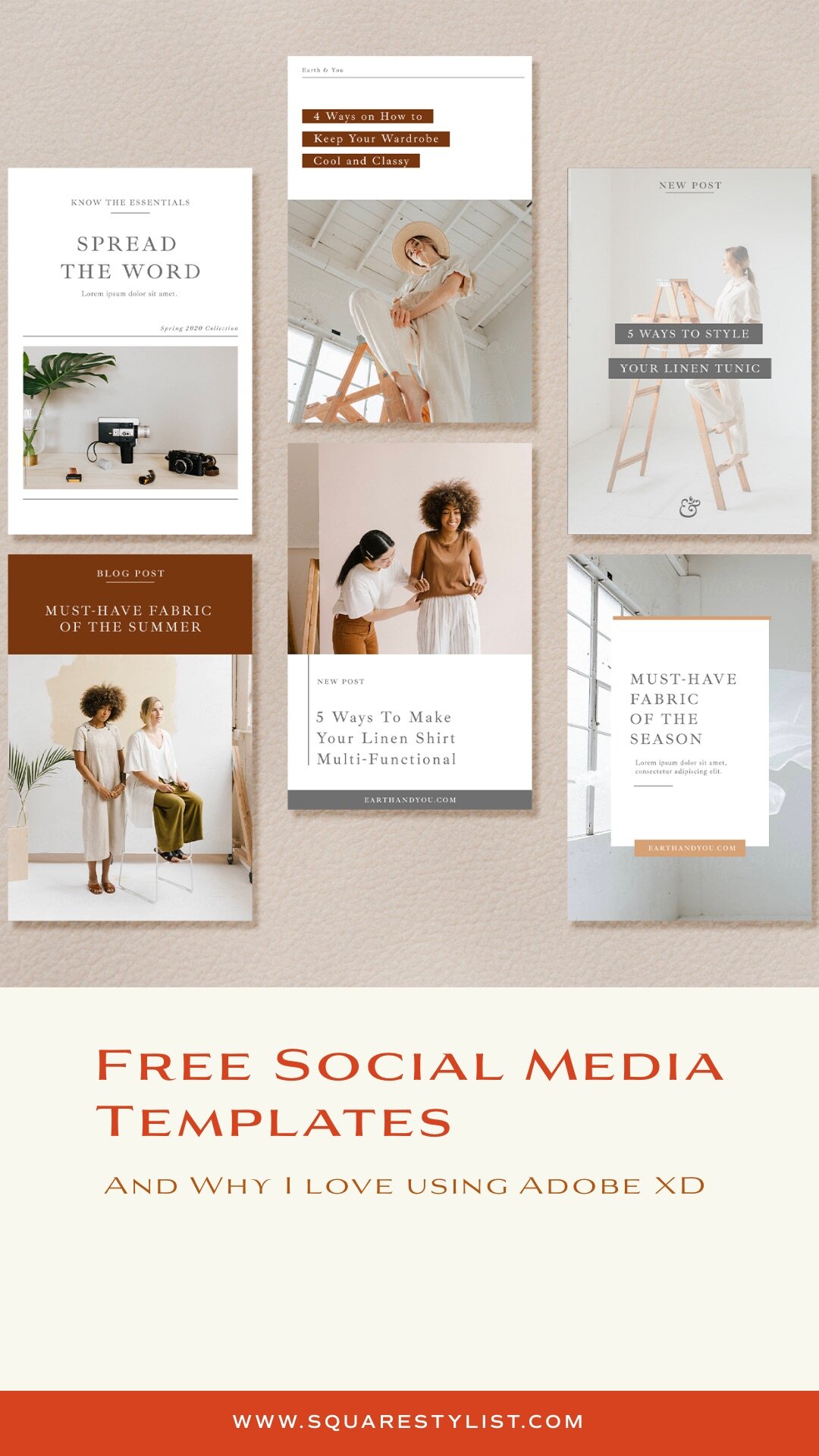
Adobe XD: My Favorite Tool in Creating Social Media Templates (Free Templates & Tutorial)
Why I swear by Adobe XD in creating social media templates. Free Templates and Tutorials inside.
As a brand designer, my main dilemma before in taking on branding clients is how to handover brand-consistent templates that they can easily edit and update on their own.
Adobe Photoshop or InDesign weren't options because I didn't want them to pay for Creative Cloud subscription just to edit their social media templates. Canva, while accessible, has limitations too. And then, I discovered ADOBE XD and it made all the difference.
Here’s why I prefer Adobe XD over other tools:

Adobe XD is Free
You may download Adobe XD starter plan for free. Just sign-up for an Adobe account and download the software. On the download page, there’s a disclaimer that “unlimited sharing and collaboration is until April 2020” only. Don’t worry about it, we don’t need this PREMIUM feature. ANYONE can download it anytime and it is FREE even after April 2020. Only the premium features (typically needed for web design) will be gone.
It seamless integrates with Adobe Illustrator
I can easily copy and paste graphics from Adobe Illustrator to Adobe XD. More so, the colors of the graphics are editable via Adobe XD.
You may use any of your desktop fonts
While Canva is free, uploading your custom font would require a Premium Paid Plan. With Adobe XD, you can use any font that’s installed on your website.
It is very easy to edit
Adobe XD is such a breeze to edit. Please download the free template below and watch the tutorial on how you can easily edit and customize the templates using Adobe XD.
Download the Free
Template Kit
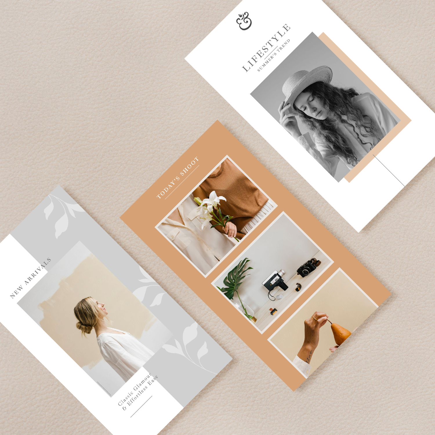
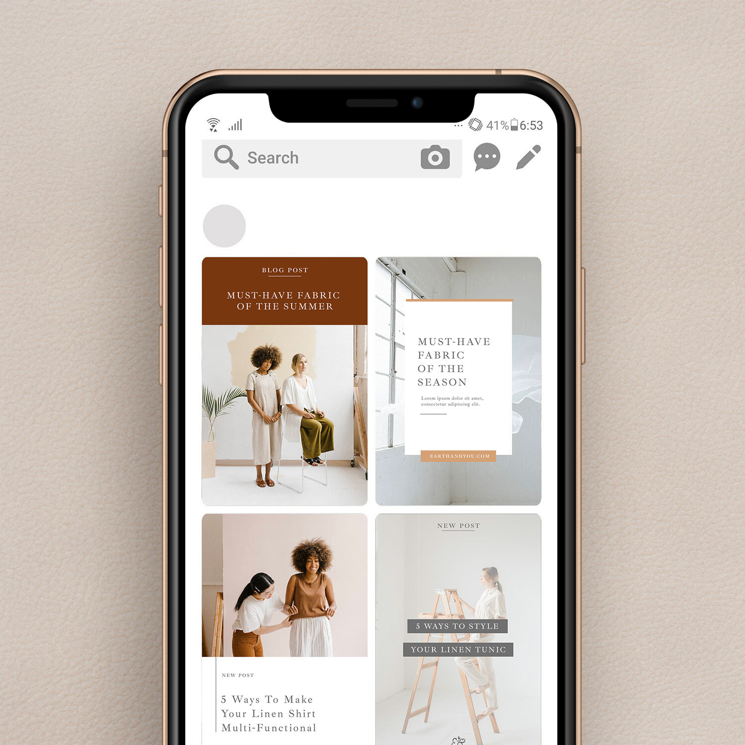
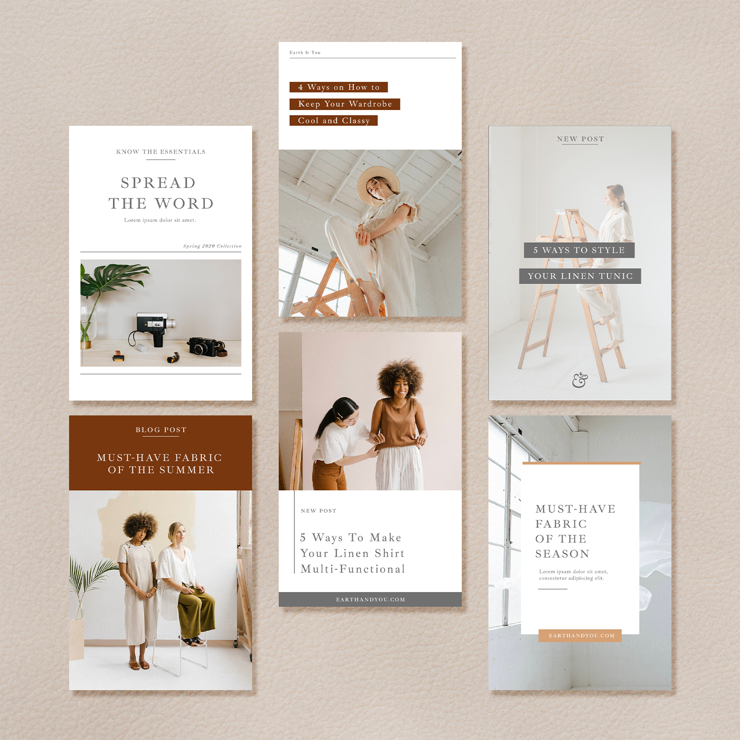
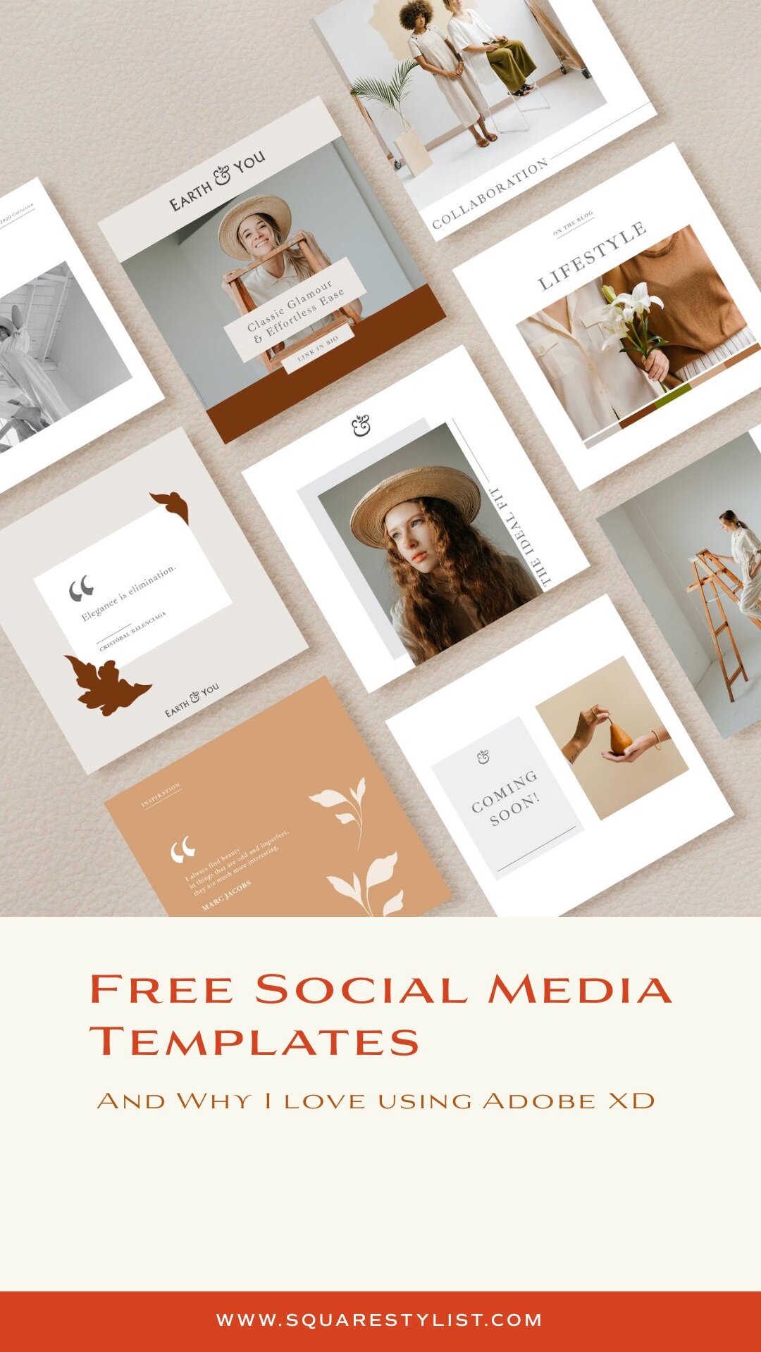
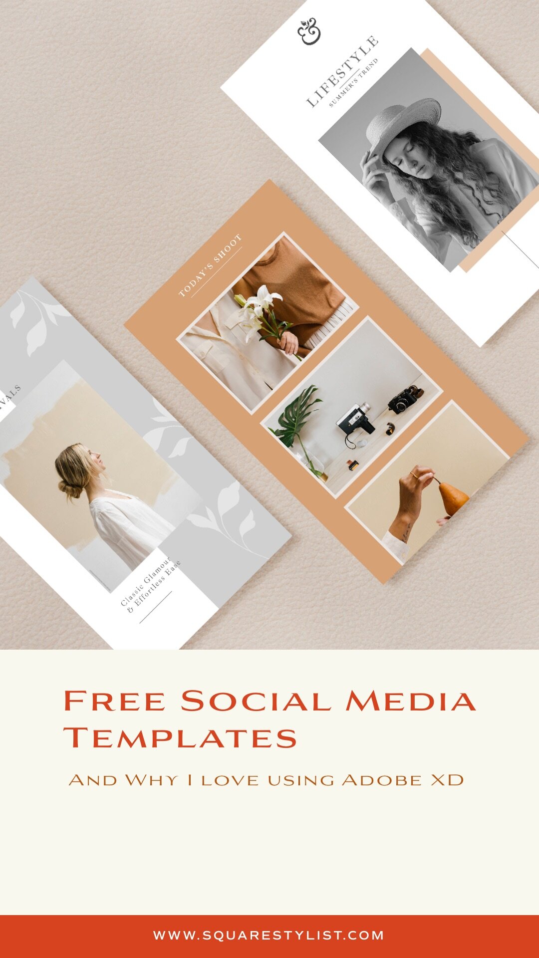
This free social media template kit by Squarestylist comes with the following:
Nine (9) Instagram Feed Templates
Six (6) Pinterest Templates
Three (3) Instagram Stories Templates
Watch this tutorial on how easily you can customize this template kit using Adobe XD
Hope this is helpful! Please let me know of your thoughts via the comment below. If you have requests for other resources, feel free to let me know as well.
PIN TO PINTEREST
Squarestylist Courses
Join the mailing list to stay in the know and check out our quick courses on CSS hacks and stylish sections.
