
Simple Gallery Thumbnails for Mobile
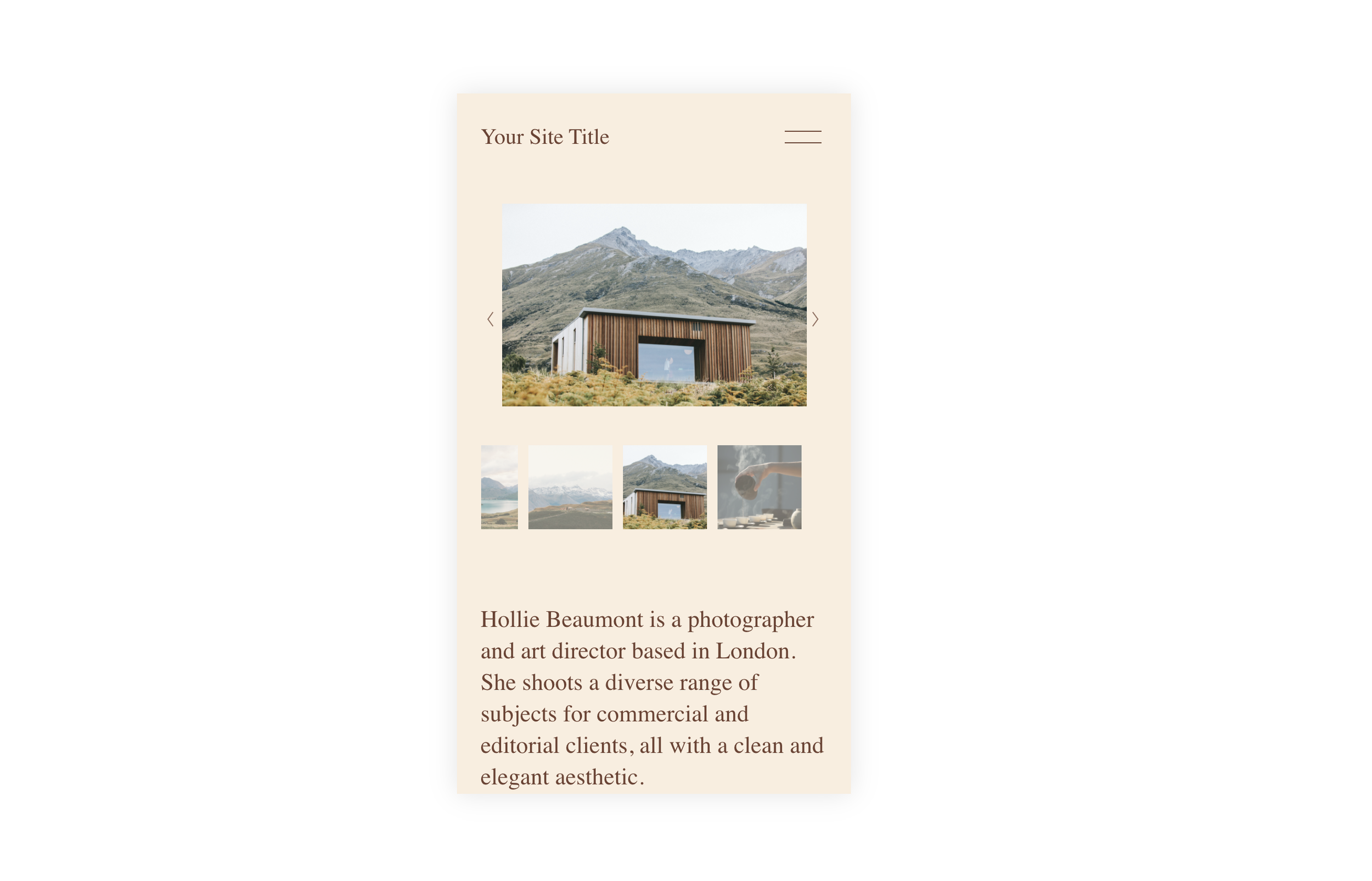
What You'll Create
A mobile-friendly gallery slideshow where thumbnail navigation remains visible and functional on smaller screens. Users can tap through thumbnails to jump directly to specific images instead of only using swipe gestures or arrows.
The Problem It Solves
Squarespace hides gallery slideshow thumbnails on mobile by default to save screen space. But for portfolios and product galleries, clients often want the ability to quickly jump to specific images without swiping through the entire gallery. This simple fix restores that functionality.
Perfect For
Portfolio slideshows, Product image galleries, Photo galleries, Before/after showcases, Client project displays
What Makes This Different
This technique overrides the default mobile behavior that hides thumbnails, making them visible and tappable on phones and tablets. It also adjusts the image positioning and container sizing so the thumbnails fit naturally below the main slideshow image without awkward spacing or overlap. The result is a complete thumbnail navigation experience on mobile that matches what visitors see on desktop.
Details
Section Type: Fluid & Classic
Code Type: CSS
Prerequisites: Gallery Section with Slideshow layout and thumbnails enabled in section settings
Toolkit Title: Simple Gallery Thumbnails
Learn This Technique
This is one of 150+ code techniques taught inside Standout Squarespace, where you get:
The complete, copy-paste code
Video walkthrough explaining how it works
The principles behind the technique so you can customize it
Access to our private community for support