
Split Slider Gallery Layout
What You'll Create
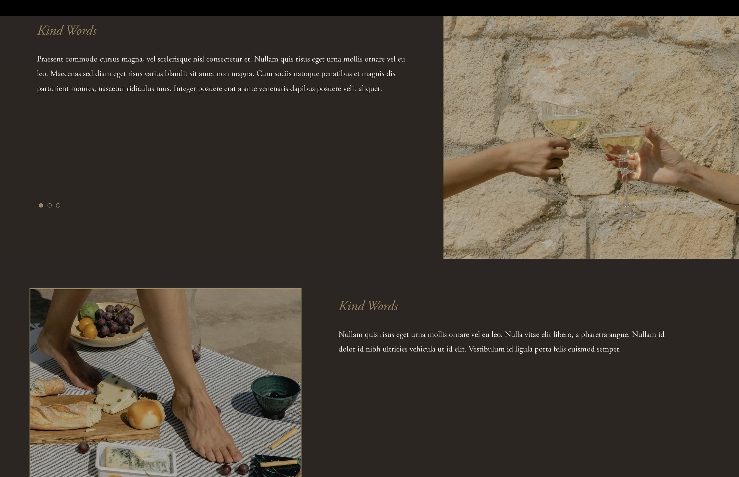
A split-screen slideshow layout where images appear on one side and content/captions on the other. Uses CSS Flexbox to create a modern, editorial presentation from Squarespace's gallery section.
The Problem It Solves
Default Squarespace slideshows show images with captions below or overlaid. When you want a sophisticated split-screen presentation with image on one side and content on the other, you need CSS Flexbox to restructure the gallery layout.
Perfect For
Portfolio showcases, Case studies, Product features, Service presentations, Editorial layouts
What Makes This Different
This technique uses CSS Flexbox to restructure the gallery slideshow, placing the image container on one side and captions on the other. Includes variations for full-height banners, image borders, and responsive mobile views. Uses the gallery section height value as a scoping selector.
Details
Section Type: Fluid Engine
Code Type: CSS
Prerequisites: Gallery section set to slideshow with captions
Toolkit Title: Split Slider
Learn This Technique
This is one of 150+ code techniques taught inside Standout Squarespace, where you get:
The complete, copy-paste code
Video walkthrough explaining how it works
The principles behind the technique so you can customize it
Access to our private community for support