

Squarespace Finish Layer in Practice: Building the Design Forward Landing Page
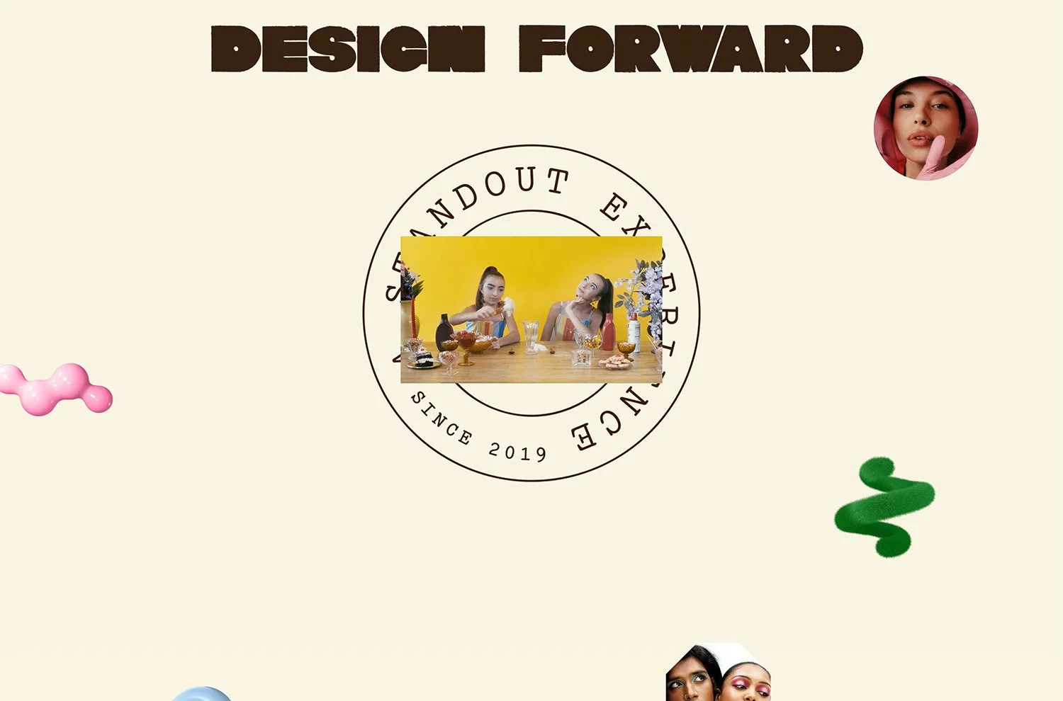
Block Animations, Stacks, Block Transforms, and Font Uploads, working together on a real project. A full walkthrough of the Design Forward landing page, built with no custom code.
Squarespace Finish Layer in Practice: Building the Design Forward Landing Page
a.
Squarespace
b.
Video
For the Make It Real Challenge by Squarespace and Contra, I submitted a Squarespace landing page for Design Forward, my upcoming four-week live bootcamp for web designers exploring how AI can streamline the tedious parts of their process. This website uses purely Squarespace’s native design tools -no added code. The page invites interested designers to join the waitlist for our September launch.
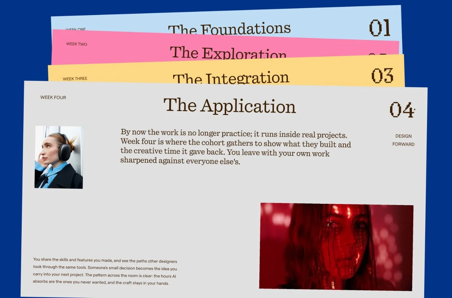
I have been building Squarespace websites for a decade, and my approach has always been to maximize the built-in features first. So I set one rule for this build. No custom CSS, no JavaScript, no extensions. Everything on the page came from Squarespace Finish Layer, the suite of design tools Squarespace released for advanced control inside the platform.
The site is built on a visual identity I have been crafting with my talented friend Edinah of Wildlogic. My goal for the experience was to guide the user's attention while reinforcing the brand's message. Design Forward is catered to multilayered creatives who are ready to push boundaries, so I wanted those unexpected layers to reveal themselves as you scroll. The overall feeling is optimism and artful play.
Font Uploads
The Design Forward type system pairs vivacious 1960s letterforms with fashion-forward contemporary typefaces. Using the Font Upload feature, I applied four custom fonts across the site with no added code. On any earlier version of Squarespace, four typefaces meant hosting the files, writing @font-face rules, and assigning them by selector.
The Scale Text feature carries the rest. It keeps sizing coherent across breakpoints while preserving a proper heading hierarchy, which supports SEO and accessibility at the same time. Typography that behaves well is doing more than looking good.
Block Transforms and Animations
I combined block animations, transforms, and the pin block feature to introduce movement and to carry the page from one color theme into the next, blurring the boundaries between them. Left alone, a theme change reads as a hard cut between sections. Animated across the seam, it becomes part of the scroll instead of an interruption.
The animations are carefully sequenced based on scroll progress, so the story unfolds one scene at a time. You are never looking at a full section all at once, which keeps attention moving in the order I intended.
For the horizontal scroll section and the scrolling banners, I layered scale and offset animations to move the composition across the screen and add visual interest. On a long landing page the call to action has to reassert itself more than once, and a moving banner does that without a second headline competing for attention.
Stacks
Stacks are the backbone of the layered editorial cards and the complex responsive layouts throughout the page. I nested stacks within stacks to reach the editorial composition I wanted, then animated each stack as a group.
Because a stack can hold any element, I used video blocks inside the cards for accessibility and flexibility. And because the group carries its own alignment and motion settings, I perfected one card and duplicated it. Every card after the first inherited consistent layout and timing without me setting either again.
Of the four tools, this is the one that changed how I work.
Mobile Overrides
Independent mobile settings let me adjust transform values, timing, and layout specifically for smaller screens. Same content, different arrangement, no media queries.
A scroll sequence tuned for a wide viewport rarely reads the same way on a phone, and being able to retime it directly meant a streamlined mobile flow without compromising the desktop experience.
See the site
The finished page is live at designforward.live. Scroll it on desktop and on your phone, since the two are arranged differently on purpose.
If you want to go deeper into how I approach Squarespace projects, both the native tooling and the code that goes beyond it, that is what I teach inside Standout Squarespace.