
Better Mobile Menu on Desktop
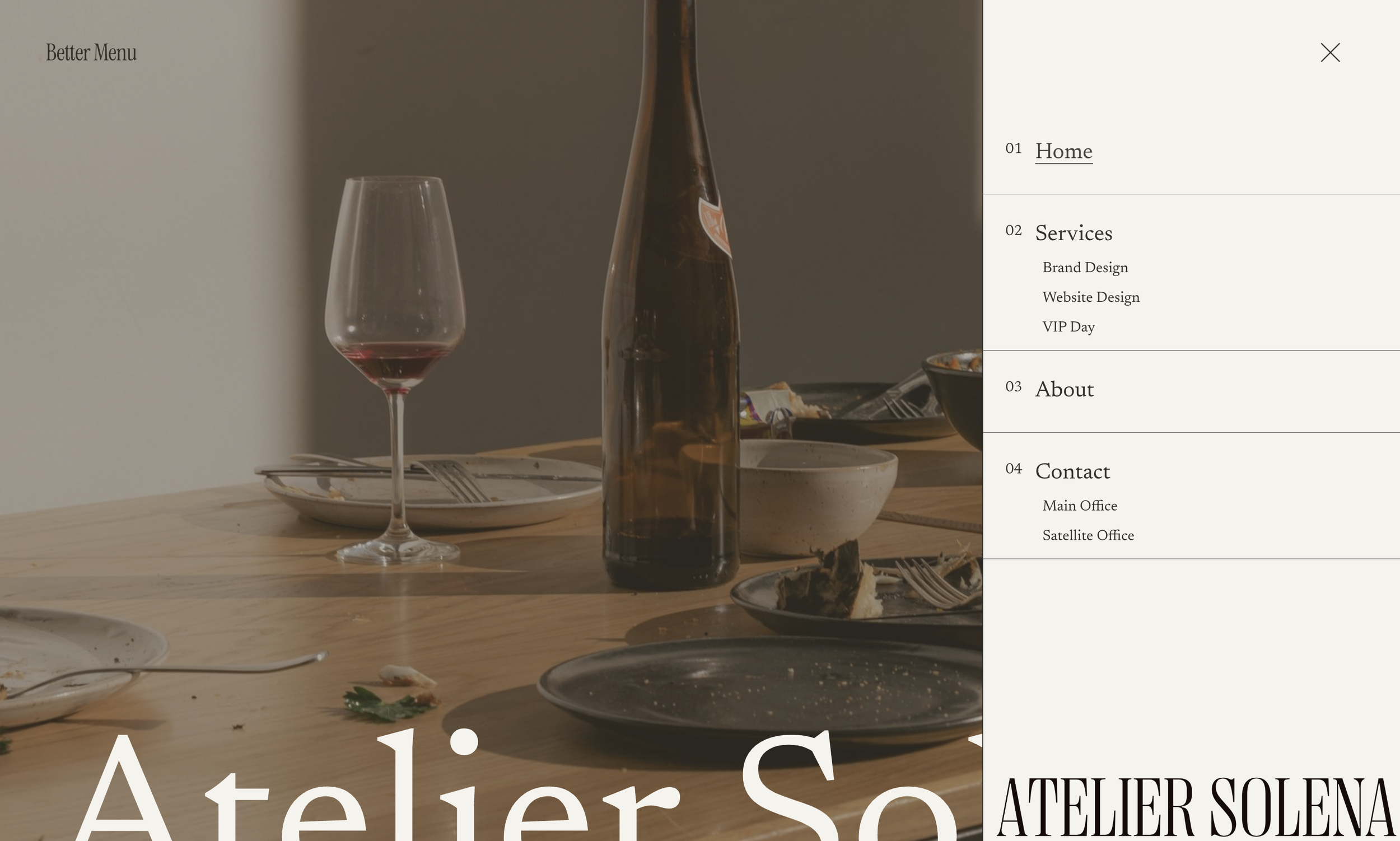
What You'll Create
A slide-out mobile menu style displayed on desktop screens. The hamburger menu triggers a side panel overlay with expandable folder navigation and hover-reveal submenus, bringing mobile UX conventions to desktop.
The Problem It Solves
Some designs call for hidden navigation that reveals on demand, even on desktop. Squarespace's mobile menu is restricted to smaller screens. This technique forces the mobile menu to appear on all screen sizes with enhanced styling and folder hover states.
Perfect For
Minimalist designs, Portfolio sites, Full-screen layouts, Creative agencies, Immersive experiences
What Makes This Different
This technique combines the Better Mobile Menu script with desktop-specific CSS to create a slide-out panel. Folder navigation shows on hover rather than click, and submenus appear alongside parent items. The menu panel width and styling are fully customizable.
Details
Section Type: Fluid & Classic
Code Type: CSS + JavaScript
Prerequisites: Better Mobile Menu script installed
Toolkit Title: Better Mobile Menu on Desktop
Learn This Technique
This is one of 150+ code techniques taught inside Standout Squarespace, where you get:
The complete, copy-paste code
Video walkthrough explaining how it works
The principles behind the technique so you can customize it
Access to our private community for support