
Fixed Split Section Layout
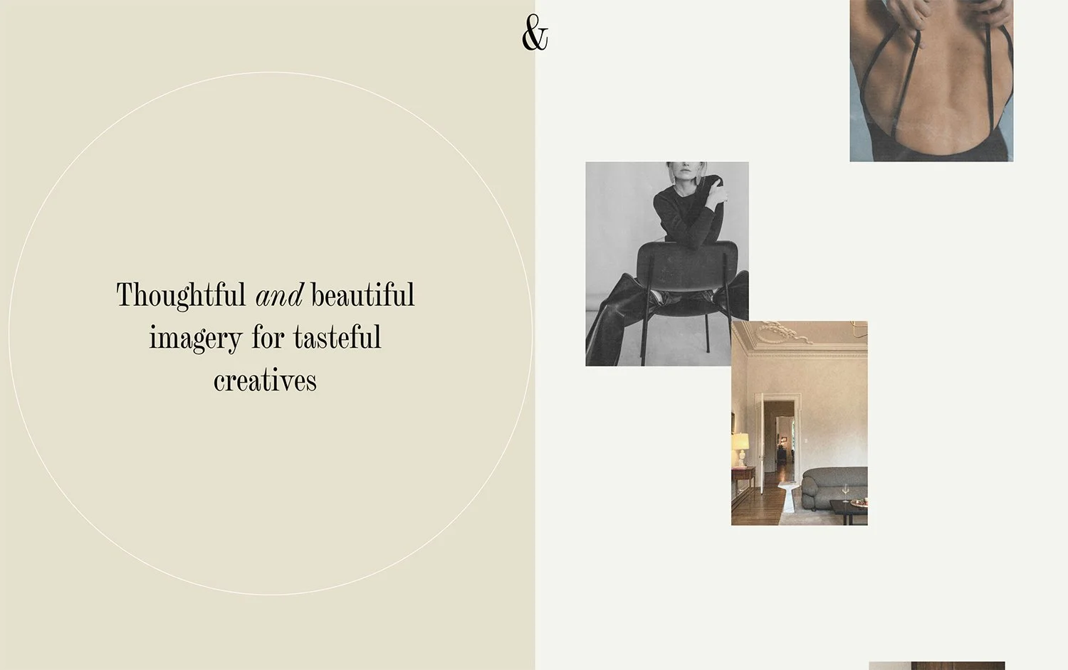
What You'll Create
A visually striking split-screen section where one half (typically featuring an image) remains fixed in place while the other half scrolls normally. This creates depth and draws attention to key imagery as visitors navigate through your content.
The Problem It Solves
Standard Squarespace sections scroll uniformly, which can feel flat and miss opportunities for visual impact. This technique creates a parallax-like experience where important visuals stay visible longer, creating a more immersive and engaging browsing experience.
Perfect For
Hero sections, About pages, Product features, Case studies, Service showcases
What Makes This Different
This technique locks one portion of your section in place while allowing the rest to scroll naturally. The effect creates visual depth that guides the eye and keeps important imagery visible throughout the scroll journey. It's particularly effective for pairing impactful photography with scrolling text content or multiple content blocks.
Details
Section Type: Fluid & Classic
Code Type: CSS
Prerequisites: Section with background image, appropriate content width settings
Toolkit Title: Fixed Split Layout
Learn This Technique
This is one of 150+ code techniques taught inside Standout Squarespace, where you get:
The complete, copy-paste code
Video walkthrough explaining how it works
The principles behind the technique so you can customize it
Access to our private community for support