
Force Mobile Menu on Desktop
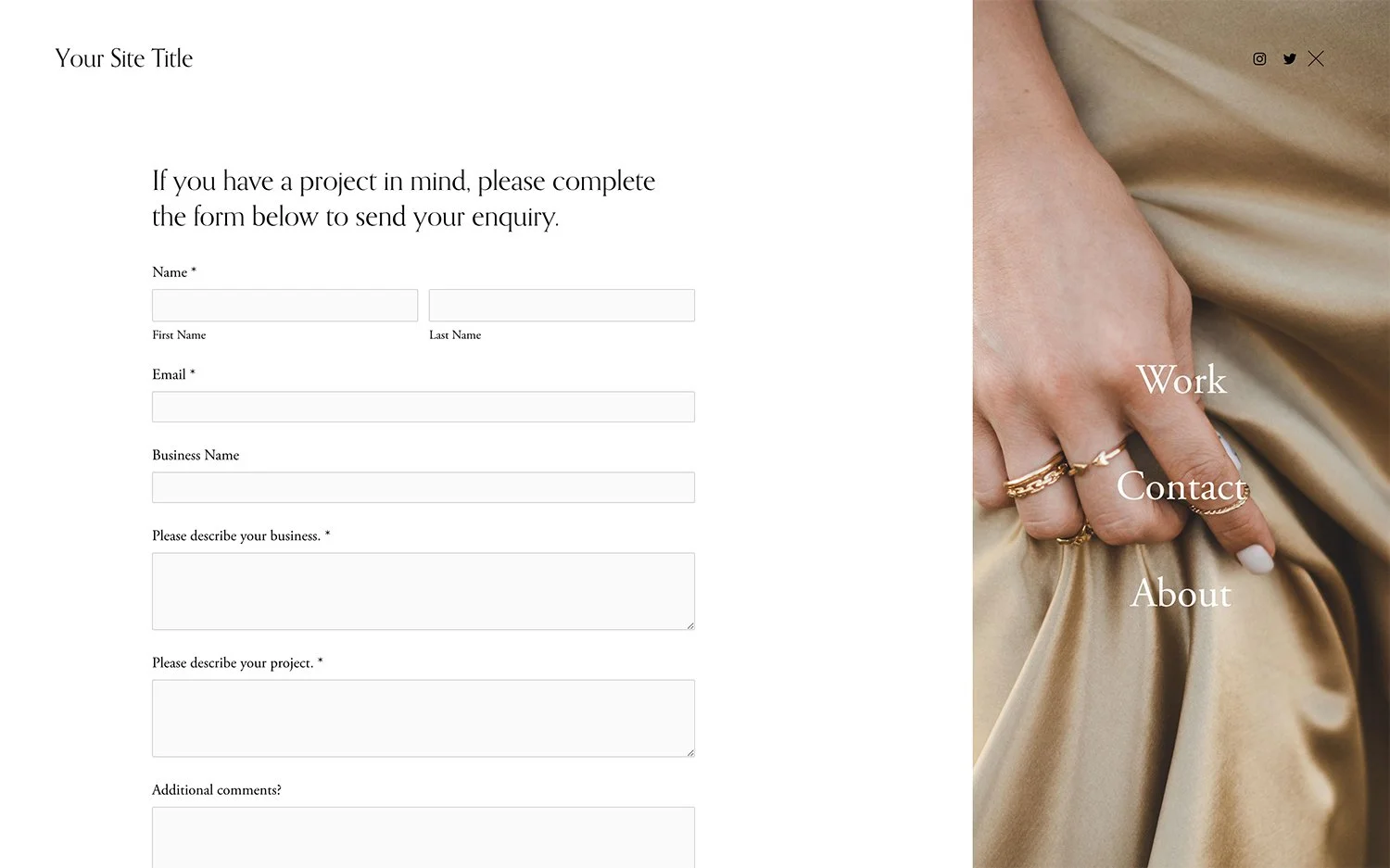
What You'll Create
Show the mobile hamburger menu and overlay panel on desktop screens, creating a pop-out menu experience at all screen sizes.
The Problem It Solves
Some designs call for hamburger menus on desktop for a cleaner, more minimal header. This forces mobile menu behavior on larger screens.
Perfect For
Minimalist sites, Creative portfolios, Full-screen experiences, Gallery sites, Art portfolios.
What Makes This Different
CSS display properties force the mobile menu elements to appear on desktop, with styling adjustments for larger screen layouts.
Details
Section Type: Fluid & Classic
Code Type: CSS
Prerequisites: Understanding of mobile menu structure
Toolkit Title: Force Mobile Menu on Desktop 7.1/Pop out
Learn This Technique
This is one of 150+ code techniques taught inside Standout Squarespace, where you get:
The complete, copy-paste code
Video walkthrough explaining how it works
The principles behind the technique so you can customize it
Access to our private community for support