Stylish Carousel Summary Block
What You'll Create
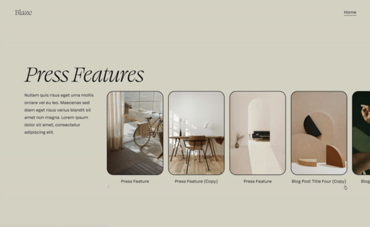
A refined carousel summary block with items that peek beyond the section edge, rounded thumbnail borders with customizable radius, and navigation arrows repositioned to the full width of the container. The overflow clips cleanly to the right side while maintaining proper containment.
The Problem It Solves
Squarespace's default carousel summary blocks feel contained and boxy. The thumbnails have sharp corners, navigation arrows sit awkwardly positioned, and there's no visual indication of more content beyond the visible slides. This technique creates that editorial "peek" effect where content extends beyond the container edge.
Perfect For
Featured blog post carousels, portfolio project showcases, testimonial sliders with personality, product highlight sections, case study presentations
What Makes This Different
Allows content to overflow specifically to the right while keeping the left edge clean. Repositions the pagination dots, adds 30px rounded corners to thumbnails, and spreads navigation arrows to the full width of the container with space between them.
Details
Section Type: Classic
Code Type: CSS
Prerequisites: Summary block set to carousel layout
Toolkit Title: Stylish Carousel Summary Block
Learn This Technique
This is one of 150+ code techniques taught inside Standout Squarespace, where you get:
The complete, copy-paste code
Video walkthrough explaining how it works
The principles behind the technique so you can customize it
Access to our private community for support


