
Stacked Gallery to Grid Layout
What You'll Create
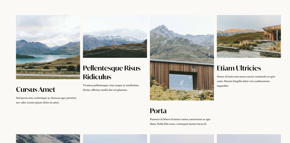
Transform a stacked gallery block in Squarespace into a responsive grid layout with customizable columns and gaps. Images display with their titles and descriptions visible, arranged in a clean grid rather than stacked vertically.
The Problem It Solves
Squarespace's Stacked Gallery Block displays images in a single column by default, which works for some designs but wastes space when you want a grid. While Grid Gallery Blocks exist, they don't show titles and descriptions the same way. This technique gives you the metadata display of a Stacked Gallery with the layout flexibility of a grid.
Perfect For
Image galleries with captions, Product showcases with descriptions, Team photo grids, Portfolio thumbnails with titles, Image collections needing metadata.
What Makes This Different
Grid styling transforms the stacked layout into columns while code repositions the metadata to appear with each image. You control the number of columns and spacing through simple style values. The result combines the best of both gallery types—grid layout with visible titles and descriptions.
Details
Section Type: Fluid & Classic
Code Type: CSS + JavaScript
Prerequisites: Stacked Gallery Block with titles/descriptions enabled
Toolkit Title: Convert a Stacked Gallery Block to Grid
Learn This Technique
This is one of 150+ code techniques taught inside Standout Squarespace, where you get:
The complete, copy-paste code
Video walkthrough explaining how it works
The principles behind the technique so you can customize it
Access to our private community for support