
Split Image Layout with Full Content
What You'll Create
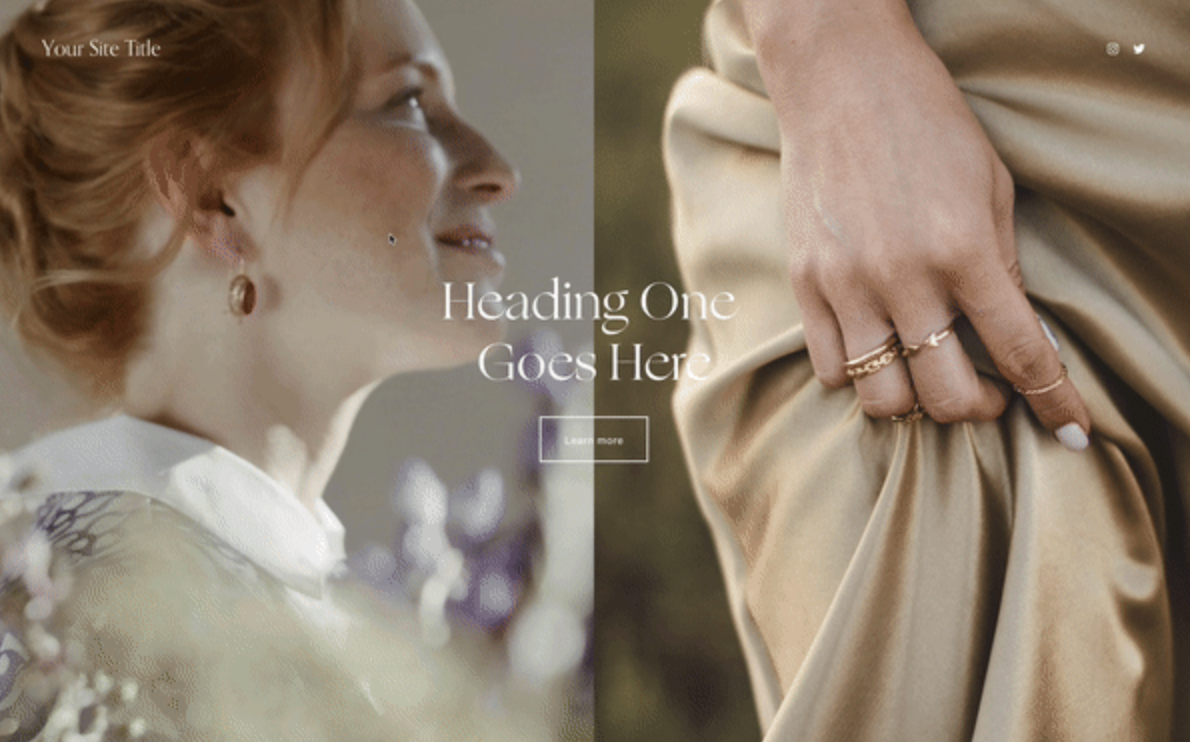
A dramatic section layout where content fills one half while two separate images split the other half. As visitors scroll, the images create visual interest alongside your text, perfect for storytelling layouts.
The Problem It Solves
Squarespace's standard layouts don't easily let you place multiple images in a split configuration next to full-width content. This technique uses background images and pseudo-elements to create that magazine-style split effect.
Perfect For
About pages, Brand stories, Case studies, Service overviews, Portfolio introductions
What Makes This Different
This approach creates a two-column layout where one side holds your content and the other side is split between two images. The images are positioned using background techniques so they scale beautifully at any screen size. The result feels more editorial and intentional than standard block arrangements.
Details
Section Type: Classic
Code Type: CSS
Prerequisites: Section with specific content width setting, Image URLs for background images
Toolkit Title: Full Content + Split Images
Learn This Technique
This is one of 150+ code techniques taught inside Standout Squarespace, where you get:
The complete, copy-paste code
Video walkthrough explaining how it works
The principles behind the technique so you can customize it
Access to our private community for support