
Split Section with Background Gallery
What You'll Create
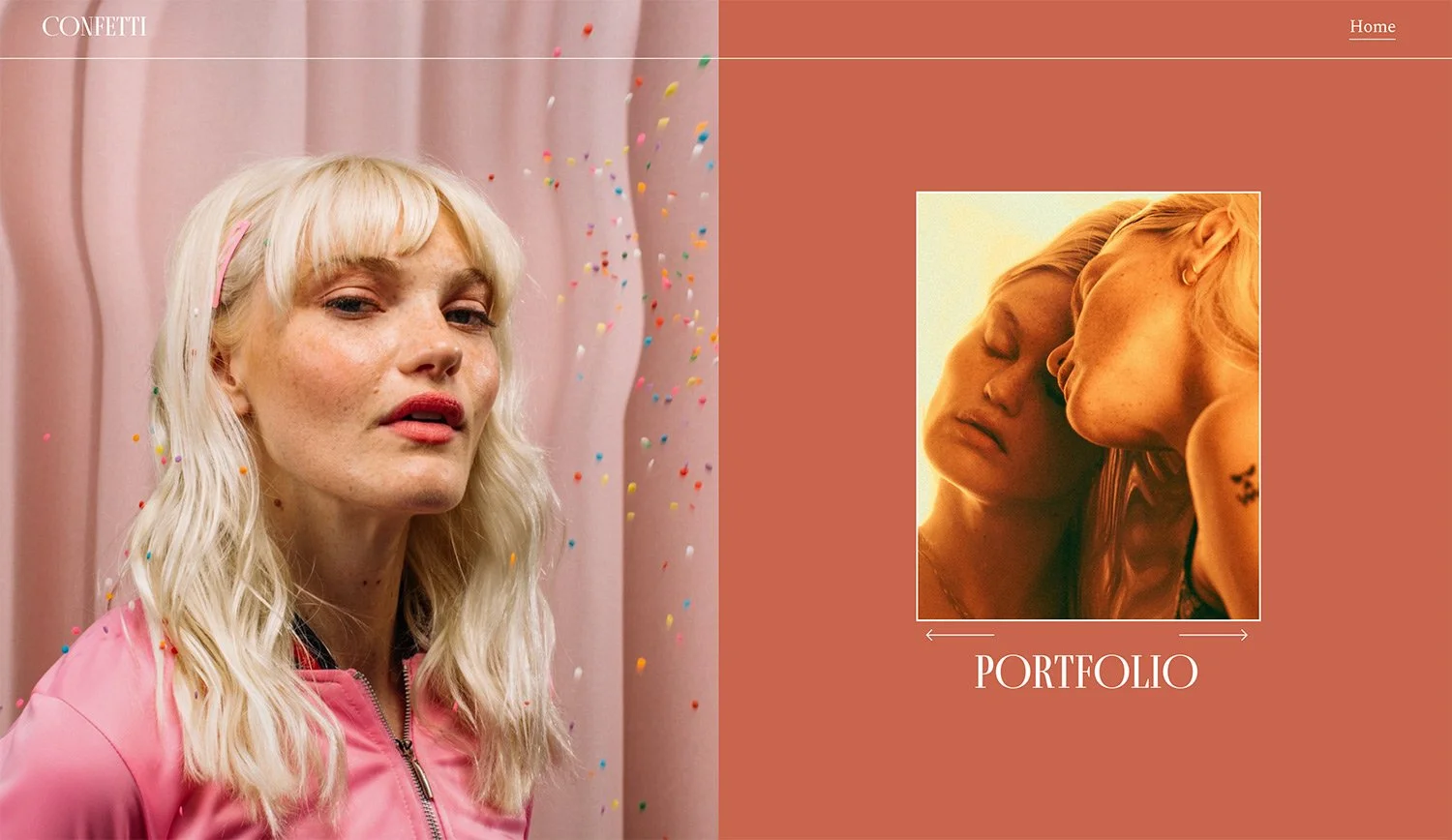
A split-screen section where a background image fills half the screen while content fills the other half. Includes custom gallery block arrows and styling options.
The Problem It Solves
Squarespace's section background images always fill the entire width. When you want a true split-screen layout with the image covering only half and content on the other side, you need CSS to constrain the background image and reposition content.
Perfect For
About pages, Service descriptions, Portfolio features, Team introductions, Product highlights
What Makes This Different
This technique uses data attribute selectors to target sections with specific content width settings. The background image is constrained to 50% width while content floats on the opposite side. Includes custom arrow font integration and responsive mobile handling.
Details
Section Type: Classic
Code Type: CSS
Prerequisites: Section with specific content width settings (62), custom arrow font
Toolkit Title: Split Section with Gallery
Learn This Technique
This is one of 150+ code techniques taught inside Standout Squarespace, where you get:
The complete, copy-paste code
Video walkthrough explaining how it works
The principles behind the technique so you can customize it
Access to our private community for support