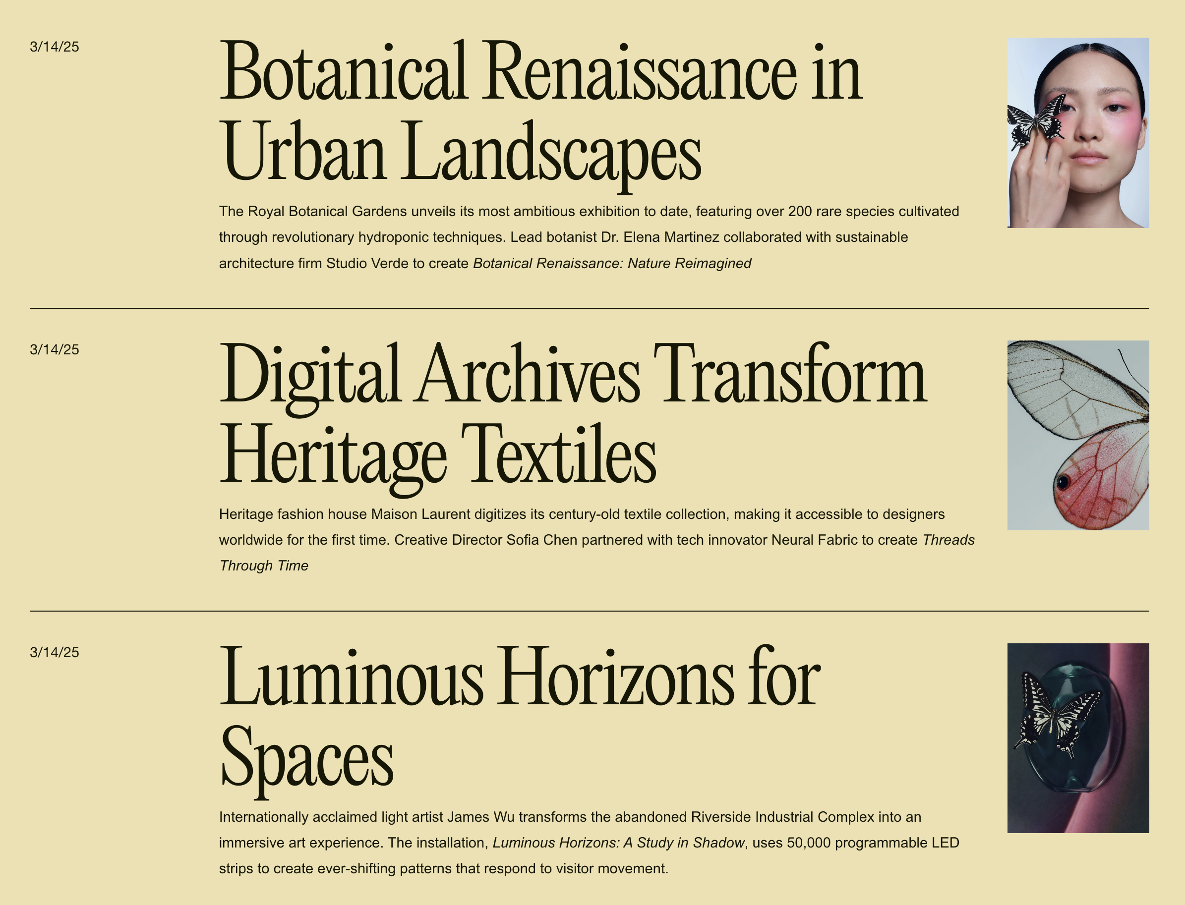
Editorial Blog Stacked List Layout
What You'll Create
A stacked, editorial-style blog listing where posts display in a single column with large typography, small thumbnail images, and horizontal divider lines. The layout places the image on one side with post metadata organized in a grid pattern—creating that clean, magazine index feel.
The Problem It Solves
Squarespace's default blog grid layouts prioritize images over text. When you want a text-forward, editorial approach where headlines dominate and images play a supporting role, custom CSS transforms the Basic Grid into this sophisticated stacked presentation.
Perfect For
News or magazine-style blogs
Editorial portfolios
Text-heavy content sites
Minimalist design approaches
Professional service blogs
Any blog prioritizing headlines over imagery
What Makes This Different
The CSS uses flexbox with row-reverse to position small thumbnails alongside large headlines, with a grid layout for the metadata. The responsive clamp() function scales typography smoothly across screen sizes. Horizontal borders separate entries cleanly, and the layout collapses gracefully on mobile while maintaining the stacked aesthetic.
Details
Section Type: Fluid Engine
Code Type: CSS
Prerequisites: Blog page using Basic Grid layout.
Toolkit Title: Blog Stacked List
Learn This Technique
This is one of 150+ code techniques taught inside Standout Squarespace, where you get:
The complete, copy-paste code
Video walkthrough explaining how it works
The principles behind the technique so you can customize it
Access to our private community for support


