
Carousel Arrows Bottom with Side-by-Side Layout
What You'll Create
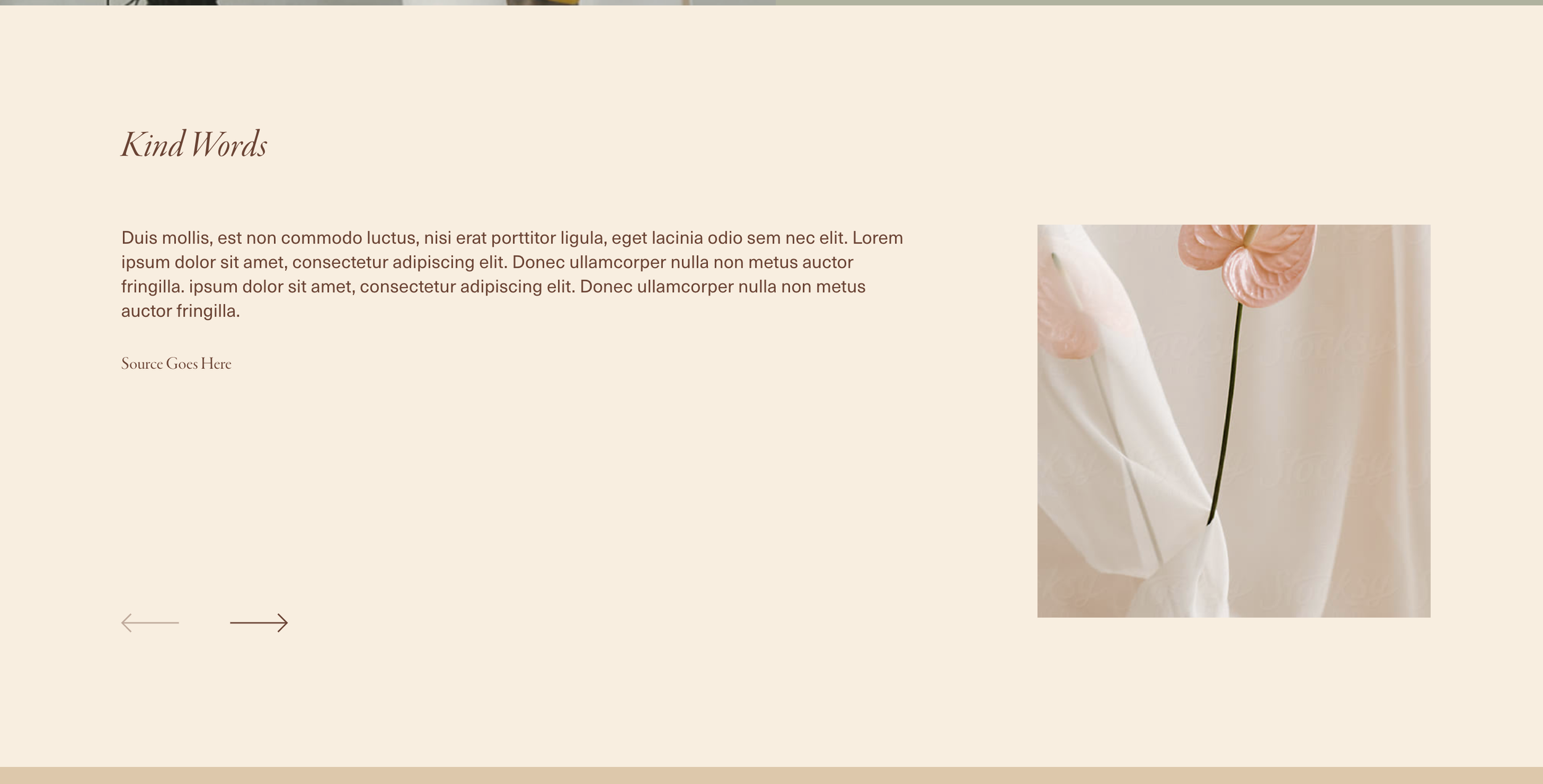
A carousel summary block in Squarespace with navigation arrows repositioned to the bottom of the container, plus a side-by-side layout where the thumbnail sits on one side and content on the other. This creates a more editorial, magazine-style presentation.
The Problem It Solves
Default carousel arrows sit awkwardly at the sides of slides. And content stacks vertically by default, which doesn't take advantage of horizontal screen space. This technique repositions the pager to the bottom and transforms the layout into a sophisticated side-by-side arrangement.
Perfect For
Featured article carousels, Product highlight sliders, Case study presentations, Team member showcases, Testimonial sections with photos
What Makes This Different
The CSS moves the carousel pager below the content and anchors it 3% from the bottom edge. For the side-by-side layout, the thumbnail gets positioned at 30% width on the right while the text content takes 60% on the left. The content area reorganizes vertically to maintain a clean reading flow from title to excerpt to metadata.
Details
Section Type: Classic
Code Type: CSS
Prerequisites: Summary block set to carousel layout
Toolkit Title: Carousel Arrows Bottom and Side by Side Carousel for Summary Block
Learn This Technique
This is one of 150+ code techniques taught inside Standout Squarespace, where you get:
The complete, copy-paste code
Video walkthrough explaining how it works
The principles behind the technique so you can customize it
Access to our private community for support