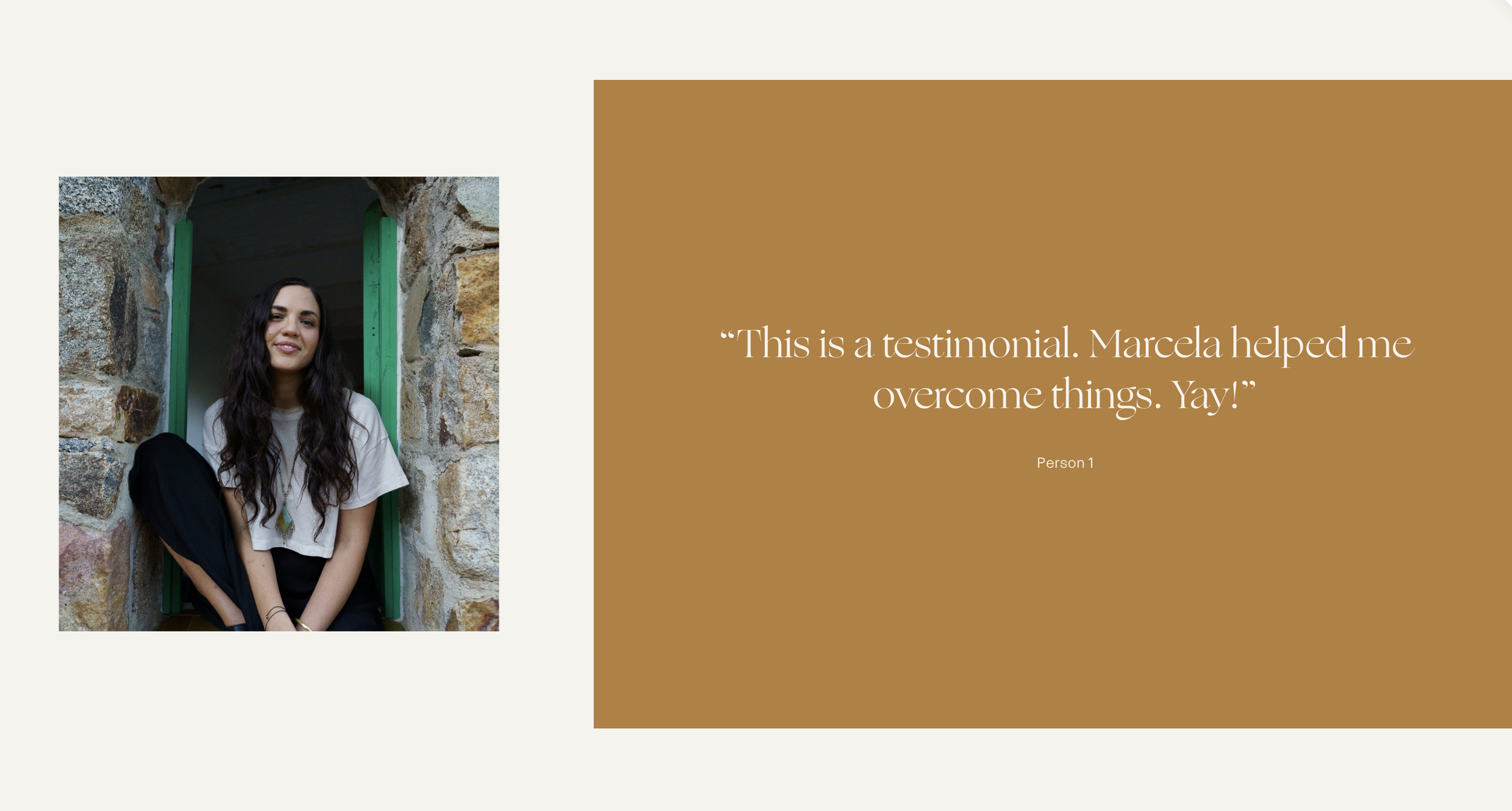
How to Create Split Section Layouts with Background Images in Squarespace
What You'll Create
A split-screen section layout where your background image occupies a portion of the section width (like 40%) while your content fills the remaining space. The section's overlay color extends into the empty area, creating a polished two-tone design with image on one side and colored content area on the other.
The Problem It Solves
Squarespace background images always fill the entire section width. There's no native way to have a background image take up only part of a section while a solid color fills the rest—a popular layout for about pages, service showcases, and portfolio features.
Perfect For
About pages with featured imagery, Service showcases with visual emphasis, Portfolio landing sections, Brand storytelling layouts, Feature highlight sections
What Makes This Different
This technique splits your section into two distinct zones: one showing your background image at a controlled size, the other extending your overlay color. You control the split ratio and can flip the layout left or right using Squarespace's built-in alignment settings. The background image is also resized within its zone for a more refined look. Works on desktop with appropriate mobile fallbacks available.
Details
Section Type: Fluid & Classic
Code Type: CSS
Prerequisites: Section with background image, content width set to 49%, horizontal alignment set to left or right
Toolkit Title: Split Sections v2
Learn This Technique
This is one of 150+ code techniques taught inside Standout Squarespace, where you get:
The complete, copy-paste code
Video walkthrough explaining how it works
The principles behind the technique so you can customize it
Access to our private community for support


