
Sticky Scrolling Blog Layout
What You'll Create
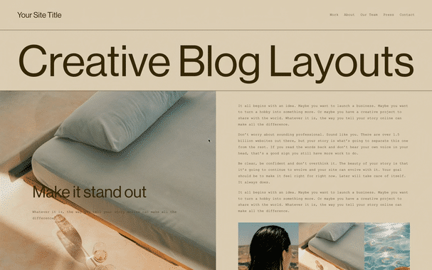
A split-screen blog post layout with a sticky image on one side while content scrolls on the other. The image remains fixed in view as readers scroll through the article text.
The Problem It Solves
Standard blog posts stack content vertically, which can feel monotonous for longer articles. When you want a more engaging two-column layout where images stay visible while text scrolls, you need CSS Grid with sticky positioning.
Perfect For
Long-form articles, Case studies, Portfolio pieces, Visual storytelling, Feature content
What Makes This Different
This technique uses CSS Grid to create a two-column layout with the first element (typically an image) set to sticky positioning. Horizontal rules can trigger new sticky images throughout the post. Images automatically fill viewport height for maximum impact.
Details
Section Type: Fluid & Classic
Code Type: CSS
Prerequisites: Blog post with image blocks, Desktop viewing
Toolkit Title: Sticky/Scrolling Blog Item Layout
Learn This Technique
This is one of 150+ code techniques taught inside Standout Squarespace, where you get:
The complete, copy-paste code
Video walkthrough explaining how it works
The principles behind the technique so you can customize it
Access to our private community for support