
Show Multiple Carousel Items on Mobile
What You'll Create
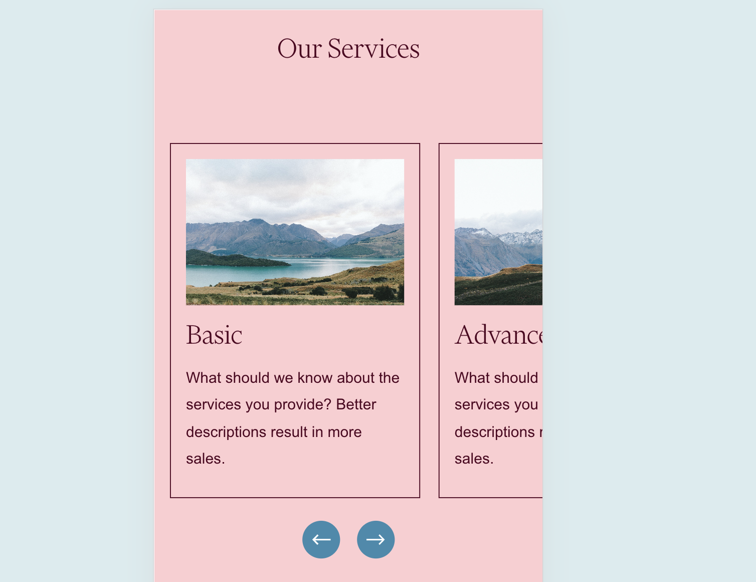
A mobile-friendly carousel that shows multiple items peeking into view rather than displaying one item at a time. Visitors can see there's more content to explore, encouraging them to swipe through your carousel.
The Problem It Solves
Squarespace's default carousel behavior shows only one item at a time on mobile devices, which can make the carousel feel disconnected and hide the fact that more content exists. This technique reveals partial views of adjacent items, creating visual continuity and inviting exploration.
Perfect For
Service showcases, Team member previews, Product teasers, Portfolio thumbnails, Testimonial carousels
What Makes This Different
This technique allows the overflow of carousel items to peek into view on mobile screens. Instead of seeing just one centered item, visitors see about 70% of the current item with neighboring items visible on the edges. This creates a more engaging mobile experience that naturally encourages swiping.
Details
Section Type: Fluid & Classic
Code Type: CSS
Prerequisites: List Section with Carousel layout, section anchor ID
Toolkit Title: Show more than one carousel list item on mobile
Learn This Technique
This is one of 150+ code techniques taught inside Standout Squarespace, where you get:
The complete, copy-paste code
Video walkthrough explaining how it works
The principles behind the technique so you can customize it
Access to our private community for support