
Discover What You Can Build
500+ workshops, Techniques, and Resources Inside Standout Squarespace
Explore the library of techniques, templates, and resources available for you inside Squarestylist’s Standout Squarespace program.
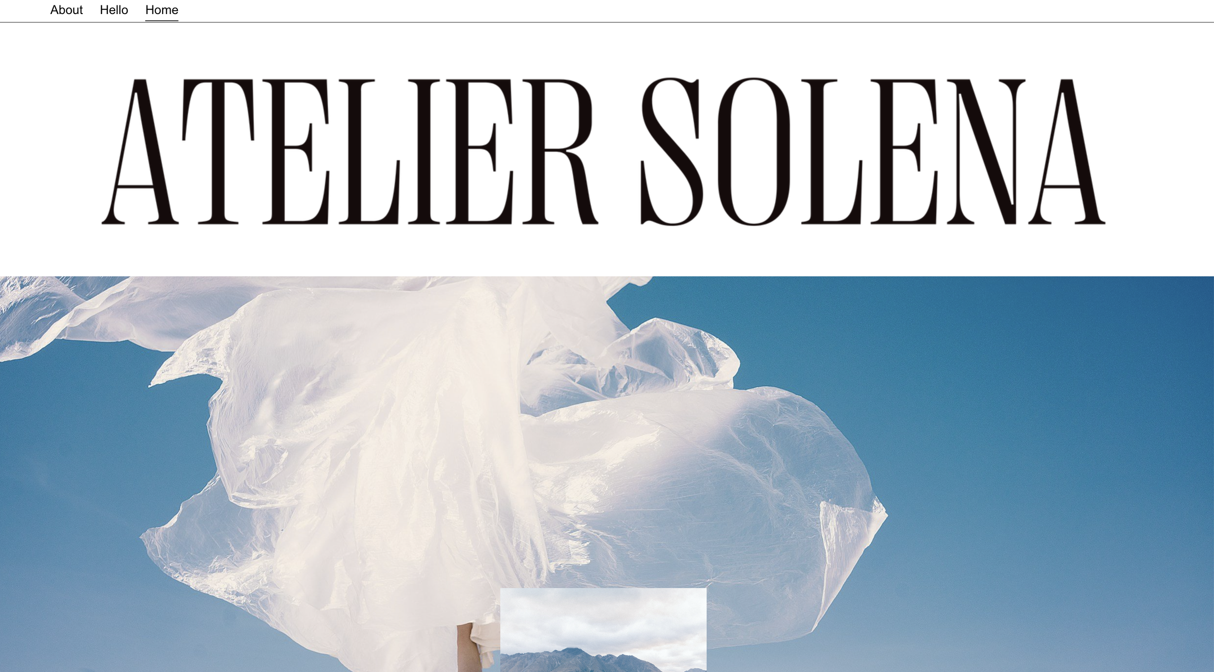
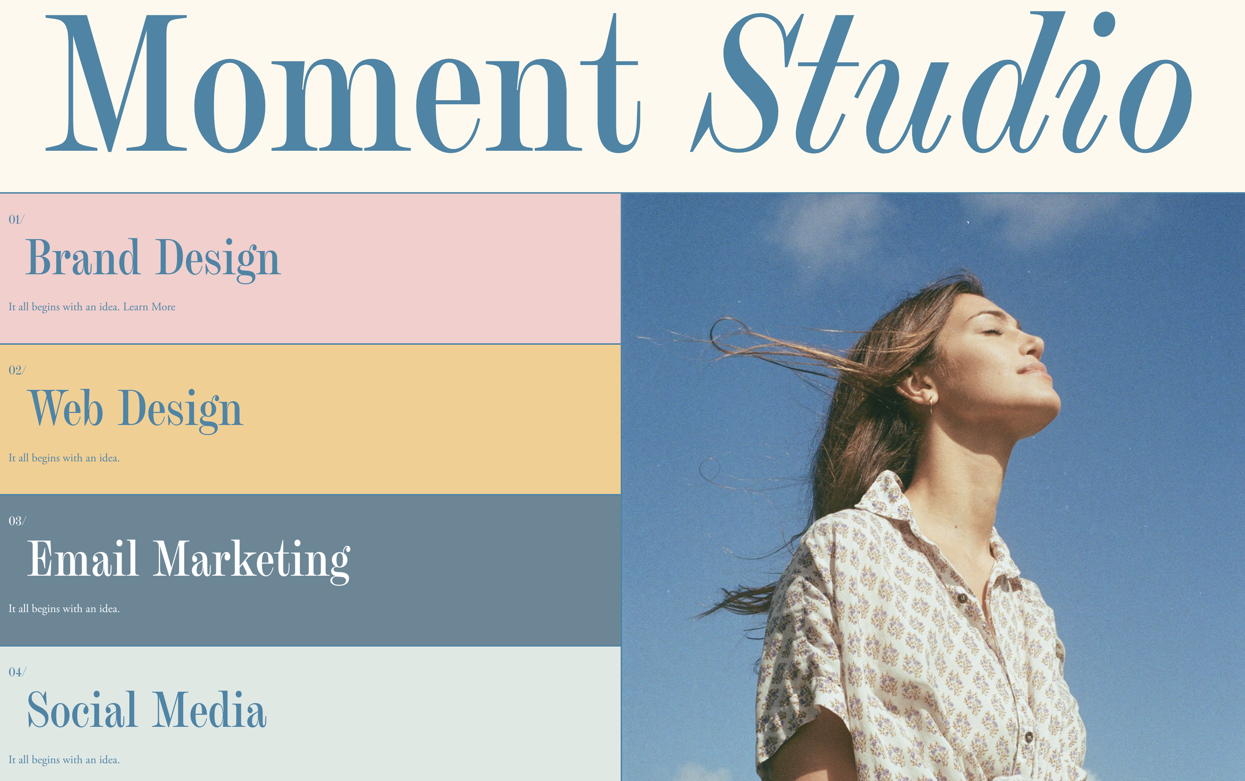
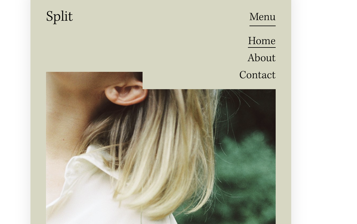
Full-Width Logo Header
Transform your centered header layout into a full-width logo display with navigation below using CSS flexbox restructuring.
Custom Cursor Slideshow Arrows
Replace default Banner Slideshow arrows with a custom cursor image that follows mouse movement and rotates for left/right navigation.
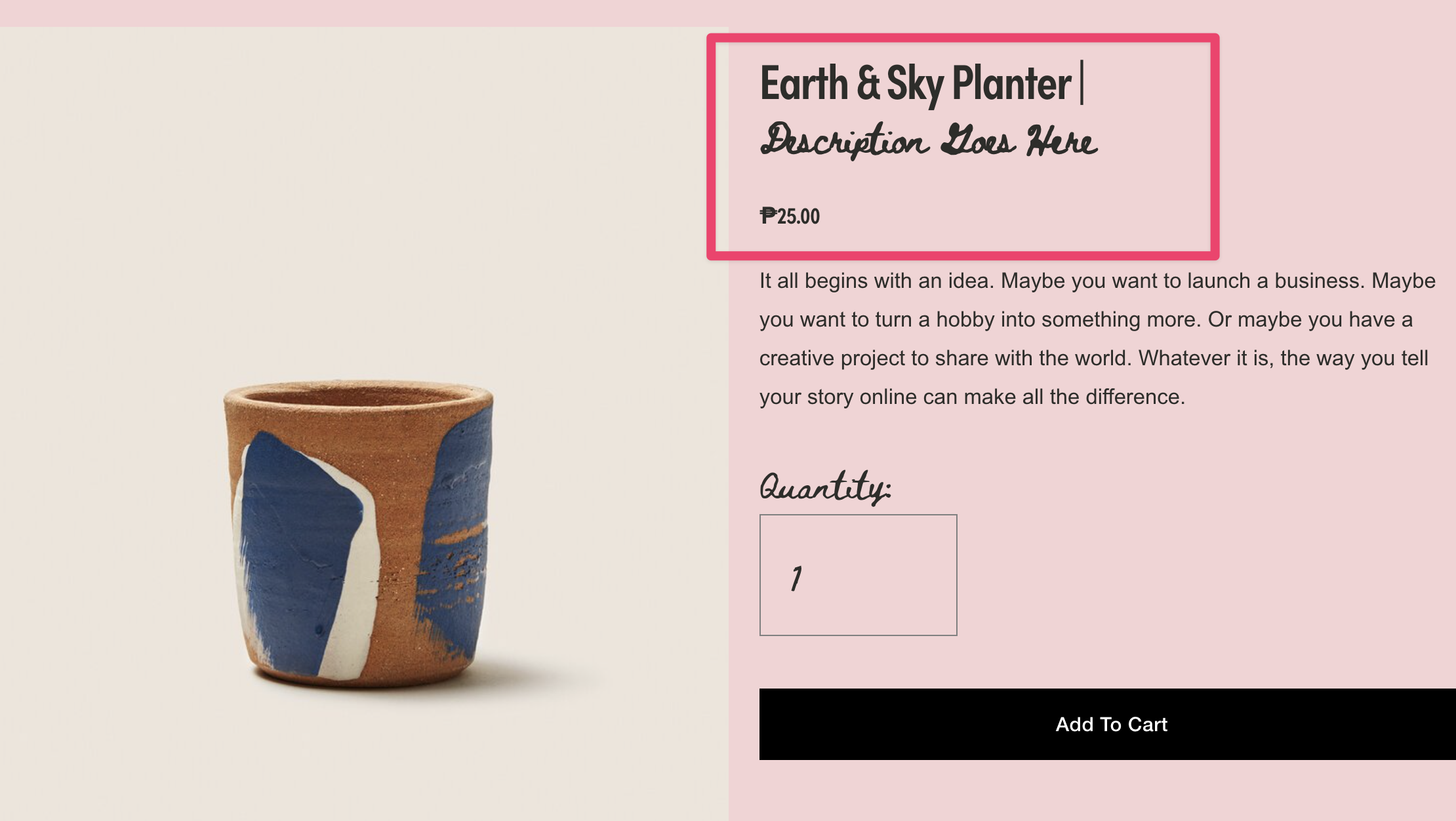
Product and Blog Subtitles
Split product and blog titles at the pipe character to create styled subtitles using JavaScript DOM manipulation.
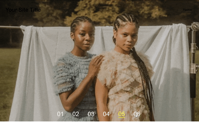
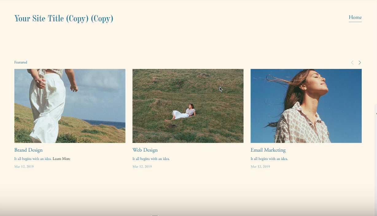
Gallery Slideshow Horizontal Counter
Replace default bullet navigation with numbered counters using CSS counter-increment for a sophisticated slideshow pagination display.
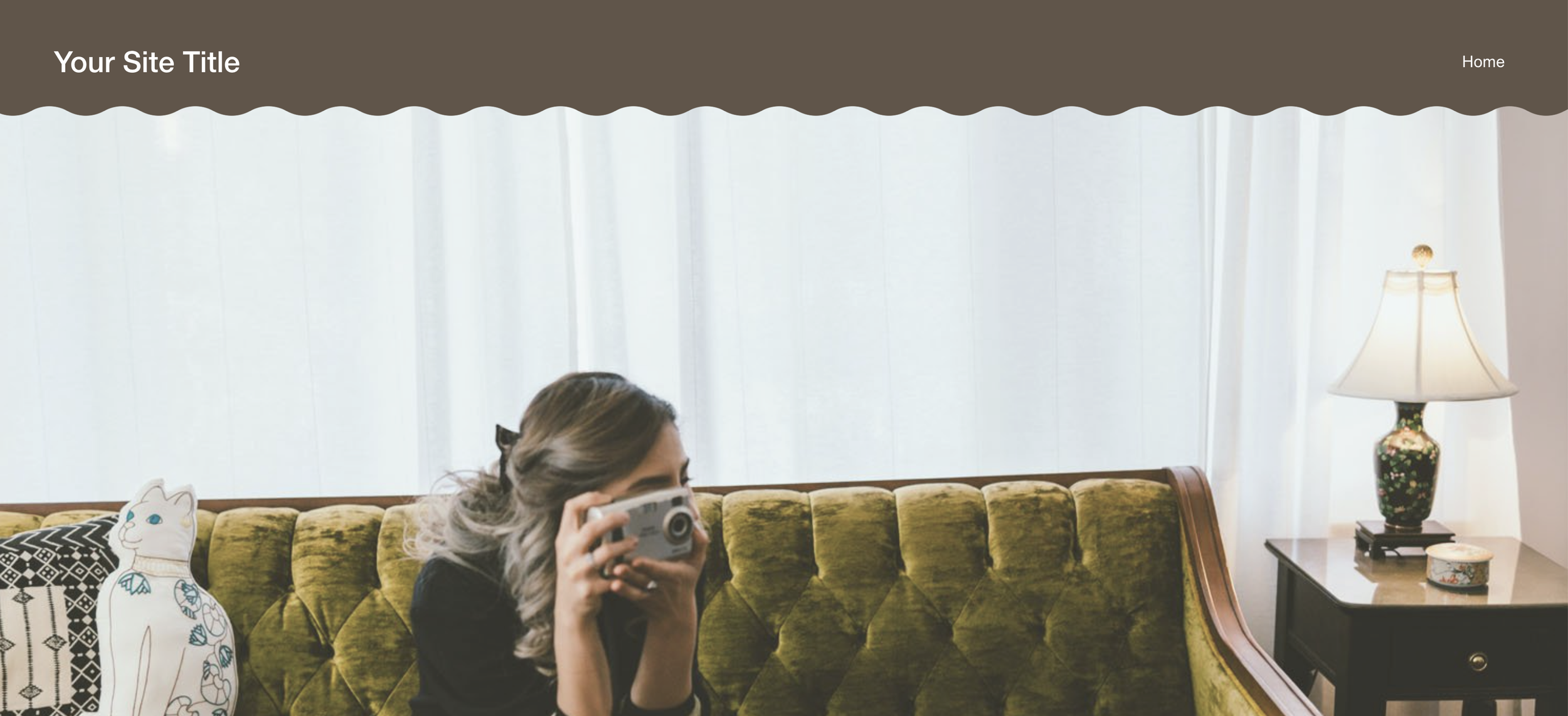
Curved Wave Headers
Add elegant curved wave borders to solid headers using CSS mask-image for organic, flowing header designs.

Page Background Color Change on Image Hover
Dynamically change section background colors when hovering over specific images using CSS :has() selector and image filename targeting.
Dynamic Archive Dropdown Display
Automatically display the active blog category name in your archive dropdown—no manual updates needed as visitors navigate your filtered blog pages.
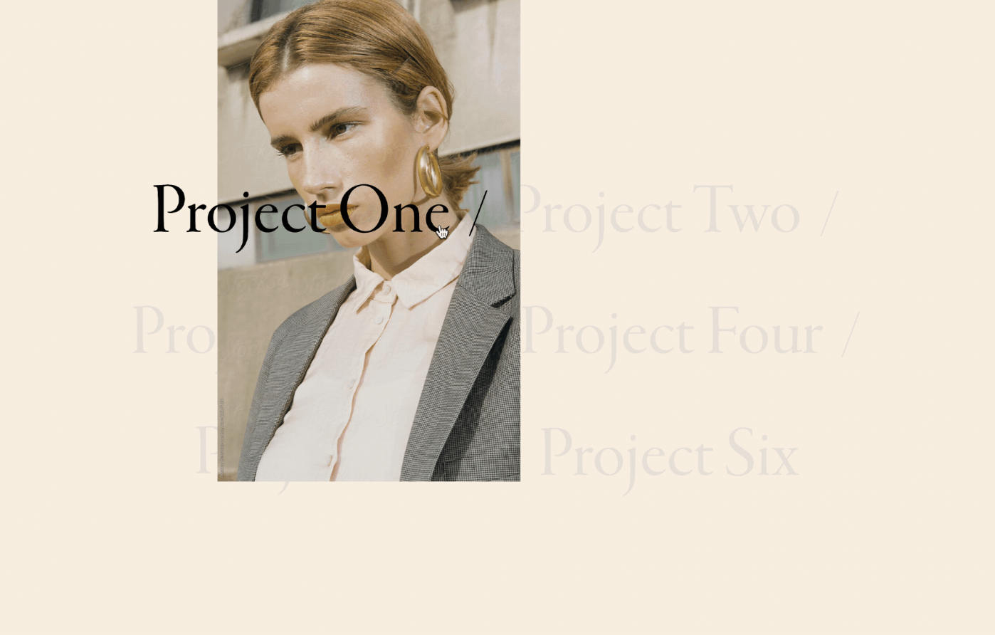
Portfolio Hover Follow Title Spotlight
Create a dramatic spotlight effect where active project titles remain bold and visible while inactive titles fade to muted tones as visitors hover through your portfolio.
Custom Social Icons with Pseudo-Elements
Replace default social link text with custom icon images using CSS pseudo-elements—add any icon for any platform without touching the HTML.
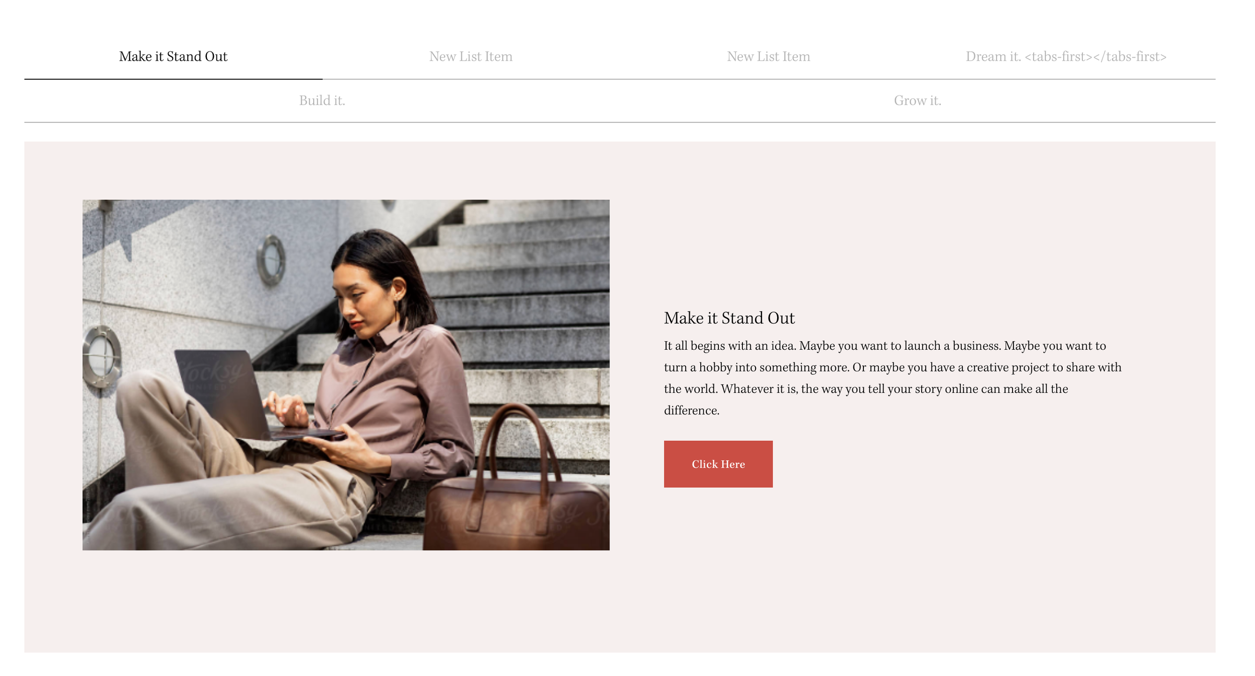
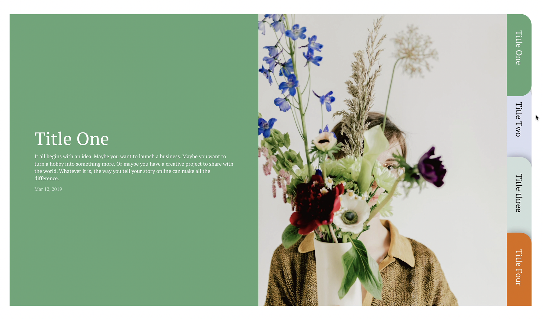
Top Navigation for Stacked Tabs
Flip your Stacked Side Tabs navigation to the top using flexbox column-reverse—create a horizontal tabbed interface from vertical List Sections.
Control Summary Block Items on Mobile
Manage how many Summary Block items display on mobile devices with a simple CSS technique—reduce clutter without affecting desktop.
Video Block Aspect Ratio Fix
Override Squarespace's default video padding to achieve custom aspect ratios—perfect for vertical videos, cinematic widescreen, or square formats.
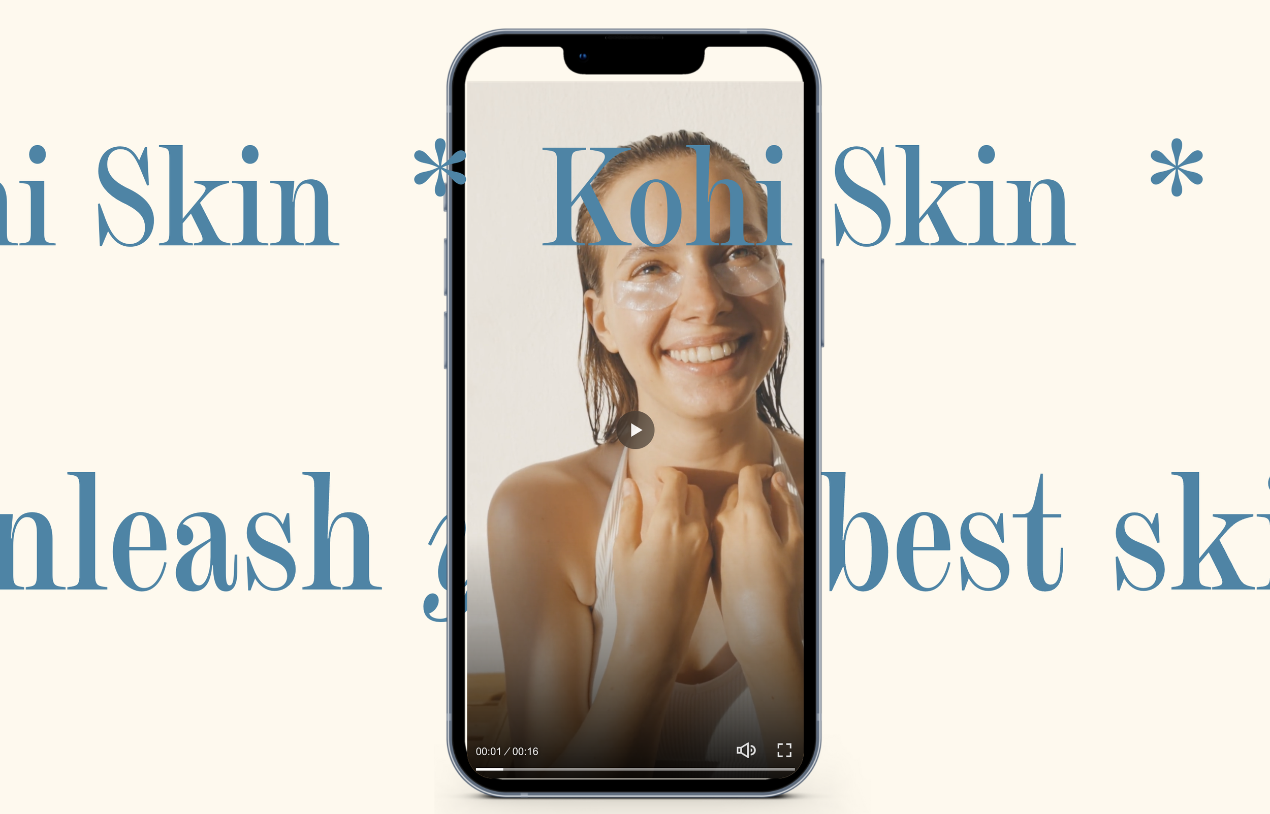
Phone Mockup Video Frame
Display videos inside a realistic phone frame overlay using CSS pseudo-elements—perfect for app demos, social media previews, or mobile-first showcases.
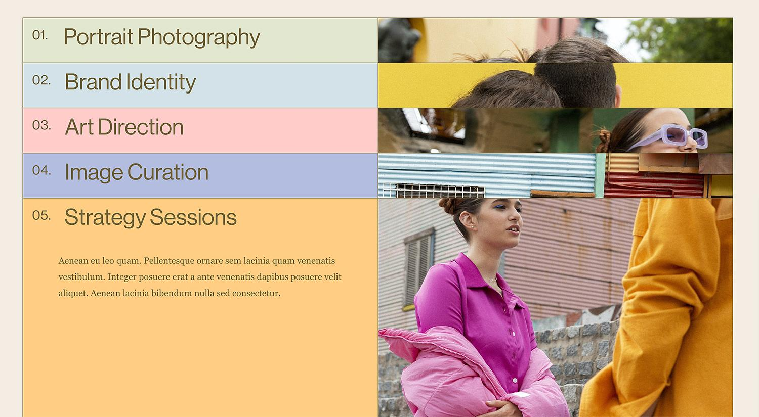
Stacked List Cards with Scroll Offsets
Create an elegant card-stacking effect where each list item sticks at a different vertical offset as visitors scroll—revealing colorful layered cards that stack on top of each other.
Full-Height Tabbed Grid Navigation
Build a full-height vertical navigation grid that spans your entire section—each tab stretches to fill available space with distinct colors and clickable areas.
Desktop Navigation on Mobile Devices
Override Squarespace's mobile hamburger menu to display your full desktop navigation on tablets and phones—keeping folder dropdowns and navigation structure intact.
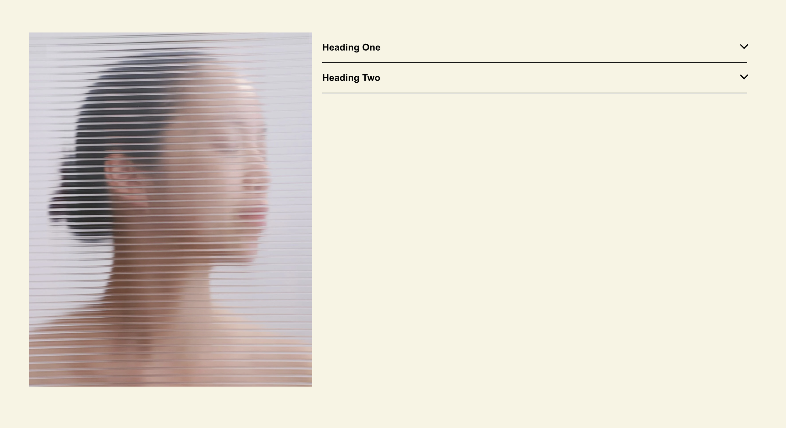
Markdown Block Accordion System
Transform markdown blocks into accessible, animated accordions with automatic grouping—use any content type in expandable sections, not just text.
Disable Summary Block Item Links
Remove clickability from summary block items using CSS pointer-events, turning your summary blocks into display-only content showcases.
Style Store Collection by Category
Apply unique visual styles to each product category page using JavaScript body classes and CSS targeting, enabling category-specific banners and layouts.
Folder Tabs for Summary Block
Transform summary blocks into a tabbed folder interface with vertical desktop tabs and horizontal mobile tabs using Slick.js carousel integration.